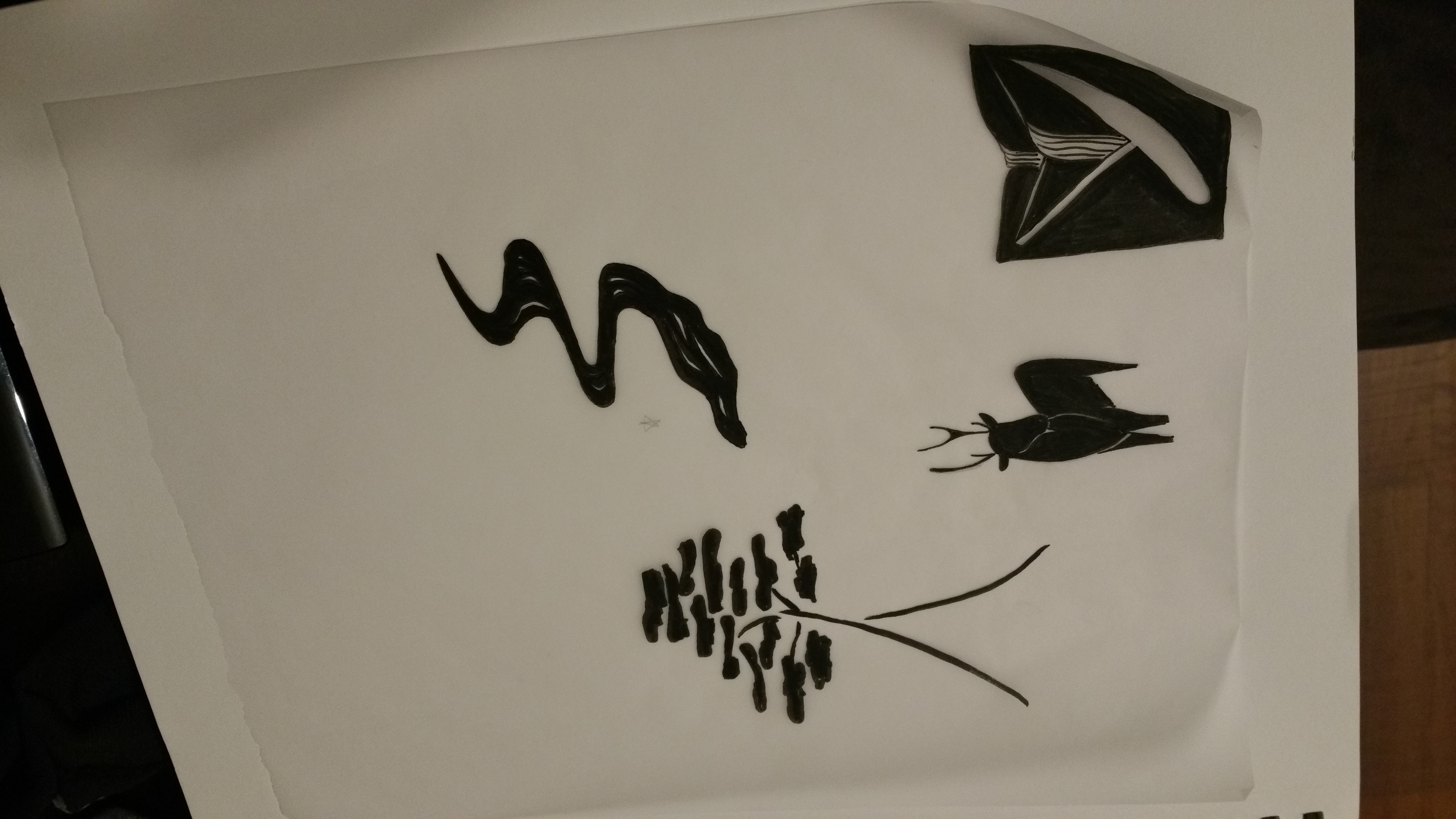
For the second week of my Design Synthesis class, we continued developing marks and logotypes for our chosen site. I started out with lots of loose sketching of animals, trees, or mountains/rivers from photos of the forest.
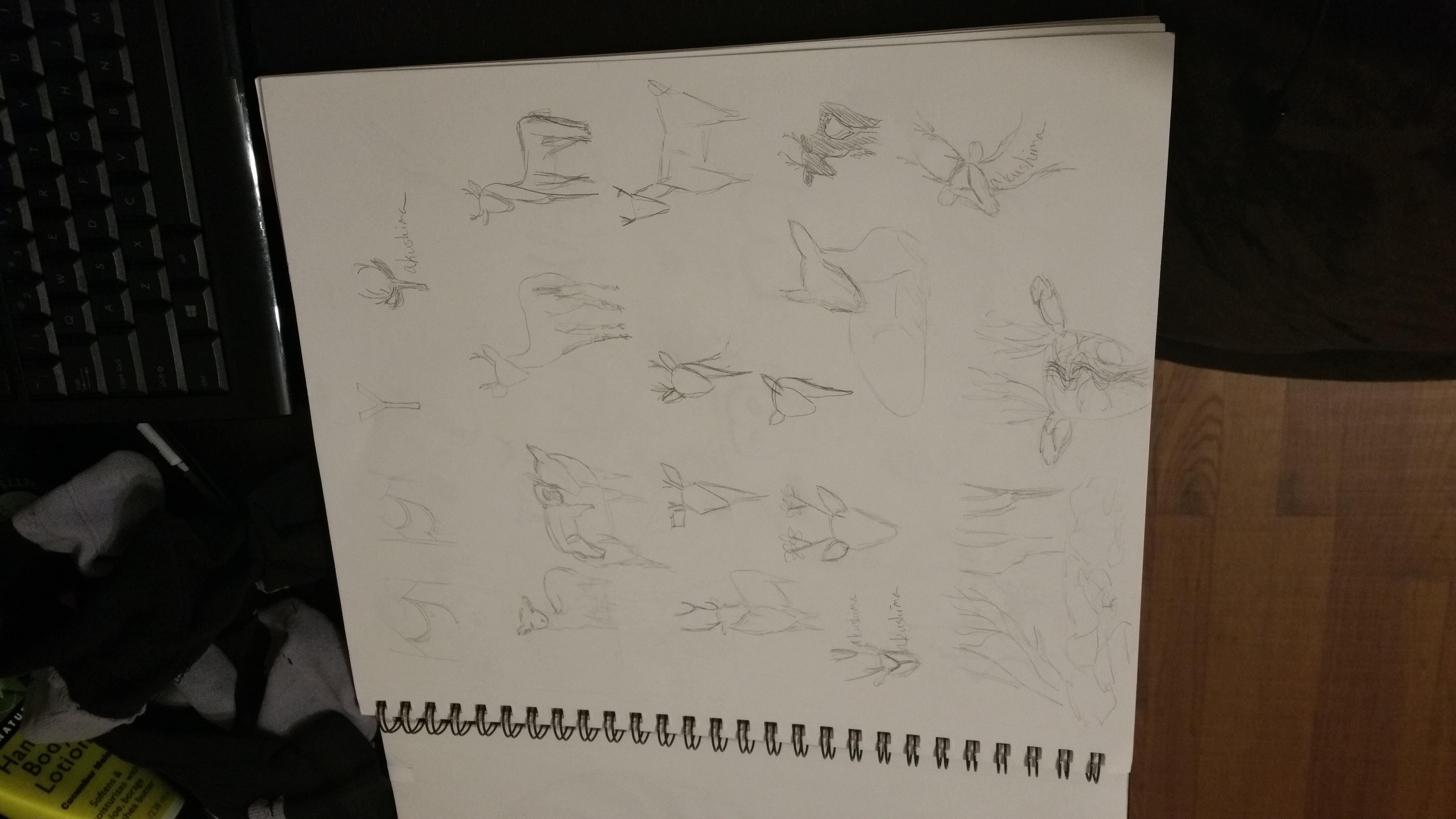


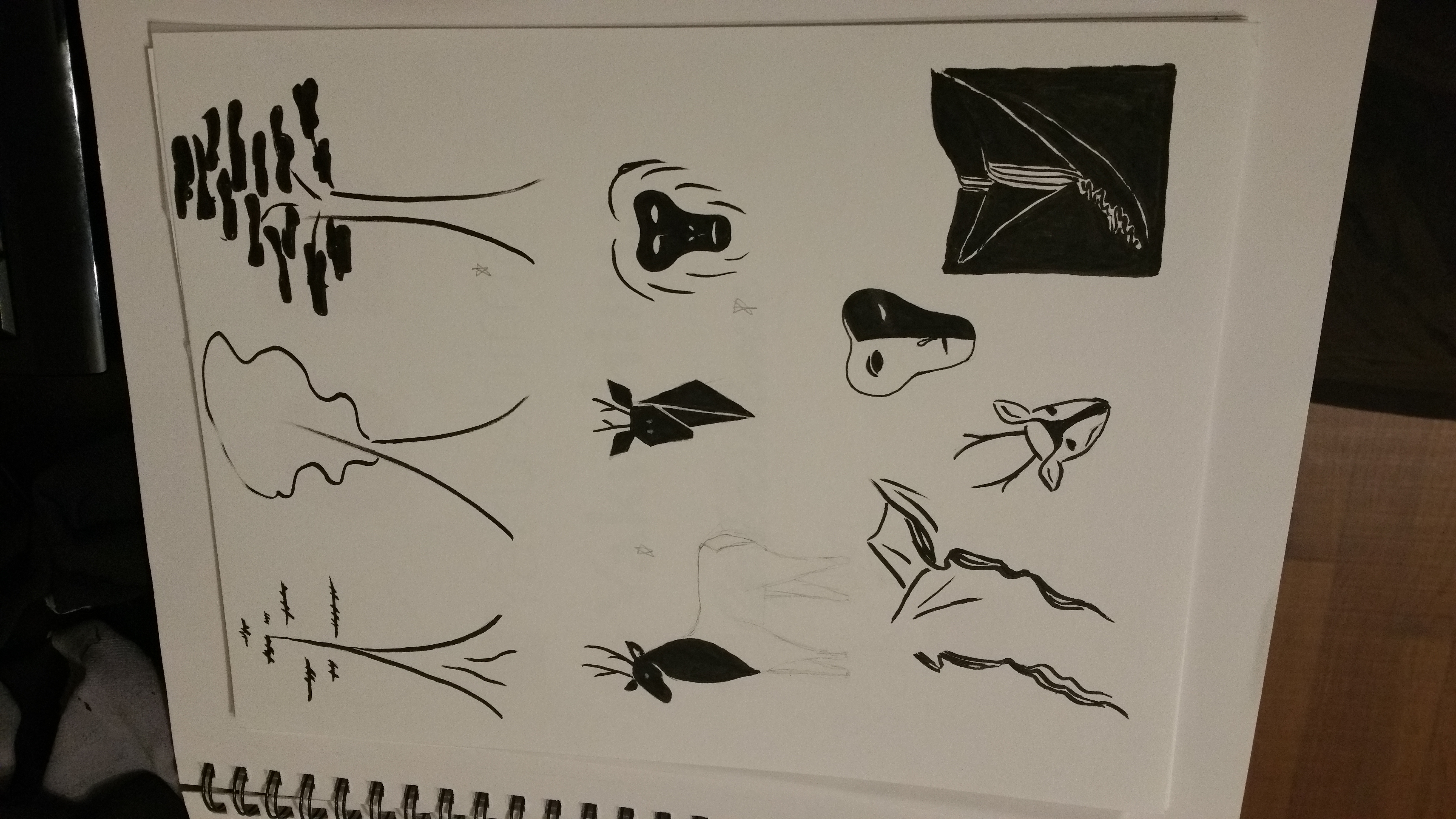
Many of these were far too decorative, but they helped me to get a feel for the place, some of its lines and textures. After sketching for a while, I went back to a few of the stronger ideas and tried playing a bit with ink and a Japanese brush. That was pretty hopeless, but I have a brush pen that worked well to play a bit with calligraphy.
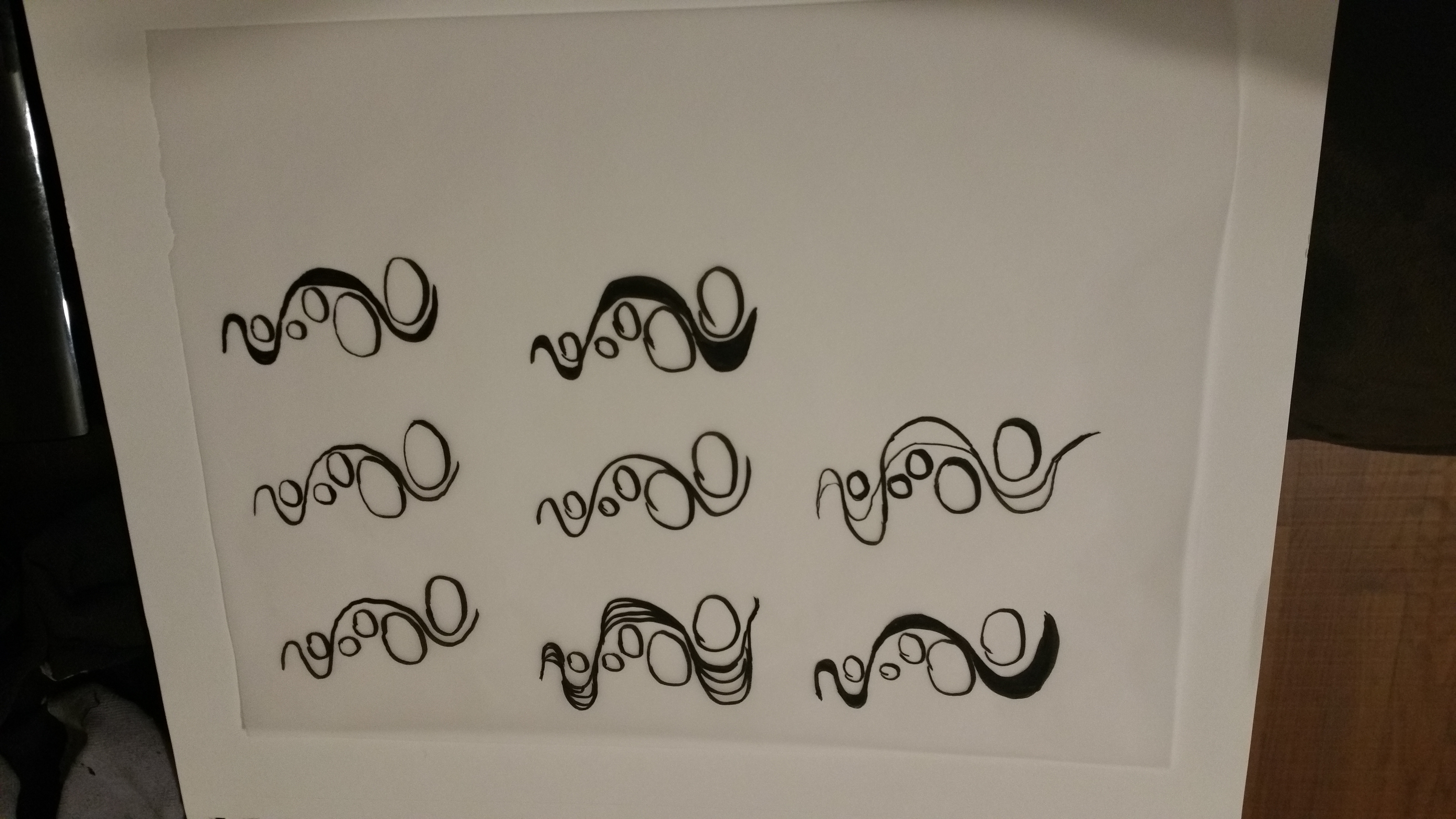
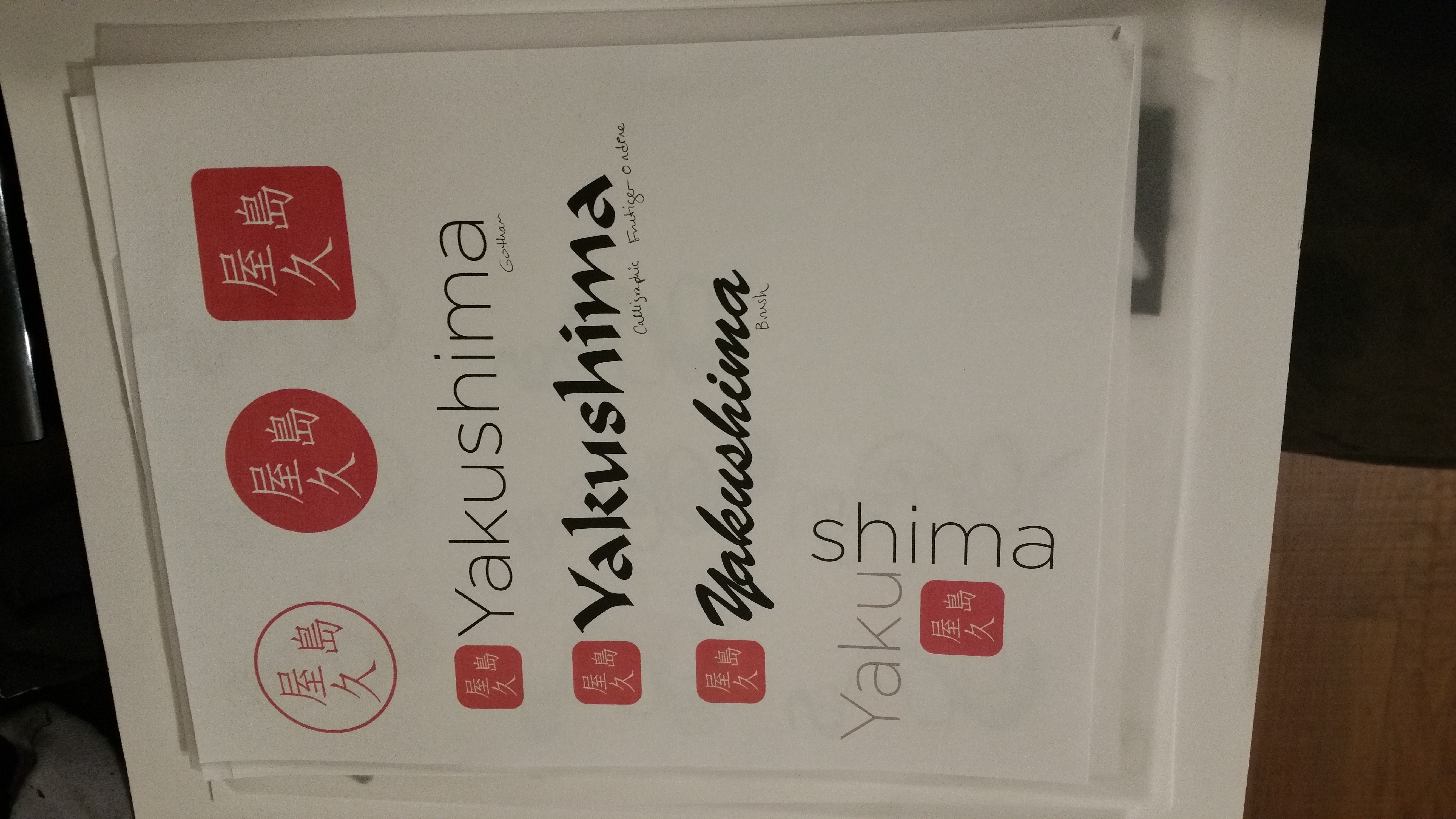
Doing the brushwork sent me off to Pinterest looking for examples. In many of the traditional pieces, I noticed symbols written or stamped onto the page in red ink. After some research, I found out that these are called hanko, and they are Japanese signature stamps, used for signing all official documents. I started playing around with a few styles of those, combined with brush/calligraphic typefaces. Gotham still felt best – a light, open sans serif that feels very clean and simple. I liked the calligraphic types, but they felt more like a restaurant in chinatown than an ancient forest to me.
I liked the direction that was heading, but wanted to make sure that it wasn’t culturally strange to use a human signature stamp for a place. So, I emailed a Japanese friend and asked for her opinion. She said it was ok to use hanko for a place, but that I’d chosen a very standard typeface (the Times New Roman of Japanese type), and it’s common to use something more ornate. She also suggested that I use diagonal lines if possible, because it was hard to tell which way to read the signature from the way I had placed the kanji.
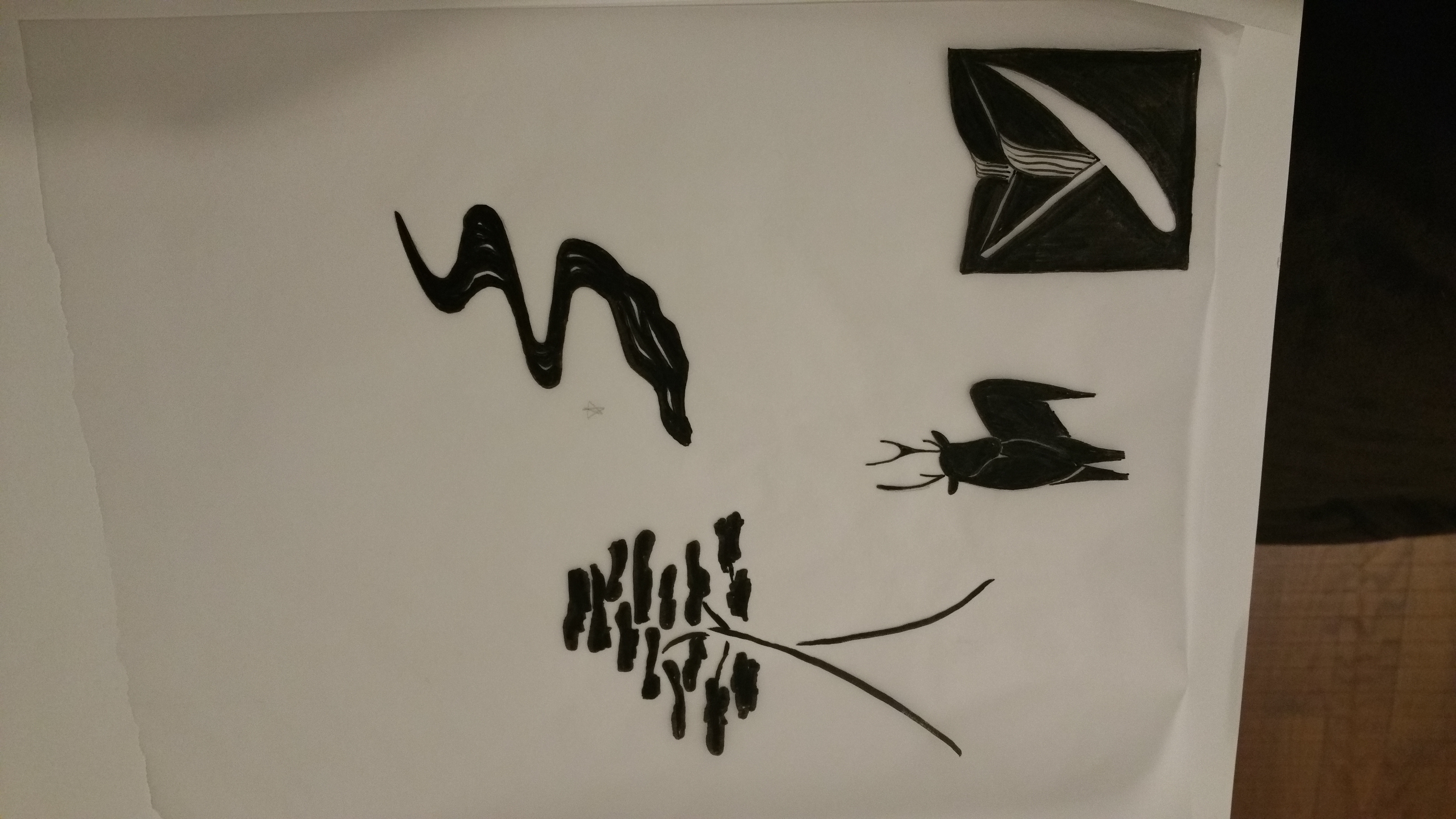
Next, I went back to the brush pen and sketches, and worked on making some stronger graphic forms.
When I mixed those elements with a few of the logotypes and hanko, things were starting to hang together a bit better.
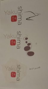
Doug pointed out that the bottom mark looks like a Japanese ink art called suminagashi; I created it from an outline of Yakushima island, which I then simplified and scaled multiple times to make it look like tree rings. Thick and thin lines and varying opacities gave it a more realistic feel. Slightly overcomplicated for a mark, but possibly something to use for a fifth element later.