I’m really excited to be taking another studio elective with Doug Scott this spring. The class is called Design Synthesis, and it’s a mixed undergrad-grad course to focus on design principles. As always, Doug has a rigorous schedule planned, with lots of different components. We will be designing a brand identity for a UNESCO World Heritage Site, of our choosing. The final identity will include the following elements:
- Mark
- Logotype
- Color Palette
- Typography system
- “Fifth element” – a textural or supplementary design element
- Identity summary to catalog use of main identity elements
- Letterhead
- Envelope
- Business Card
- Series of 3 ads for the New Yorker Magazine advertising a show at the Museum of Fine Arts in Boston
- A single information page to summarize the site
- Simple webpage with basic information
- Site sign in 3D that could be installed at the site, typeset in at least 5 languages
- And information booklet about the World Heritage Site program and specifics about our chosen site
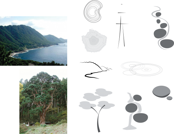
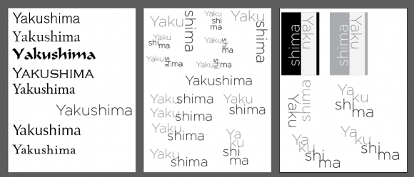
Each student in the class chose two different sites to work on, and we spent the first week developing sketches of the marks and logos for each. Since my thesis project is about soil ecosystems, I wanted to choose a natural site. I ended up going with Yakushima forest in Japan and Yosemite National Park in the US as my preliminary choices, since both have ancient trees and forests as part of their qualifications for the World Heritage program.
At first, I thought that it might be hard to distinguish between the two sites – after all, how different are two forests likely to be? That turned out to be laughable. I started out by searching for images of the two sites, and compiled a list of words for each place.
Yosemite:
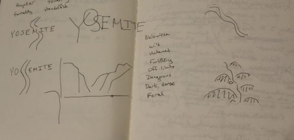
Roughness, contrast, extremes, harsh sun, gritty, bare, granite, cliffs, cascade, grandeur, stark, sculptural, craggy, angular, formality, rugged, wild, strong, solid, unmoving, enduring, mighty, air, stable, towering, standoffish, sky, exposed, majestic, vast, dramatic, open, chiseled, forbidding, merciless, determined, unstoppable, edges, outlines, boundaries, grizzly bears, Miwok people, acorns, sequoias, oaks, elemental, “mouth” (ancient name from which Yosemite is derived), space, light.
Yakushima:
Delicate, organic, velvet, deep, shadow and light, wet, sunbeams, verdant, primeval, secret, rounded, mounds, ropes, integrated, harmonious, secluded, cloistered, sanctuary, peaceful, gentle, moss, humidity, (name means) medicine island, elusive, cedars (sugi), mist, water, softness, ripples, tree rings, generations, decay, cycles, continuity, echoes, timelessness, ecosystem, rhythm, mysteries, cool, sheltered, dripping, environment, arches, Japanese, rebirth, brushwork, enchanted, enchanting
They could hardly be more different. Yosemite wants to be sharp, hard, angled and geometric, more about the mountains and the sky than the forest. Yakushima is all about softness, quiet, and diffuse light.
Some early sketches from the first week:


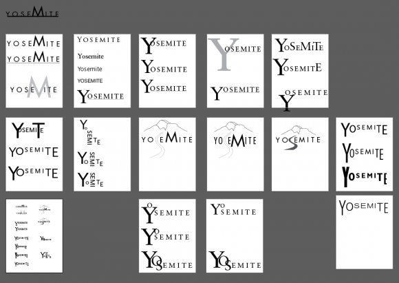
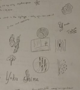
After the first week of sketching, we needed to choose a single site to continue on with. It was a difficult choice; Yosemite felt much easier to access, with lots of large wildlife and other potential symbols. Yakushima was more reluctant; harder to get a hold of, formless and remote. In the end, I decided to go with Yakushima, intrigued by its mystery, and interested to see where it would lead.
