I help people think with data.
Here’s what I can bring to your team.
A blended approach
I am trained as a scientist, have 15+ years of teaching experience, and completed a master’s degree in information design and visualization. With this background, I bring a unique blend of skills and perspectives to your project. I am also practiced at speaking across disciplines and functions.
Hands-on experience
I have 7 years of hands-on work in product design, user research, strategy and architecture, as well as subject-matter expertise in data visualization and familiarity with UX principles and practices.
- 2.5 years as design director overseeing product design and platform integration for the AI innovation branch of Medidata/Dassault Systemes.
- 4 years as lead designer in charge of user research, design strategy, UX and data visualization design for an AI-enabled clinical trial planning tool. The product grew from a fledgling product to $25M/y revenue in that time.
- 3 y developing data selection logic, design systems, and chart visuals for a dashboarding application that dynamically selected charts based on user-configured data inputs.
- 5 month (internship) position visualizing research data for the MBTA, creating an interactive dashboard to support experts in exploring transit data.
A magic wand
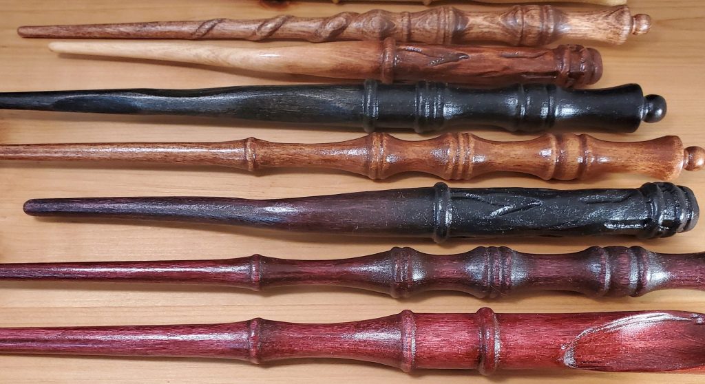
I believe that we get further when we allow ourselves to dream. I come to a project with a blank slate, and encourage users (and the team) to imagine how things could be, rather than focusing on how they are today.
I embrace complexity
I allow a problem to be as messy and as complicated as it needs to be — and no more. Finding that balance is at the heart of any design challenge.
I love big, complex projects with lots of moving parts, and I’m all for scaling Mount Everest. It’s the truly ambitious, audacious things that are worth doing, and I’m ok with a 5 or a 20 year roadmap if that’s what it takes to get things done.
I’m not afraid of chaos, but I do believe that it needs to be structured and organized to make progress. Discipline and good planning are how we do that.

Realistic scope
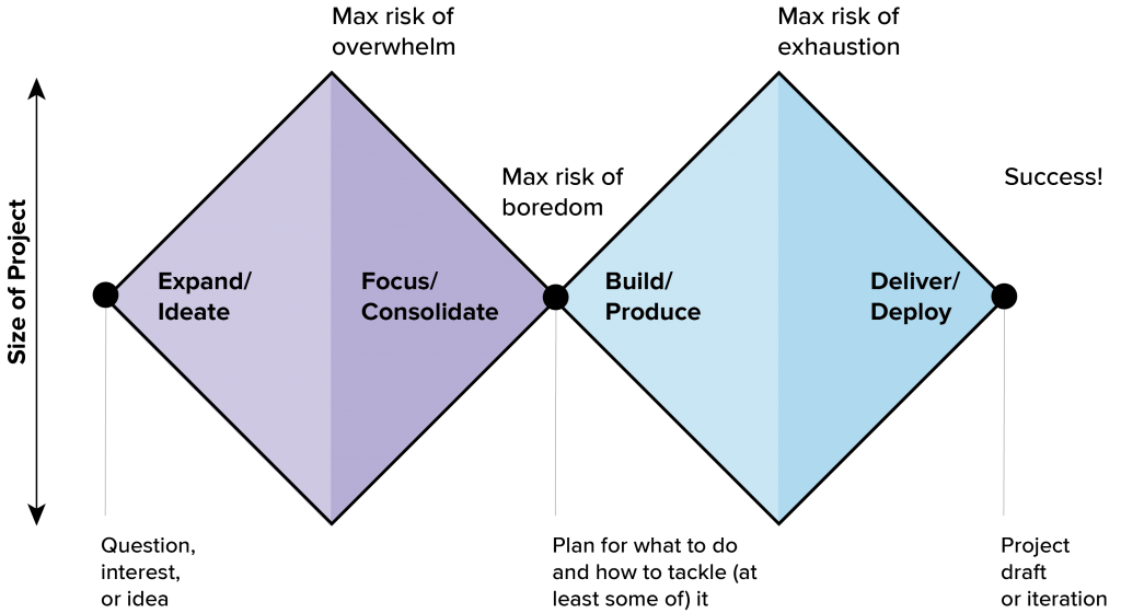
Fun as it is to dream, there is also a moment to put the magic wand away. Once we’re clear on the vision of what could be, we need to prioritize and decide where to start. I understand when to say no. (Or not yet.) Sometimes, even good ideas end up on the cutting room floor.
Vision, scheduling, and structure
I am a planner, and a doer. I like to make things happen. That usually starts with a crazy spreadsheet or a schedule, and then becomes a collaborative refinement effort from there. A realistic plan is how we put foundations under our dreams.
I love breaking down ambitious projects into manageable pieces, and identifying the core items needed to execute on our dreams. I’m a cautious planner who won’t commit to something until I think it can be made realistic, but I’m also a creative problem solver who loves figuring out how to get things done…and who delivers on time.
Focus on the team

Collaboration isn’t a nice-to-have: it is essential for doing the work. We all have a piece to bring to the table, and the team can’t function without it. Whether I’m working with engineers and data scientists, product managers, or directly with a client, I believe that deep listening, “yes-and” thinking, and thoughtful, constructive feedback make us all better, and help us to produce better work. If we’re going to get there, it has to be together.
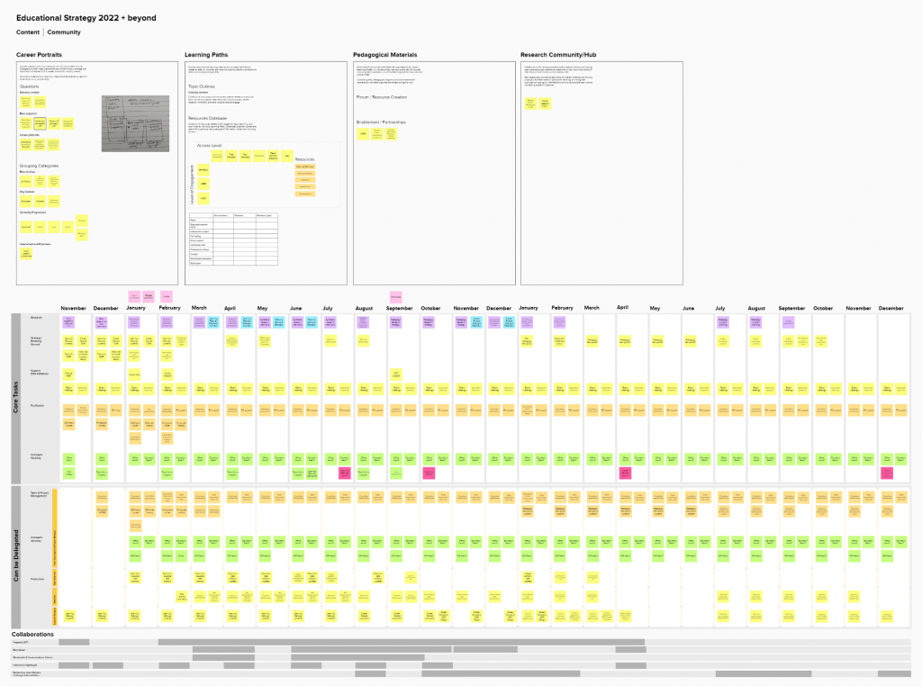
You can see an overview of how I work with a team here, and a breakdown of the requirements and design process here.
Collaborative leadership
I am an experienced leader. Whether it’s convincing 400 students to do their homework instead of going to a party, organizing a team of lab instructors for a course, supervising individual research theses, developing a committee of volunteers for a nonprofit, or managing individual designers, I know how to work with people, and how lead a project or team. (Hint: it’s about vision – not threats, coercion, or shame.)

Respect for the data
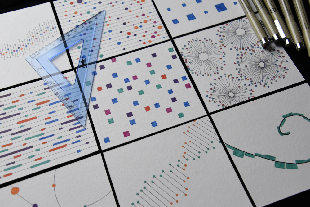
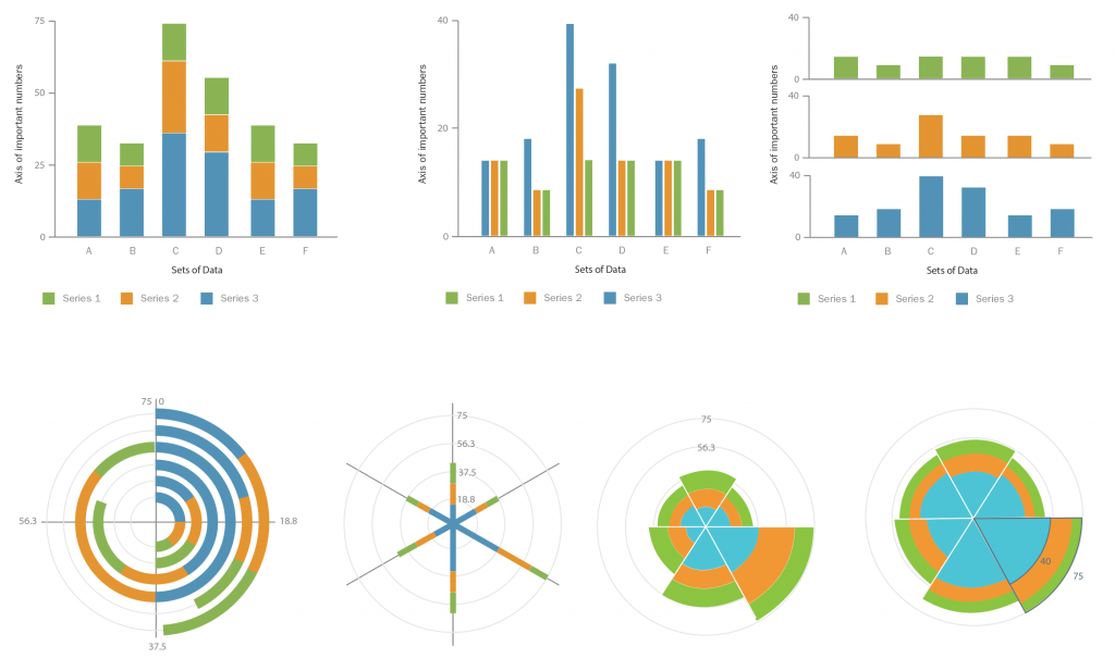
I know how data works. I understand the difference between zero and null (“not there” vs. “I didn’t measure”), realize that n values matter, understand propagation of error and statistical significance.
Data integrity matters. In my job, ensuring accurate data display is the most important thing I do. I never fight unless I have to (and I should never have to), but I will stand up for the data, every time.
Data-informed design
I prefer to measure, rather than guess. Whether that’s monitoring team performance metrics, understanding the audience for a project, creating systems for tracking user feedback, or conducting user testing for designs, I am an empiricist at heart. What’s measured matters. If you’re not measuring, you’re flying blind.
Metrics should be used to inform strategy and improve process, not as a performance grade for the team. When used to surface obstacles and identify efficiency losses (rework, changed directions, dependency delays), metrics can be one of the best ways to articulate opportunities to help and support the team.
What I don’t do
It’s easy to talk a lot about what you do, but sometimes it is just as important to be clear about what you don’t do. Here are some places where I might not be a good fit for your project.
Top-notch performance, not heroics.
I’m always up for a challenge and will always push for an ambitious project, but I won’t kill myself (or my team) to get there. If you want weekend work, all-nighters and no boundaries, I’m not the right fit for you.
I am not a developer, an analyst, or a data scientist.

I am sufficiently fluent to be comfortable working with technical people, but I don’t have the training to work with analysis software, and code is not what makes my heart sing. I can get by and cover a few gaps here and there if I have to, but if you’re looking for someone who codes, you need someone else.
I am not an evangelist.
I want to work with people who know and respect my value, and I don’t want to spend my time arguing about whether or not I (or my function) should exist.
I am happy to work with a team that is new to design. I am always open to helping people to understand what design does and how it works. I am not interested in convincing you, your boss, or your entire company that I bring value.
I come into a team as a partner and an equal, and I expect that my colleagues will do the same for me.
I am not a rock star.
I believe in top-notch performance and excellence at all levels. I love both watching and giving a good presentation, and I am always looking to achieve something amazing.
I am not hunting for a stage, looking for a spotlight, or hoping to be the most important voice in your organization. I am good at what I do, but business isn’t (or shouldn’t be) a popularity contest. I am not interested in using my skills solely to entertain, perform for, or impress your team.
I am here to perform with your team, and I believe that is more easily done outside of the spotlight’s glare. Let’s drop the toxic dynamic of focusing on one individual, and put the whole team on the stage, as active participants in the work.

I don’t do last minute.

I understand that things come up. I believe in doing what it takes to get things done, and I love pulling off magic tricks to accomplish the impossible. But let’s be honest: in most cases, urgent, last-minute work reflects either poor definition of scope or a failure of planning, and it compromises the thoughtfulness and quality that I want in my work.
I’m not an adrenaline junkie, and I find them stressful and exhausting to work with. If you need an emergency response specialist or a hoop-jumper, I’m not the right fit for your team.
I’m not here to make things pretty, or to “jazz up” your design.
I have a deep appreciation for aesthetics, and will always work to move toward a relevant, engaging, and appealing presentation. I believe that UI is critical to making a usable interface, and that good aesthetics help a user to connect with and understand your data.
That said, my approach is functional-first. I make really ugly sketches, we get clear on the need, and then we design something that supports the user task, within the constraints provided by the data. If that happens to be a bar chart, then so be it. Flashy graphics, gratuitous visual noise, and eye-catching but unreadable graphics are not my area of expertise. I’ve written about this here and here.
If you just want someone to add a visual layer without thinking too much, asking questions or raising objections, then you’re not getting the full value that I provide.
Still feel like a good match?
If you’ve gotten this far and you’re still interested, I’d love to talk more! Please feel free to connect on LinkedIn — and be sure to include a message, so I’ll know who you are!
You can see more detail about past projects on my projects page, get an in-the-weeds view of works in progress in the blog, and check out my more formal publications here.