The next step for my research methods poster is to figure out how to add in the richness of the dataset and a sense of context/importance of the topic for global issues. To do this, I really wanted to get into granular data about land use and soil degradation, rather than sticking with the simple global trends. I’m hoping that this will help to make the topic seem a little more approachable, and invite people to participate in comparisons of the situation in different parts of the globe. I really want this poster to show the complexity and the texture of problem, rather than suggesting that the problem is the same in all parts of the world.
Saying that I want to include more data is one thing. Figuring out how to do it is quite another. I went back through all of the datasets I’ve been compiling this semester, and started pulling out the pieces that I thought were most relevant to my current narrative for the project.
Most of these topics related to land use and population change, as these are primary drivers for soil degradation. Understanding the pressures of population growth and urban density are also important for helping to explain why this topic is relevant in our daily lives. We rely on the soil for food, shelter, and clothing, and a finite amount of land has to supply all of the people on the planet. Figuring out how to do that sustainably is a huge challenge, and an exciting global opportunity.
I found that the data I cared most about fell into two broad categories: land area, and population. So, I started playing with ways of visualizing several of these variables in a compact way. Since I wanted to draw visualizations for all of the countries in the world in a quantitative way, I decided to import the data into d3 and do most of my exploration there.
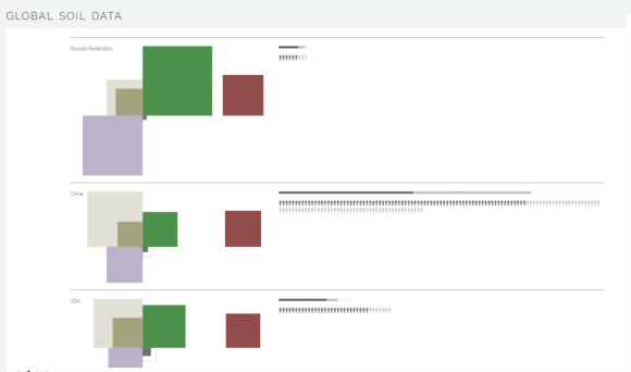
My first approach was to create a bounding box to represent the total area of a country, and to show all of the different land use variables as colored areas inside it. The square on the left shows the land usage, separated into 5 categories – red: degraded land, green: forest, dark gray: urban, dotted gray line: urban expansion predicted for 2050, light brown: agricultural land, dark brown: arable land. The set of squares on the right shows population information – light gray is the total population, and dark gray again shows the number of people living in cities.
I really liked the aesthetics here, as did several people who saw the sketch. I also really liked the fact that differences between countries became obvious, even at a glance. I chose to use squares and place them consistently in specific corners of the land area box in order to facilitate comparison between countries. A partition layout would be a more standard approach, but I don’t find them very readable, and it can be hard to make comparisons based on area when the aspect ratio of the rectangles is constantly changing. I also wanted there to be a positional component for identifying the different variables, so that you could look at all of the squares on the top left to compare degradation, and all of the ones on the bottom right to see urban expansion.
Unfortunately, these advantages came at a cost. Requiring that all of the variables be represented as squares meant that they had to overlap in some instances, and that overlap was not actually meaningful in any way. The fact that the land areas plotted don’t add up to 100% created an additional complication. The land degradation data is from a different dataset than the land use data, and the land degradation does overlap with the different categories. I don’t have that level of detail in the data, though, so it wasn’t possible to show the overlap quantitatively.
As I expected, most people found the overlap distracting at best, and at worst confusing. So, I needed to find another way to show the same data.
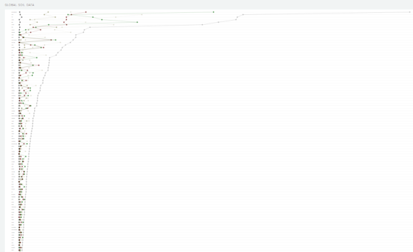
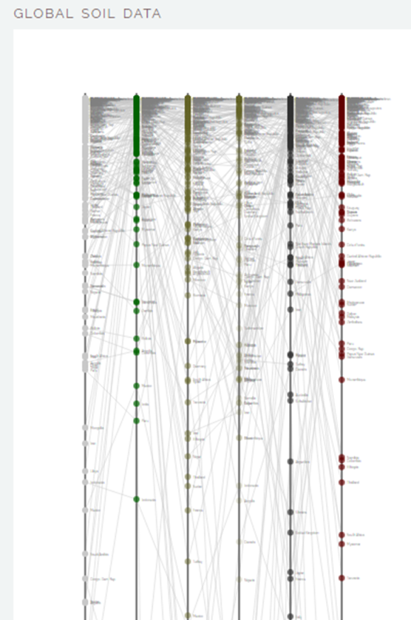
I had tried plotting the different land use variables on multiple y axes, but found the results completely unreadable and unhelpful. This might work in an interactive setting, but I definitely didn’t think it belonged here.
Several people suggested that I use side by side bar charts for comparison of data between countries. That would be possible (and quantitatively superior to area maps), but I felt that multiple bar charts would be hard to read and compare quickly across different countries – you wouldn’t get the same shape signature that you get with the squares.
I did try collapsing down the bar chart data into a single line for each country. Since the variables share a single axis, it’s possible to plot them all as colored dots on a single line, and then the reader can follow dots of the same color to compare the different countries.
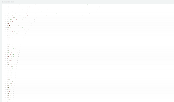
This was a more compact way to represent the data, but I found that this was also hard to read, especially with many spots of different colors. I tried adding lines to help guide the reader through the forest of dots, but the connecting lines suggested trends or connections between countries that didn’t really exist.
The other disadvantage of the line/bar plots was that they use a linear scale. That’s much better for making comparisons, but it also means that the length of the bars for the biggest countries need to be huge in order for the data for the small countries to be visible on the same scale. The area maps use a square root scale, which alleviates the problem (at least slightly…it is still an issue).
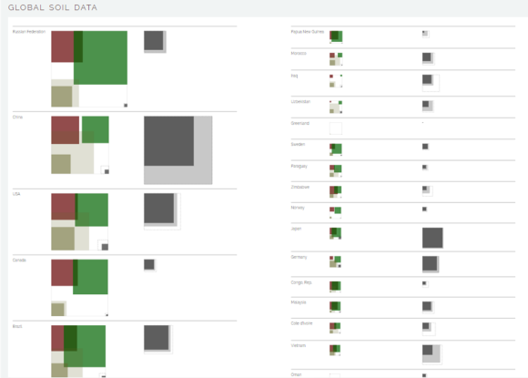
Dietmar suggested that I break the bounding box, and let the collection of squares stand on its own to represent the size of the country. I’ve been playing with that idea, and am pretty happy with the outcome. By creating an “other” category in the land use group, I can keep a glyph made up of collections of squares. Taking the red square out of the country area group eliminates the problem of overlap, and helps to draw attention to land degradation as the important variable.
I also started stacking in the population data on the right. I didn’t like the fact that both population and land area were represented in the same way on the first draft of the square glyphs. Here, I decided to represent population as a bar chart, and then to show the number of people per km of land for each country as a series of person icons. I hoped that this would give a more tangible sense of crowding.
This graphic was extremely mean to my computer (each square, bar, and person is a separate path, and there are 40,000+ people alone!), but I think it works pretty well. I’ve thrown a low-resolution image in as a placeholder for a mockup poster design below.
The set of squares in the top left shows global land use, and the table on the right gives values (on the same scale) for each of the countries in the world. By the middle of the third column, the scaling means that the country icons are becoming almost invisible, and their usefulness as glyphs is limited. But an interesting thing happens right around that same time – even though these are small countries that contain only a small portion of the world’s population, they are also some of the densest places on earth. The gray blocks in the table are grid layouts of the number of people per square km for each country. The largest is Singapore, which comes in at just over 7500 people per square km (the global average is 6). You can also see right away how many of those people live in cities. Compared with the tiny land area that cities occupy, they contain a huge proportion of the population. Feeding that many people requires access to agricultural lands, which leads back to the question of how we should balance land use against a growing population.
So, that’s where we stand right now on this design. I am bringing this prototype in to class tomorrow and will pester people for feedback, so there will almost certainly be new updates and things to consider then. For now, I’m pretty happy with where it’s heading, and think that this direction is showing some promise.
