My research methods class is doing a semester-long project on the origins and implications of an object of our choosing. I decided to work with soil, as I wrote about before.
After doing the “object autopsy” from my previous post, I went to the scientific literature and started looking deeper into what goes into making healthy soils, and what relies on them. Our class has spent the last few weeks on a very basic introduction to R and RStudio, so I’ve also been looking for datasets that I can use to practice my new skills.
It’s been a long, uphill struggle to find data that I can work with. There are plenty of databases out there, but the data isn’t clean, and I am not yet an advanced enough R user to do the manipulations that it takes to get things in order. As a result, I’ve been taking my cue from Edison and have spent several days fully exploring all of the combinations of things that don’t work. While that has taught me some things about R, it’s not really helping to move my project ahead.
This week, I decided to regroup and start over with some general land use statistics from the World Bank. Much of the literature discusses the importance of land use practices in determining soil health and its interaction with the global climate, so looking at global land use patterns seems like a reasonable “big picture” place to start. The World Bank data are also much cleaner and more evenly formatted than the other datasets, which is a real benefit. Hopefully I’ll learn enough about R using these datasets that I’ll be in a better place to tackle the messy ones later. (Or maybe I’m just procrastinating…it’s hard to tell.)
The following are a mix of plots made in R and Excel to help me start to get a sense of what’s in the data. They’re all very ugly, but it’s a start.
The first set of plots were generated in R, to get practice using the tool (and to prove that I actually could make it draw a line graph, after all). First, I plotted all of the data on a line chart
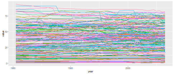
…which was cluttered and impossible to use. So, I looked for the max and min points in the data, and sorted by the difference to get the 10 countries with max change over that time period.
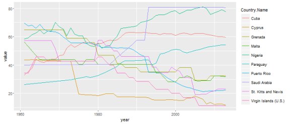
The plot is still difficult to read, but it’s possible to see long-term trends, and to see that there were some pretty big changes in some of the countries. (I’m not sure that I’d call some of these areas “countries” – I’ll have to look into what the World Bank uses for its definition. What on earth is St. Kitts and Nevis??)
Plotting all of the countries as a bar chart gives a good sense of the variation, and shows how few countries have negative values. (I’m not sure if the scale of the negative axis is meaningful).
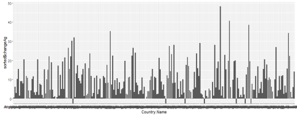
It’s still not a terribly readable plot, with all of the axis labels printed on top of each other and bars only a few pixels thick, but I do think this graphic is useful because it gives me an intuitive sense of the amount of variation we’re dealing with.
Looking again at the top 10 countries, there are increases of between 28 and 48% in the percent forested land, on top of whatever was there to begin with. (If Puerto Rico started out with 20% agricultural land and added 48%, it’s now at 68%.)
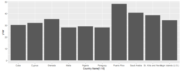
Looking at this plot, I realized that it will also be important to look at the relative land areas reflected in these percentage changes – a 10% change in the Virgin Islands doesn’t mean the same thing as a 10% change in the US or India. To do that, I’ll need to import and merge several csv’s from the World Bank, but once they’re properly imported I should be able to follow a similar analysis to deal with those datasets as well.
I wasn’t quite feeling up to tackling the challenge of an n-dimensional dataset in R with no idea where I was heading, so I went back to familiar ground and plotted out some basic variables from the World Bank in Excel to do some side-by-side comparison.
I chose to work with the US and Brazil as my sample pair; a developed and developing nation, of similar size, but with very different economic and social structures. (Sorry for no units – as I said, these are sloppy graphs.)
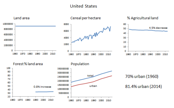
The US has had a stable land area over the time measured (as should most countries, except in the case of war/boundary changes). The percent agricultural land has decreased by about 5%, likely as a result of changes in agribusiness and increases in crop efficiency. The amount of forested land has remained constant, with only an 0.8% increase over the time period shown. The population is steadily increasing, but the gap between total and urban population remains relatively constant; there is not much indication of rapid urbanization in the US.
Since the absolute values of the two population curves are increasing, there has still been an increase from 70 to 81.4% urban population (compared to the total population in the same year) between 1960 and 2014: an increase of 11.4%. Comparing the city populations in 2014 with those from 1960 shows an increase of 20% in the total number of people living in cities over that time period. (This just goes to show how difficult it is to pick a percentage that means something – the percentage you get all depends on how you slice the data, and whether you measure change in percent, or percent change in the absolute numbers.)
Brazil’s graphs show a different story. The total land area of Brazil is 91% that of the US, so changes have roughly comparable magnitudes. The Brazilian land area has also not changed, but the land usage has experienced some pretty big shifts. There has been a roughly 6% decrease in forested land area, and a 15.3% increase in agricultural land. The crop efficiency is similar to and somewhat lower than that of the US, but has improved steadily since the 1980’s. The population curves show that there is a much larger move toward urbanization in Brazil: from 49% urban in 1960 to 85% urban in 2014 (an increase of 36 percentage points). The total population of city dwellers has increased by 20% compared to the 1960 levels – the same percentage increase as in the US.
A comparison of the absolute forest and agricultural land areas in the two countries reveals an additional interesting dimension: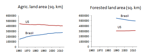
The US is only about 9% bigger than Brazil, but it was far more developed in 1960 when “the clock started,” so to speak. This means that the US already had a much larger number of acres devoted to agriculture than Brazil did, and a much smaller area of forested land. Looking at the data from this perspective emphasizes the importance of timing in determining the “biggest offender” in climate or ecological issues – the fact that the US had already decimated its forests before anyone knew that they were valuable puts the small “gain” in US forested land area in perspective, which is especially important when comparing it against a much larger loss of forests in Brazil.
A few thoughts based on the data analysis so far:
I don’t expect that total land area will be a significant variable for most countries, but it’s important to be aware of it when explaining anomalies in the data (if a country splits in two due to civil war, there will also be large changes in population and other variables that might affect calculations). It is probably reasonable to skip plotting the land area variable, and to just search for the countries with the biggest changes and make note of those.
The cereal per hectare variable is interesting because it (indirectly) shows the benefits of modern, intensive agriculture. The agribusiness industry argues that their practices are necessary to meet the food demands of a growing world population – at least from these two plots it seems that that argument has some basis, especially in the US, where agricultural land area has remained steady and productivity has increased. Whether that increased productivity has come at the cost of soil depletion and exposed us to the risk of future food insecurity is a matter open for debate. (This extremely rough analysis also doesn’t account for confounding variables relevant to food supply scenarios, such as the ratio of food that the US imports/exports. The data also only contains information about cereals, which are a dominant component of food production, but not the only food that people eat. These are complex and multi-faceted problems, and no back-of-envelope calculation can provide a clear answer.)
The percent agricultural and forest land area are particularly relevant to this project, as land use is a dominant factor in determining the organic content of soils and thus affects carbon sequestration. Tilled land is more prone to erosion, depletion, and loss of organic matter. The use of fertilizers, pesticides, and other chemicals are also related to ecological problems (probably outside of the scope of this project), and there is some evidence that they can affect the nitrogen, methane and carbon cycles in the soil, and thus possibly affect climate change. Since so many of these variables are driven by the demand for food and living space that results from population change, urbanization and population growth also seem like important things to measure.
The biggest difficulty with using the World Bank data set is that there are so many countries (and data points) to display. I need to find some way of subsetting the data to view only the most important countries, whatever those are judged to be…I still need to find a reasonable criterion for selecting where to focus this analysis. I want consistent countries across all categories, so I can’t just choose the countries that show the biggest change for each of the variables measured. Making that selection in a justifiable way is one of the major “next steps” for this project.
There’s also the question of how to get this effectively n-dimensional data into R, and how to use it once I have it there. Each spreadsheet has a wide format dataset with years in columns and countries in rows. To map multiple datasets onto the same country, you’d ideally want each one to have separate time-data “vectors” attached for each of the variable sets measured. Given the difficulties that I’ve been having working with even a simple 2D dataset, it seems like implementing that analysis might be a challenge.
Doing two versions of these plots out by hand was a lot faster than fighting with R for another week, but that time advantage decreases rapidly as the number of countries increases. Once I have a clear idea of what it is that I want to plot, it will be time to head back into R and figure out how to make it work. I’m hoping that spending time with these better-behaved datasets will let me wrap my head around the variable structure in R, and that that practice will help to ease the transition into more complicated datasets.