This website was developed during the 2017 academic year as part of my MFA thesis at Northeastern.
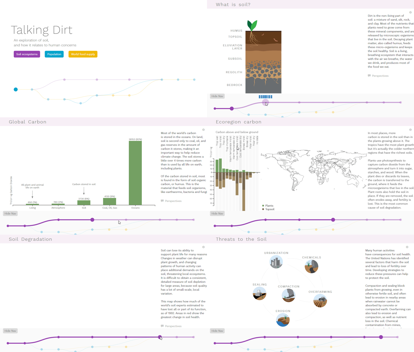
The project is a continuation of earlier work in the Soil Map and Food Flow visualizations, and serves as a case study to illustrate how visualization can be used to support science communication. The website introduces viewers to topics related to soil health, human population growth, and how global land use relates to food supply, helping them to understand the importance of this global ecosystem.
The final website is no longer hosted for live viewing, but the animated .gifs below give a brief overview of the site. (Click on an image to see a larger version of the animation.) My thesis document contains additional screenshots and information about the project theory, iterations, and development.
The related posts below provide more detail about the project visualizations and development.

