We’ve also been working on designing a site sign for the World Heritage project in my design synthesis class. The sign needs to show 100-150 words of text set in 7 different languages; the official languages of the UN, and the language for the country that the site is located in.

My first sketch focused on using the logotype as a pattern for a physical garden, and used small plaques on rocks for the text. Doug thought that it would probably be too tight to try to fit that much text on the stones. Once I started setting the text, it was pretty clear that the stones would have to be really big (or the type really small) to make that work.
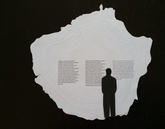
The second idea was to use my fifth element design as the basis for the site. I had drawn a cross section of a tree using the shape of Yakushima island as the outline. This could be mounted on its side, and scaled up to match the 2.6 m diameter of the largest trees in the forest.
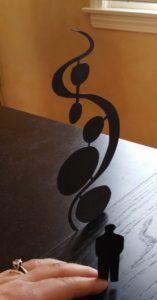
Last week, I took those initial sketches and started making some physical models to see what they might look like. Rather than putting the logotype on the ground, I thought about using it as a sculptural piece, where the lower stones could contain text. I really liked this idea, but I’m not sure it would work, even using both sides of the sign. Again, the problem comes down to the quantity of text. To make the type a legible size with appropriate leading, the bottom stones would have to be huge.
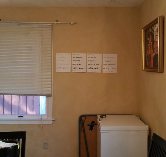
To figure out the type size, I made some sample text in a few different sizes and a couple of different weights/styles of Gotham, taped it on the wall, and stood back about 15 feet to see what I could still read. My preferred font size was 72 or 80 points, but those were just impossibly large when the full text was set. In the end, I went down to 48 point in the bold typeface, which is still pretty legible from 8-10 feet, though it’s a little hard to read at 15.
Once I had a size for the type, I made a 120″ page and put my tree cross section on it. The 48 point type works out about right, so that’s what I’m planning to go with for now.

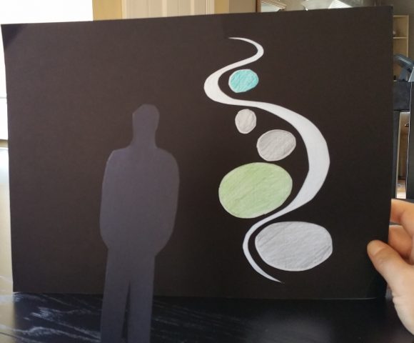
I’m also considering a version that uses a cutout of the mark for an aesthetic element. The holes could be filled with colored glass (approximated here using tracing paper and colored pencil), and the text would be set in the large area on the left hand side.
The tree cross section could be made from wood or a resin to give it texture, or it could be printed flat on a plastic surface like a museum sign. I’m thinking that the sculptural pieces would be made of metal with a matte surface treatment. The text could be either raised or etched into the surface, depending on the final sign construction (I want it to be double-sided, which might affect which of those two methods would work well).


