This post is part of a larger series focused on exploring the fundamental principles of data visualization. Eventually, the collection may grow into something larger and more coherent. For now, each post simply picks up and plays with one idea related to how we represent data visually. Other posts in this series can be found using the Form to Data tag.
In a previous post, I explored the different tasks that we can accomplish using marks in visual communication. This post will take a closer look at how we make marks, and how different mark properties can be used to encode information. Jacques Bertin cataloged the different visual variables available to designers in his 1967 book, Semiologie Graphique (The Semiology of Graphics).
Position:
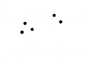
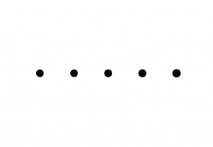
We can create relationships between marks by changing their position; marks close to one another will appear to be related. This is often used to create groups or establish a sequence.
We can change the size of a mark to show that there are differences between them.

Shape:
Changing the shape of a mark indicates that it is different from something else.

Value:
Changing how dark or light an object is drawn makes it seem more or less important than the others.
Color (Hue):
Changing the color of an object separates it from the rest of the group. Orientation:
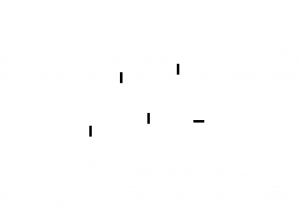
Objects that are aligned with one another appear to be grouped together.
Adding texture can also indicate that an object is different from the rest of the group.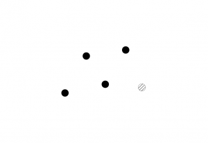
The examples above focus on how visual variables can be used to distinguish one (or more) objects from the rest of the group. Even though all of the visual variables are applied to the same task, we tend to interpret the results in different ways. Quantitative visual variables usually function as modifiers that add information about an object without changing what it is: a big circle is still a circle. Categorical visual variables change how we define the object itself, and are best for creating groups based on shared identity: a circle is one kind of object, and a star is another kind altogether. Some variables can play either or both roles, depending on the situation.
Size and value work best to encode quantitative values (numbers), while shape, texture, and hue are most effective at conveying identity (categories). Position can be used in either way; it can indicate a quantitative value when compared against an external reference, or it can simply be a way of arranging objects into groups based on shared identity. Visualizations work best when there is a good match between how people naturally interpret a visual variable and the kind of data that we encode with it.
More advanced visualizations require more intricate groupings, and so we might choose to combine visual variables in different ways to achieve the groupings that we want. As we saw with the Gestalt principles, applying visual variables in ways that reinforce their meaning creates clearer visualizations than encodings that create contradiction or competition between variables.
In the image below, shape is used to encode two different categories of object: circles and squares.  The following image uses color to reinforce the shape encoding: it adds emphasis, but does not change the meaning of the original encoding.
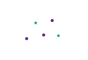
The next image uses color to encode a different grouping in addition to shape: there are green items and purple items, and some of each color are circles while others are squares.  There are times when this kind of multi-grouping is necessary, but it makes the visualization much harder to read. Because shape and hue are both very strong identity indicators, they fight for dominance and make it difficult to read the chart. (A similar thing happened when we used position and value to contradict each other in the Gestalt principles post.)
Position is a weaker identity indicator, so it doesn’t conflict with the shape encoding as much. In the image below, there are clearly two groups, each of which contains one star. This works best when the position encoding is very extreme: the objects that are grouped together are much closer to each other than to anything else.
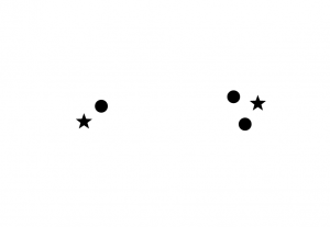 Adding order to the objects can help to reinforce the sense of intentional grouping, but it also creates an expectation of symmetry that is violated by the position of one star at the beginning and one star at the end of the row. Because the stars don’t follow our expectations, they draw a lot of attention and reduce our ability to focus on just the groups of items.
 Rearranging the sequence makes the easiest comparison between groups: the stars come first and then the circles, making it very fast to compare similarities and differences between groups. Aligning the groups so that the stars line up also helps to increase the order and make the visualization easier to read. Now, the focus is back on comparing the two groups: the one on the top is the same as the one on the bottom, except that the bottom one has an extra circle at the end.
 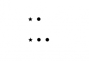 This visualization effectively makes a single unit out of the first row. Because the grouping and symmetry are strong, it is effortless to see that the two stars and two circles line up, and all that is left is the extra circle in group 2. If our goal is simply to be able to compare the two groups, this is much easier to read than the purple and green examples above.
The strengths and weaknesses of the different visual variables and details about how to use them will be discussed in a future post.

1 thought on “Visual Variables”