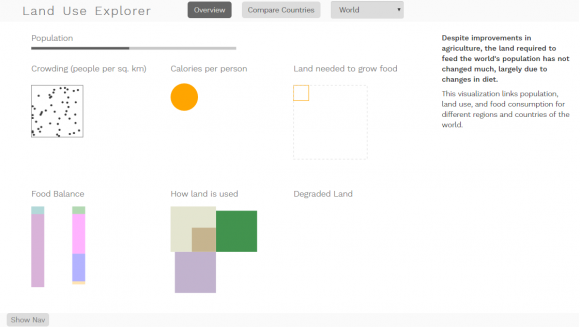
I spent most of last week roughing out the code structure for the land use data. The broad-strokes development phase can be a lot of fun, because things come together so quickly, and you don’t have to focus on all of the details. Once it’s mostly-functioning and I can see where it needs to go, then the cleanup begins. This week (and for the rest of the semester), it’s time to focus on cleaning things up, debugging all the little issues, and tightening down the design.
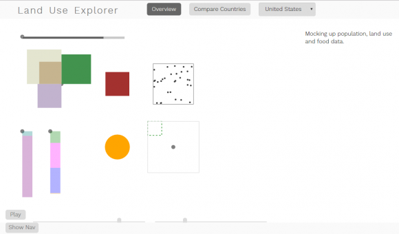
Today, I started by adding labels. I apparently forgot to take a screenshot of the mess that happened when I used my originally-programmed code to add labels to each visualization on the overview page. But trust me: it was in fact a mess. The problem stemmed from the positioning method I was using to draw the shapes. D3 draws different shapes using different anchor positions: rectangles and text from the top left corner, circles from the center, etc. The little gray dots in the image below show my reference points for the different visualizations (except for the two that are covered up).
When I first designed this view, I thought it was going to be focused on helping people to see changes in time. For that to work well, the land use squares needed to grow bigger from the center out, so that growth of one square wouldn’t force the others to move over time. Since the land use squares were center-aligned, it didn’t make sense for the land degradation to be top-aligned, so I left the red degraded land and the dotted crowding squares center-aligned to the land use data. Similarly aligning the calories circle and the squares that show land required to support the population (lower right) meant that I had a bunch of squares of different sizes all roughly aligned to a center grid. So far, not terrible. But the food balance bars on the left really didn’t work in that scheme. Center aligning them on the circle meant that their ends were close to but not aligned with the squares at the other end of the row. Lining them up with the top of the circle made the required land squares feel like they were floating. And so on, and so on.
In short, the grid simply wasn’t working well; I had at least two competing sets of rules, and they didn’t play nicely together. When I tried adding the labels to this mismash of different rules, I ended up with a whole bunch of text scattered in random and conflicting positions all over the page. Not a pretty sight.
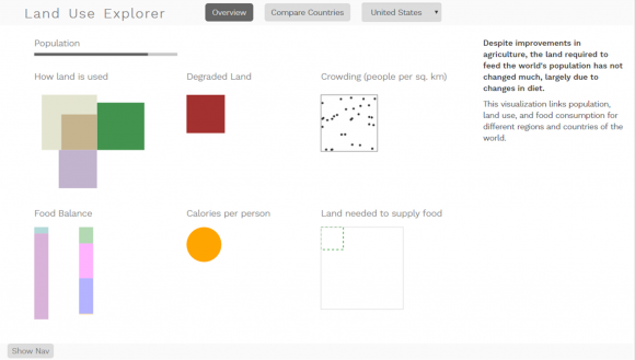
When I got rid of the animation component of this view, my life got a whole lot simpler. It was no longer necessary to look at changes happening over time, so there was no quantitative reason that all of the sizes had to relate back to the same origins. That meant that I could use the labels to define the grid, and hang the visualizations off of those.
So much better!
Adding the labels also helps to make the overall story clearer, which exposed some issues with the flow. While I was roughing out the code, I kept roughly the same organization that I had used in the original poster, which was optimized for space efficiency with a subset of these variables. Then, I added the new variables in on the bottom row. Reading from top to bottom and left to right, that meant that I started with population, jumped to land use and degradation, back to population/crowding, then to food imports, food consumption, and total land required. This wasn’t necessarily terrible since these stories can be read in many different ways depending on emphasis, but I was pretty sure that it was possible to do better.
Rearranging the same components, the newer narrative talks about people first; total population and crowding, then how much those people eat, and the land needed to make all that food. Then, it shows the food imports and exports, and the amounts produced, consumed and wasted. Finally, it shows how the total land area is currently used, and how much of it is under threat of degradation. I still need to do a better job of connecting these narratives for people who might not read all of this into the data, but I think this new order makes much more sense.
I also changed the color of the square that represents the land required to grow food to match the color of the food narrative, and the calories circle. I switched it to a solid stroke to make it obvious that it was the more important of the pair, and made the total land area square dotted to help it recede. Tiny little changes, but they do help to make things clear.
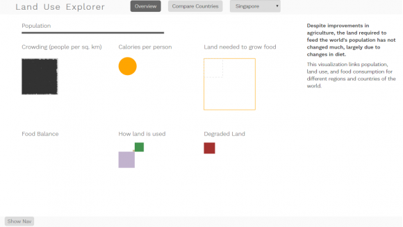
While I was in there mucking around with all of my coordinates anyway, I also set up relative scaling for the different views. The overview page will always scale so that the country selected takes up all of the space available; it doesn’t maintain scale consistency across different filter selections. This means that I can now see values for Singapore, which before was invisible because it is so small:
Singapore has one of the highest population densities on earth, at around 7000 people per square km, if I remember right. It’s a tiny, tiny nation, so it doesn’t have a big proportion of the world’s land area, and not even a huge fraction of its population. But in terms of squeezing huge numbers of people into tiny spaces, Singapore wins. It’s one of the few cases in the dataset where the land required to feed a country’s population far exceeds the amount of land available in the country (by about a factor of 10). It has had a pretty large growth in degraded land (the red square shows how much additional land has degraded since 1982), and most of its land falls in the “other” category, which includes cities. Unfortunately, there isn’t any food balance data available in this dataset, because it would be interesting to see what its trade balance looks like. Even if Singapore used every square inch of its soil to make food at the highest productivity capacity, this country would be unable to feed itself without importing food from other places. That’s a pretty powerful thing to think about, and really supports the message from Food Flow: that we are all connected.
Looking at the whole world, the land area use looks pretty good; we farm a little more land than we currently need to feed the world population, and it looks like there’s plenty of other land available. Of course, when you factor in things like local climate, things are a little less rosy – that total land area includes Antarctica, Greenland, the Sahara, the Himalayas and Siberia, none of which are really known for being great places to garden. Most of those likely fall into the “other” category, though some are included in the agricultural lands estimate as well; if there’s enough grass to feed a herd of goats, the land counts as agricultural (that’s how Saudi Arabia ends up with an agricultural land value of something like 80%).
From that perspective, it looks like a lot of the available fertile land really falls into the forest category, which makes it easy to see why deforestation is such a huge issue. When we think about the amount of carbon stored in those forests, and all of the biodiversity reasons to keep them, it’s easier to understand how all of these different topics start to interrelate.
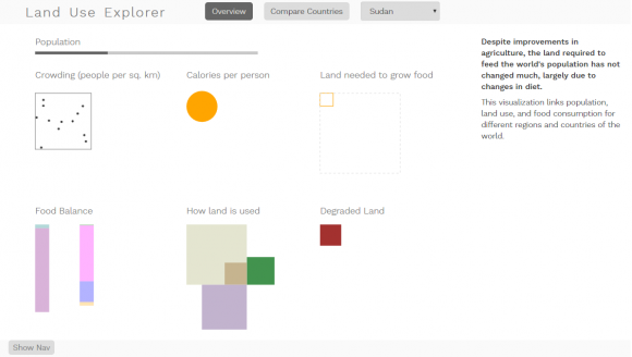
When you compare two countries side by side, the size scales to whichever of the two variables has a larger value, so that you can immediately see the relative distribution of values for the two countries selected. (This is also a good way of comparing a particular country to the world.) I just happened to take a screenshot of the Sudan and China here; they have pretty similar land use distributions, and similar proportions of degraded land, but China’s larger size means that it’s percent degraded land makes up a much larger proportion of the planet. Combining these different views helps to get a sense of how a country fares on its own, and how it stands in relation to the rest of the world.
The rank page contains information for all of the countries, so that one always scales to the maximum value represented in the data.
Still lots of work to do, but it’s getting there, bit by bit!
