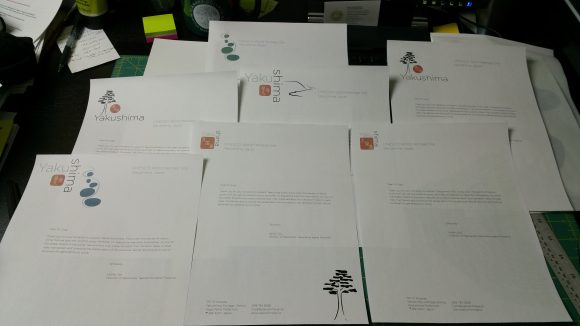
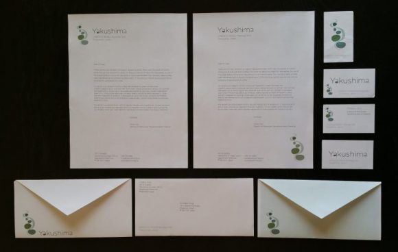
Once we had chosen a site and created a draft mark/logotype, my design synthesis class began working on designing the documents that would make up the rest of the site identity. We started with the letterhead, trying out various sketches to see how the different marks worked.
These were my top 3 picks. Sorry for the cropped-out corner…that’s what happens when you bring things to Doug’s class…they get chopped up, drawn on, and thrown on the floor, all in the service of creative development. The piece missing had the red square version of the logo on it.
This was a good opportunity to try out some different papers, and to use the logos and type in different ways to get a better feel for the requirements of this particular identity. I liked the red square/tree combination the best, but Doug thought that it didn’t work well. He was much more interested in a design that I’d put on the back burner; the more organic river-rock shape from the week before.
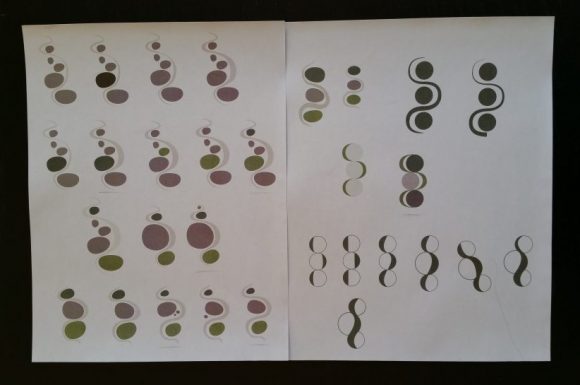
I wasn’t happy with that design yet; I didn’t feel like it was working in its original form. I spent some time tweaking the river shape, and experimented with different numbers and colors of rocks. Then I went a little crazier and let it get hyper-geometric; not at all what I wanted for this project, but sometimes it’s useful to see where things go, if you just follow whatever crazy idea pops into your head.
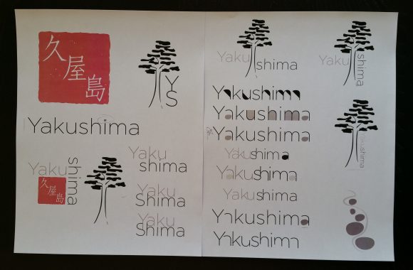
I also went back to the red square logo and tried adding some texture to make it feel a bit more handmade, and played around with using the tree as logotype. Then, I did some horrible things to type while experimenting with ways to make a unique logotype for the site.
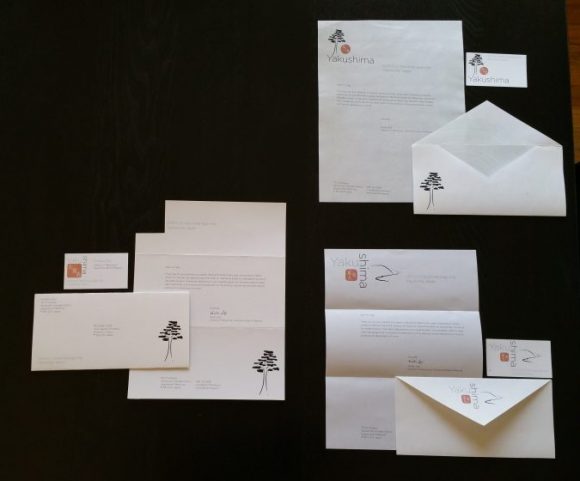
After all of the tweaking and adjusting, I made a revised set of letterhead, envelope, and business card designs to see how the new mark and logotype would work.
