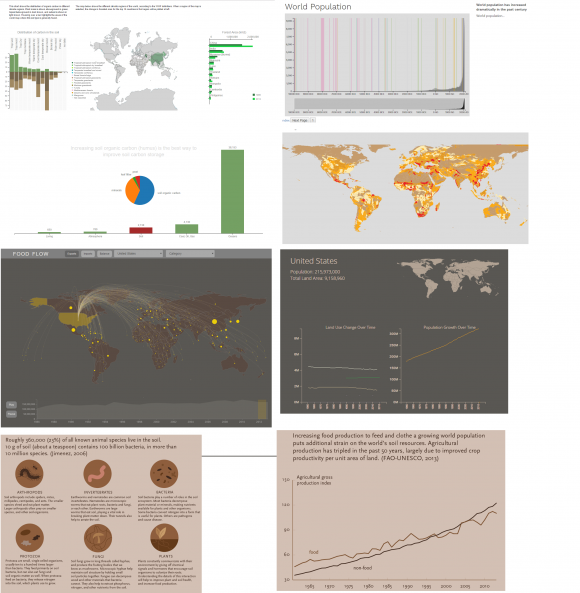
Last semester, I spent most of my time on the thesis project developing new visualizations and expanding my collection of experiments. Since December, I’ve been working on consolidating, integrating, and unifying the structure and design of those many different directions.
First, I built a website infrastructure over the break that allows me to pass variables between pages, so that (theoretically, should I manage to implement it) the website can keep track of where people have been and adapt accordingly. This also required merging 10 or so different code folders into one shared structure. I started working on that in January, and also started building a front page to introduce the viewer to the visualization.
Once all of the visualizations were aggregated together in one place, I was able to step back a bit and focus on the design. All of the pieces were constructed at different times, for different purposes, and with very different professors guiding the outcomes. So, although they shared a few common things, most of the styling and layout was completely incoherent. The projects also had very different levels of polish; some were month- or semester-long projects, and some were one-week homework assignments, and some were not yet even in digital form.

One of the first things I did was to start building a template and setting up JQuery to populate the template from a script. Then, I began converting the code for each of these separate pieces to work with the new format. For some, that was just a matter of changing a line or two of code; for others, it took a lot of rearrangement.
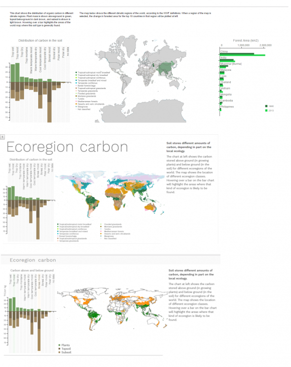
Once the code was functional in the template form, I started thinking about how to update the CSS styling to make the visualizations look more cohesive. The Food Flow visualization is the most difficult one to integrate with the rest; it relies on a dark background, and has several sub-components that can’t be changed without re-structuring the whole program. I made the colors easy to change, but the layout is a more difficult problem. The bar across the top of the screen is one of the strongest style elements, and is hardest to change because it’s the basis for all of the navigation controls, so as a first step I decided to try to move the rest of the website toward that styling. Reducing the title size and adding a color background on the template pages were easy changes, and go a long way toward making the pages work together. The photo below shows the evolution of the ecoregions visualization over the past couple of weeks:
The top image shows the visualization in its original form. The second is the result of importing it into my placeholder template form, which required converging three separate SVG elements and a Canvas into a single SVG/Canvas stack. I also decided to eliminate the bar chart on the far left, as I discussed here, and removed Antarctica from the map to declutter the space.
The third pane shows the visualization as it currently stands; I’ve been working on clarifying the narrative as well as updating the CSS. I started by removing the WWF ecoregion designations from the map. Since I’m already highlighting them when the user hovers over a bar in the bar chart, it’s not necessary to show them separately, and the complicated color scheme and legend add a lot of unhelpful complexity to the visualization. I also wanted the main story to be clearer when the user arrives at the page. One of the interesting things to note in this graphic is that the distribution of above and belowground carbon is very different around the world; the tropics have the most plant material (aboveground carbon), but relatively poor soils. The northern ecoregions store much more carbon in the soil, and sequester more total carbon than the tropical regions do. The two bars are now highlighted when the user first arrives at the page, and then they are able to select individual bars to explore the dataset further. Further improvements include making the bar chart highlights more apparent, and possibly adding cues to clarify what the initial map colors mean.
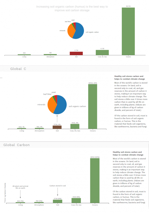
The Global Carbon visualization has been going through similar simplification. The original version was an animated bar chart, which took about a minute and a half to run. As an isolated graphic, I thought it worked well, but I decided to scrap the animation in the final version for two reasons. First, I hate it when a website starts playing background music without warning, and the animation really works best with the music. Second, I thought that the pace of the animation was too slow for a situation where this visualization is just one stop in a longer narrative. I liked the gradual unfolding of information that the animation provides, but it wasn’t the right paradigm for the rest of the visualizations and wouldn’t feel like part of the same design.
Removing the animation meant that I needed to find another way to make the main points clear from the beginning. In the current version, I decided to get rid of the pie chart as interesting but non-essential information, and to add simple labels for the two most important bars. The comparison between the carbon stored in soil and in all living organisms on earth (including plants) was the main story that I wanted to tell here, and the other bars are really just added for context. The oceans and coal, oil, and gas bars will attract attention naturally because they are so large, so I really only needed to label the smaller bars to make them stand out.
I’m still working on details and finalizing the conversion of all the picky little details in the code, but am pretty happy with where these are heading. The design is starting to feel a bit more uniform with the similar formatting and CSS styling. I think I am probably going to remove the bold face synopsis text in the right column, because it’s not really doing much, and getting rid of it would further simplify the text hierarchy. I still need to work out a site-wide color scheme to unify what colors mean in the different graphics, but that’s fairly easy to update at the end, and the final requirements will depend on how many different variables I need to show, so I’m working on developing (and simplifying) the other graphics first.

