The weekly assignment for our Design Theory class is to make a series of concept maps that summarize the readings. I’m almost afraid to admit how much fun I’m having on homework, but I love watching the concept maps evolve from a messy collection of concepts to a more coherent, structured narrative.
I’m going to indulge in a purely process post this evening, looking at the development of my map for Saussure’s theory of signs.
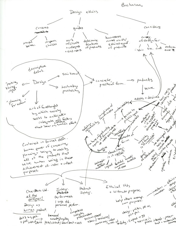
I usually start out with pages of handwritten notes about the content of the paper, and then assemble a basic list of ideas to include. Then I start mapping out the simple things, like definitions and the narrative flow of the paper.
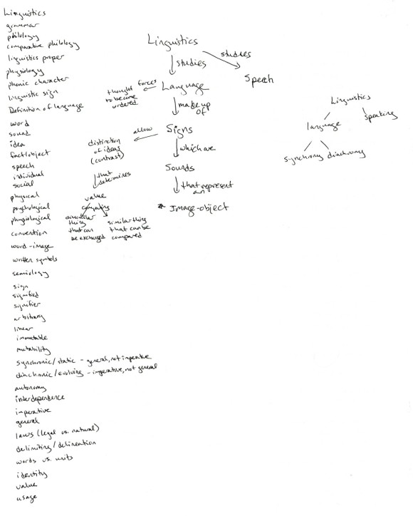
This gets more and more complicated as the ideas start to build on one another, and eventually becomes a crazy mess of nodes and links on a page.
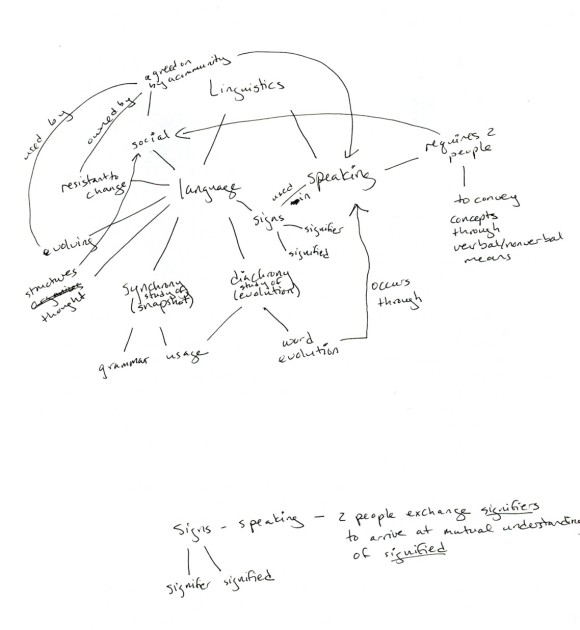
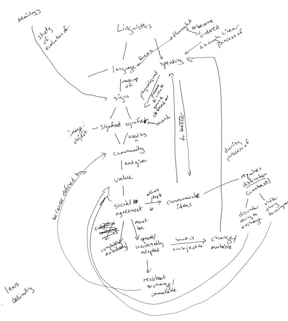
Once I’m pretty sure that I have most of the ideas represented, I head over to Illustrator and start entering the information. The transcription process gives me my first round of revisions; I make a point of placing text boxes to minimize link crossings and maximize connections between ideas.
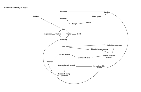
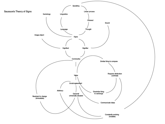
And then, I start to neaten things up. I like to take screen shots along the way, so that I can see how much the structure of the map changes as I work. After a few revisions, I ended up with this thing that looks an awful lot like a dancer.
I was kind of charmed by the dancer, and I really liked the sense of motion in the map at this stage. As I sat back and looked at it, though, I realized that all of my attention was getting caught in the white spaces between words, rather than on the words themselves. My brain was so busy putting together a picture out of the white space that it had no attention left for the actual content of the piece. The dancer had to go.
I wanted to keep the arcs, and I liked the sense of motion. After “watching” myself scan through the diagram several more times, I realized that I could use the arcs themselves to direct my eyes to the most important words. I added a few template circles, and started imposing some geometric order on all those organic lines.

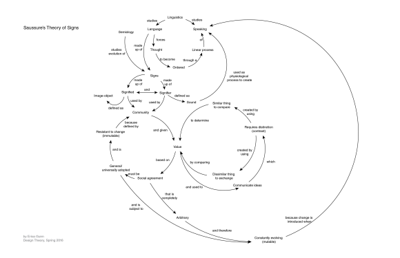
After much fussing about the exact positions of circles and words, I arrived at this version, which I think does a much better job. It keeps a sense of the iterative structure of Saussure’s theory of language, but there’s also a reasonable sense of flow. Big ideas end up at the junctions between circles, and take on extra importance because of the connections going in and out.
I really like the process of finding patterns in these different texts, and the challenge of representing those patterns in a structure that maintains their richness but simplifies the argument. Doing that with a minimum of type styling and with the requirement of fully labeled connections does add an extra layer of difficulty, but it’s fun to surprise myself by finding ways to make it work.
I’ll refrain from posting every revision of every map throughout the semester, but it will be hard. I find it fascinating to see how the legibility and meaning evolves with editing, and could go on (and on) about it all day. Just look at the glorious mess I have to sort out this week:
and that’s only one page of two…
