I wrote about the origins of my LED project and my first tottering steps toward programming in a previous post. Here, I’d like to talk a bit more about the design part of this project. (That’s way more fun, anyway.)
For an electronics project like this, there are two aspects to the design: first, what does the physical object look like? This, of course, will inform the kinds of things that you want to do with it. The second question is what the object will do. This is a trickier question, since it also has to do with lots of things that I don’t know yet, mostly related to what’s possible with programming in Processing.
So, let’s start with the first aspect, shall we?
When I first conceived of this project, I was thinking of it as a simple grid of LEDs, kind of a miniature version of one of the billboards that you see on the side of the road. We’d need a fairly good number of pixels to make complicated images, and they should be spaced pretty closely together. Branden suggested that I check out the Adafruit website, and something like this NeoPixel display seemed about right.
I wanted it to look a little less circuit board-y, though, so I’d probably cut out LED-shaped holes in some Flocking paper and use it to make a cleaner background for the display. (Flocking paper is a paper with the texture of velvet. It’s great at making a very black surface that absorbs stray light. I have a roll of it from a previous project, and it is really nice to work with.)
Combined with a nice black shadowbox frame, I think this would make a nice display piece. The depth of the shadowbox would also allow the extra electronics to be neatly tucked away.
Thinking along these lines, this coffee table by EvilMadScientist seemed like an interesting inspiration for the kind of interactivity I was going for.
While poking around looking for touch sensing displays, I also came across this table on YouTube (see the author’s website for more information on how it’s done).
Seeing the boxed-pixel display kind of changed the way I’ve been conceptualizing this design. A white frame with a nice glass diffuser and very sharp pixel outlines would be a much cleaner, more artistic feel; a step away from electronics and toward household art.
This shift in presentation medium would also change the kinds of visual modes that I’d want to write for this display. The naked-LED version would be great at pinpricks of light, lending itself toward things like stars blinking on and off, or water drops falling. The blockier, diffused version would be better for geometric displays and tilings that would be hard to recognize if graphed in individual pinpricks of light.
We still haven’t finalized a design, but the diffused version has several practical advantages from the hardware side as well. First, the LEDs can be further apart without affecting the image quality of the LED display. This makes it easier to fit touch sensors and other necessary objects into the board without disrupting the visual coherence.
Also, it’s a lot cheaper to make a bunch of little LED circuit boards and string them together than it is to make one big board. Since the diffuser spreads the LED light over a larger area, we can get a much bigger display by making the pixels larger.
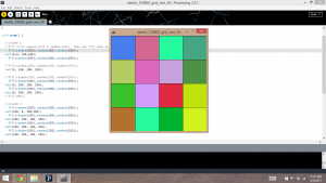
The diffused design is the one that I had in mind when I wrote my first Processing sketch to imitate the display:
Here, we have a bunch of large pixels butted up against one another, rather than a bunch of individual, separated spots. Yesterday, Branden found this video on Adafruit comparing the look of an LED matrix with a diffuser (right) and one without (left). I think the diffuser really helps to make a more recognizable image, so that will likely be the way we end up going in the end.
There are still lots of open questions and loose ends to tie up, but this design is gradually beginning to take shape. The interplay between hardware and software capability imposes an interesting set of constraints, which will ultimately help to determine where this project ends up.
