This is one of a series of posts about work that I did at the RISD Summer Institute for Graphic design in June/July of 2016. The class was Introduction to Typography, taught by Ernesto Aparicio.
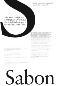
This assignment was another classic exercise – choose a typeface, and design an artistic poster to display the typeface to its best advantage. We needed to choose a single letter from the typeface to use as a decorative form, show all of the characters in the typeface, find text about its history and a pull quotation online (I chose to write my text, to make something a bit more custom), and to include a title for the poster. I also chose to include the different weights and styles, to show how the letterforms vary in different typefaces in the same family.
It was really hard to choose a typeface to work with. There were so many good options, and I could have happily dithered about the choice for days. Do I choose a typeface that I love, and really get to know it? Or maybe one that I don’t know very well, so that I can learn something new? I was tempted to try Bodoni or Didot, because I find the letterforms really beautiful but also find them hard to use. I could stick with a classic, or choose something more avant garde, look at something really common, or revel in the exotic.
In the interests of getting things done, I just picked one out of the many, and told myself that I can come back to the others anytime. I decided to work with Sabon, partly because I’d used it in my book designs, and partly because I knew nothing about it. I love Old Style typefaces, and this seemed like a good opportunity to make a new acquaintance.
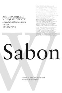
I started out thinking that I might work with the uppercase W as my highlighted letterform, since it’s a particularly recognizable character, and one that I might look for to identify this typeface in printed materials.

Another option was to use the S, to echo the name Sabon.
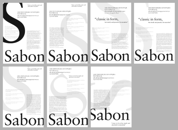
For identification purposes, I thought that the W was a better character, but I found the S more appealing as a form to play with for this exercise, so I decided to stick with that. I explored several options for the placement of the S.
And a few different options for the color.
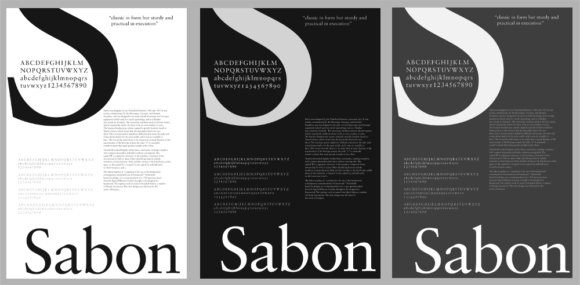
I really love grays, so the gray version was my favorite, but almost everyone else felt that the black was the strongest version. It was a bit less readable than the white and gray versions because the typeface is so light, but it had the most dramatic feel.
I only used pure white for the title; the other forms felt too strongly contrasting with a pure white, and I thought that a little bit of gray helped with the readability of the smaller letters. In the end, the accent S had a gray value of about 3%, the text inside it 15%, the body paragraph 20%, and the alternate alphabets were about 30%, if I remember right. The interesting thing is that all of them read white in the printed version, and most feel about the same brightness. Finding the right balance of values was an interesting exploration of gray value in text; the same typeface set at different sizes needed very different gray values to feel equal on the page.
I’ve been thinking about doing a series of these posters, partly as an exercise in composition and typography, and partly to help myself get acquainted with the different types available. I would really love to be able to recognize the different types quickly, but haven’t spent enough time with the details of the different typefaces to learn which is which. This could be a really interesting way to explore, and it would be nice to make an 11×17″ book or something as a sampler of different types.


