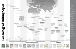
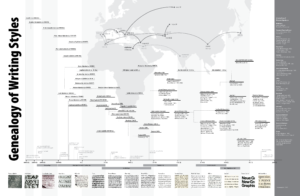
Seven months later, I finally found a day to sit down and brush up the final details for my Genealogy of the Written Word poster that I presented in my Design History class in October.
Here’s the version I presented in class:
And my first touched-up version:
The biggest change was eliminating the gradient and allowing the map to extend down into the timeline area. I also made the map bigger, and changed the colors and stroke types for the arrows that show how the technology of writing, numbers, and paper traveled throughout the ancient world.
I also removed the small vertical lines in my timeline markers; I’d originally intended them to look like flags on the timeline, but they didn’t read that way and the design felt cleaner without them. There were a few dates that needed to be filled in, and I changed the type hierarchy in the typeface list on the far right. I also reduced the gray value of the background stripes; they were a little too prominent in the last version. They’re currently at 3%; I might bump them down another percentage point for the print version, since grays often seem to come up stronger in print than on the screen.
I also reduced the weight of the timeline connectors down to 0.5 pt (from 1), and made the color uniform (and lighter) for the whole graphic. Unfortunately, the lines don’t render well for png, so they don’t look very good in the images above, but they look fine in the pdf version.
After looking at the touched-up version at the smaller size in the blog editor, I decided that the new map was a bit too strong; Africa in particular was interfering with the timeline text. Funny how stepping back a bit changes what you see in a design. I also wanted a slightly stronger contrast between the map and the timeline regions. Darkening up the timeline connectors a tiny bit helped to emphasize the more linear structure in that section.
It’s interesting to me that almost every edit of this poster has involved removing edges. From the initial framing boxes around the text, to the bounding box and gradient around the map, to the label markers in the timeline, I’ve found myself taking out more and more of the structural scaffolding as the design has advanced, working toward a more integrated view that is organized enough to stand on its own.
That last edit to the timeline connector weight was the first time that I felt I’d gone too far in dissolving the edges. After bringing the gray value up a touch, I think we might finally be there.


