We’re only a week into classes, and already the semester is off and running. My design theory class this semester is taught by Hugh Dubberly, who lives in San Francisco, so we will meet via Skype once a week, and in person for a weekend intensive workshop a couple of times a semester.
The first workshop is tomorrow, and in preparation we were asked to upload a concept map showing our definition of design. I started out with a word list, and then moved on to a massive run-on sentence to give me a better feel for how things were connected to one another.
Design is the clear communication of concepts and ideas achieved by using empathy and perspective-taking to identify cultural norms and shared values, and to uncover discrepancies and misunderstandings that can be addressed by presenting relevant information, organized in a clear hierarchy, using tools such as typography, color, shape, and contrast, working in a variety of media – including print, digital, and other venues, and a variety of formats – to create a visually compelling narrative that tells a story and brings the user to a desired end point.
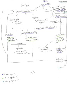
That turned into this ugly sketch, which started breaking down the linearity and suggesting cross-communication between concepts.
Another thing that emerged in the sketching stage is the different qualities of information that I was trying to present. The concepts listed could be grouped roughly into three different categories: what designers do, why they do it, and how they do it. I considered using different colors to emphasize these distinctions, but the assignment called for black and white. I thought about shapes, but that seemed like it might get too complicated. I started out with different font sizes, but the assignment specified a font for the base type. I could probably have gotten away with changing my font sizes, but decided to see if I could make it hang together without that distinction, and see where that led.
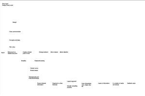
My first electronic outline was very linear, just typing out the words and arranging them in some kind of ordered flow:
I wanted to allow more room for cross-connections, so then I started moving the words around, paying attention to the best way to minimize overlapping lines.
Storytelling was beginning to emerge as a central component in my diagram, and some of the lines around it were feeling a little crowded, so I started moving it into the center and creating some extra room around it.
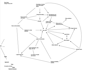
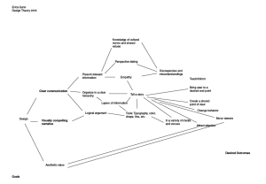
At that point, I noticed that a hexagon shape was beginning to emerge. I debated whether to keep a more organic feel to the graphic or whether it was better to be geometric. I liked the idea of organic organization, but felt that geometry would help to simplify what was promising to become a pretty complicated graphic once all the arrows and labels were added.
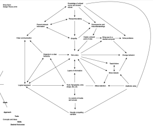
Once I’d decided to use the geometry, I started cleaning up the alignment and making sure that things fit. After adding labels and directional arrows, I ended up with this:
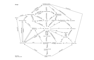
It’s a little more angular than I’d envisioned, but I think it is thorough and clear. I’m not sure if we’ll be doing additional drafts of this exercise, but, if so, it will be interesting to see where the design ends up. I feel like there’s some potential in there to make something interesting. And, with the stronger organization, I don’t feel that it’s necessary to layer on colors or change the font size; it might be interesting to do that and see if there are other patterns hidden in the map that aren’t yet apparent, but I do think that this resolution is ok with just a simple type.
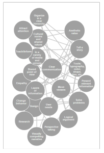
I also decided to try mapping the concepts in d3, just for the heck of it. I didn’t really expect to come up with a solution to pass in, but I thought it would be a good chance to practice some of the visualization techniques that we learned last semester. I made a force diagram using concepts as nodes, and gave them subtly different sizes based on their relative importance. (Too much of a size difference caused problems with displaying the text.)
In building the force layout, I had to implement a collision function and text wrap, and I also learned how to export svgs from the web (though I still need to figure out how to keep the CSS styling when I do).
The (still somewhat rough) live version is here. The animation is jerkier than I’d like during the minimization, and sometimes some of the circles wander outside of the svg canvas and get cut off, but it is displaying basic functionality, at least.
I’d like to add interactivity to this graphic – the ability to manually place bubbles and update links on the fly would be great – and possibly a tooltip to show the line text for connectors. In some iterations, the bubbles arrange themselves almost in a circle, which makes me wonder if a chord diagram might also work. I also noticed that my illustrator model has a wide range of connector lengths, but here the connector lengths are set to an ideal value, and are only allowed do distort from that value under duress. The competition between gravity, connector length, and particle repulsion can sometimes override the collision function, forcing the circles to overlap. Implementing a more elastic connector might be another approach to improving this graphic.
The d3 part was just messing around, really, but it was good practice to warm up for my classes this semester, where we’ll be using several different software tools to create computer visualizations. And it was kind of fun to play around with a completely different way of creating the same graphic.
