The final project for my VisComm class was to create a book layout to summarize and demonstrate the principles of style described by Christopher Alexander in his 4-book series The Nature of Order. We were given a heading and subheading, and needed to provide the text and images to illustrate and explain the ideas.
My first draft was very simple, and focused mainly on the content of the text and finding a layout theme that would work throughout the piece. I started by doing the whole book with a single typeface, but decided to challenge myself to mix type styles. I chose Minion for the headings, an italic version for the subheadings, and Scala for the body text. (I have a fondness for reversing the serif heading/sans serif body, apparently…it’s my first impulse on almost every assignment.)
The book has 17 spreads, but most of them use images for which I do not own the copyright. The ones presented here are not my favorites of the project, but they do use my own images.

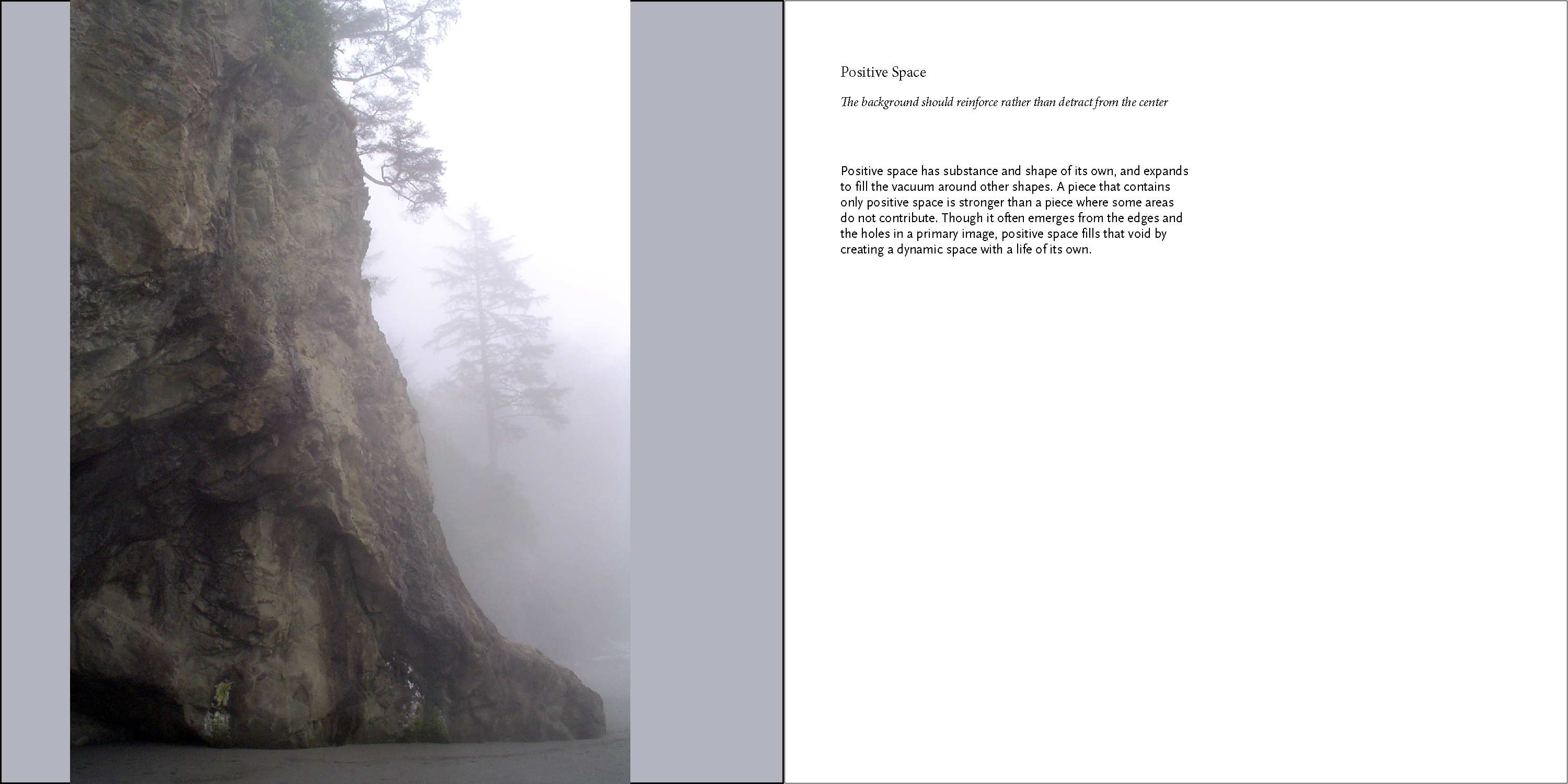
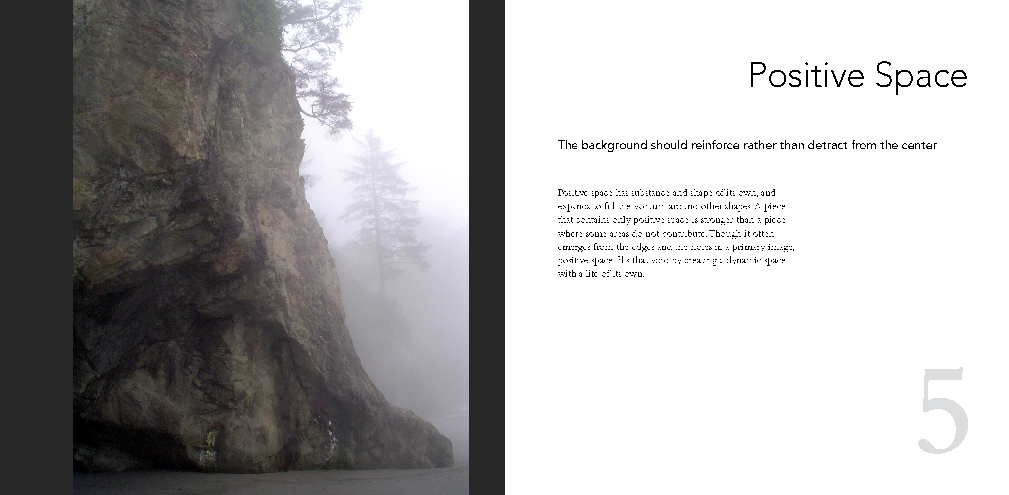
As soon as I printed out the full-sized version, I could tell that the type was too small. I increased the font size in the second version, and also exaggerated the differences between headings, subheadings, and body text. The larger font meant that some of the subheadings became too wide for the page, so I ended up with an uneasy split line of text in some of the pages (the Positive Space spread shows it, below). I wasn’t particularly happy with that solution, but kept it for this version of the project.
I also added numbers to each page, at Ernesto’s request. They are large and separate from the text in order to form strong design elements to play with on the page.
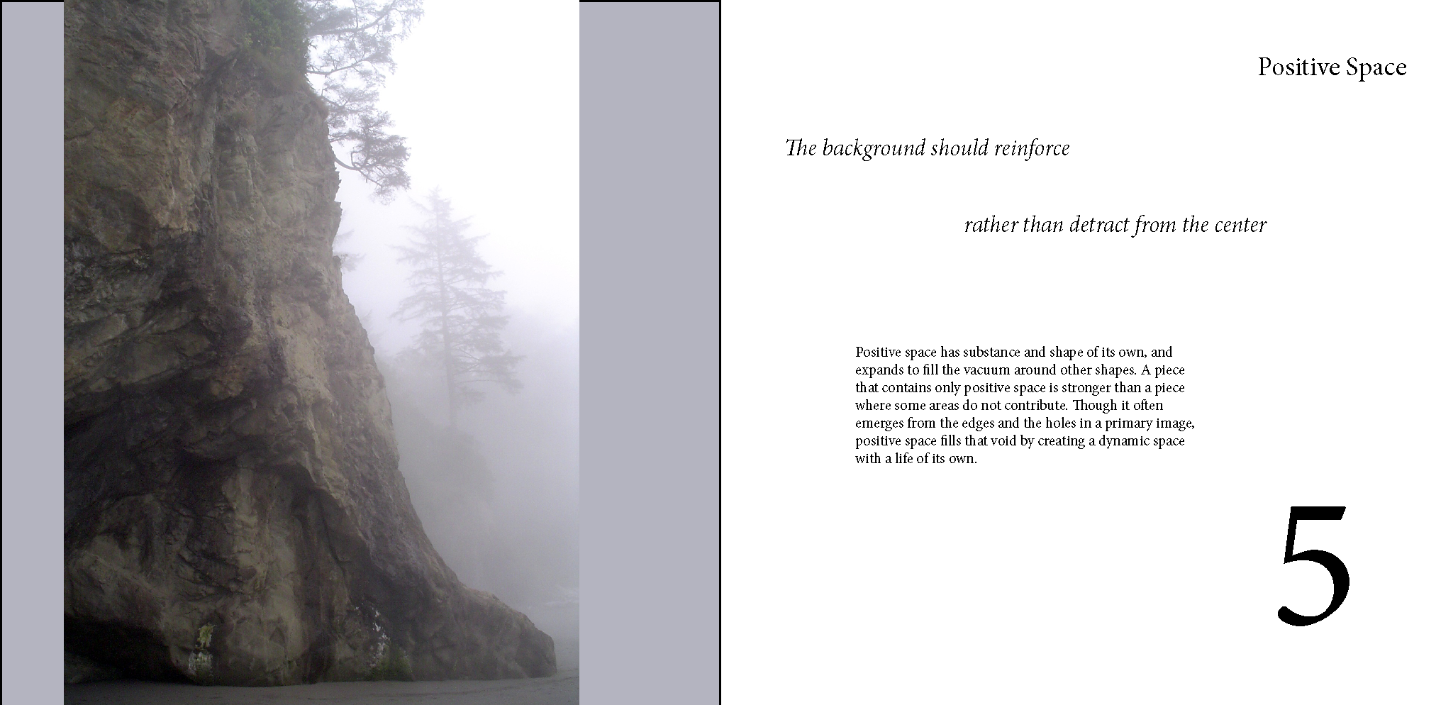

After seeing the second version, Ernesto asked me to reverse my serif/sans serif combination. I didn’t care for Avenir and Minion together, so I switched the subheads and body text to Bembo instead.
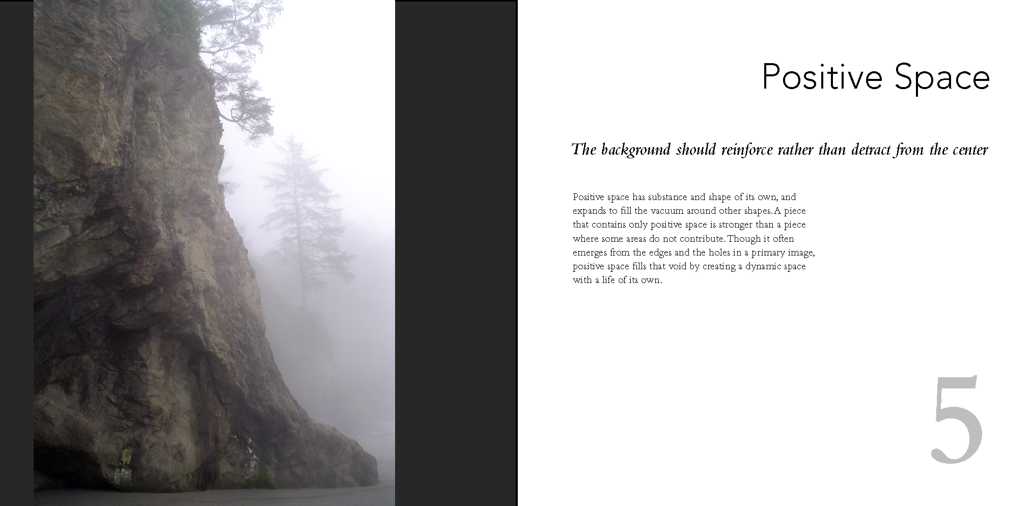
In this version, I made the numbers a medium gray to reduce their weight on the page, at Ernesto’s suggestion, and I changed the background color to be the same for all filled pages. (The page background was an element that I introduced to deal with a few specific photos from the other spreads, but we extended it to multiple pages in the book to improve the consistency and coherence of the design. It wasn’t required for these images specifically, though I did prefer the misty photo with a background to one without.)
We also played with the position, size, and alignment of the text and images in each revision, moving toward a simpler organization and a more dynamic, open feel.
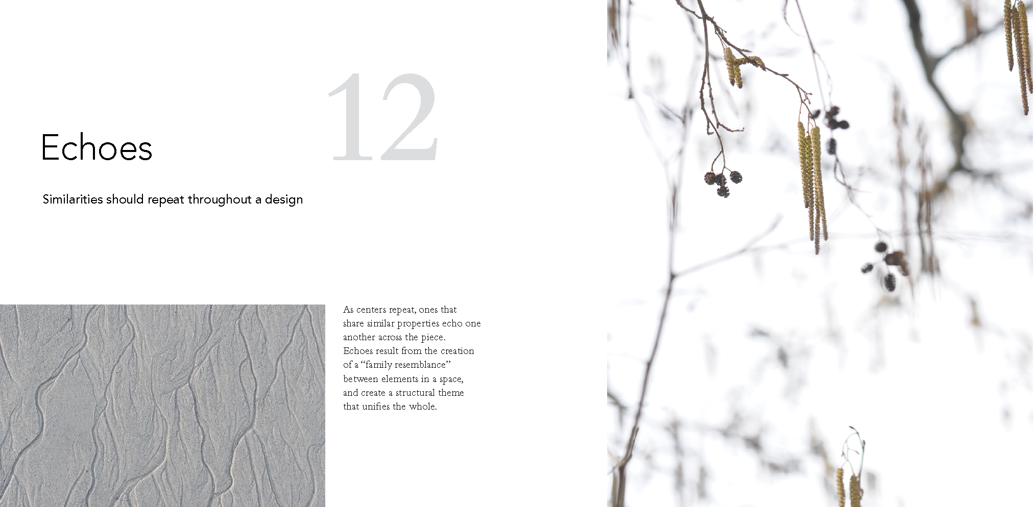
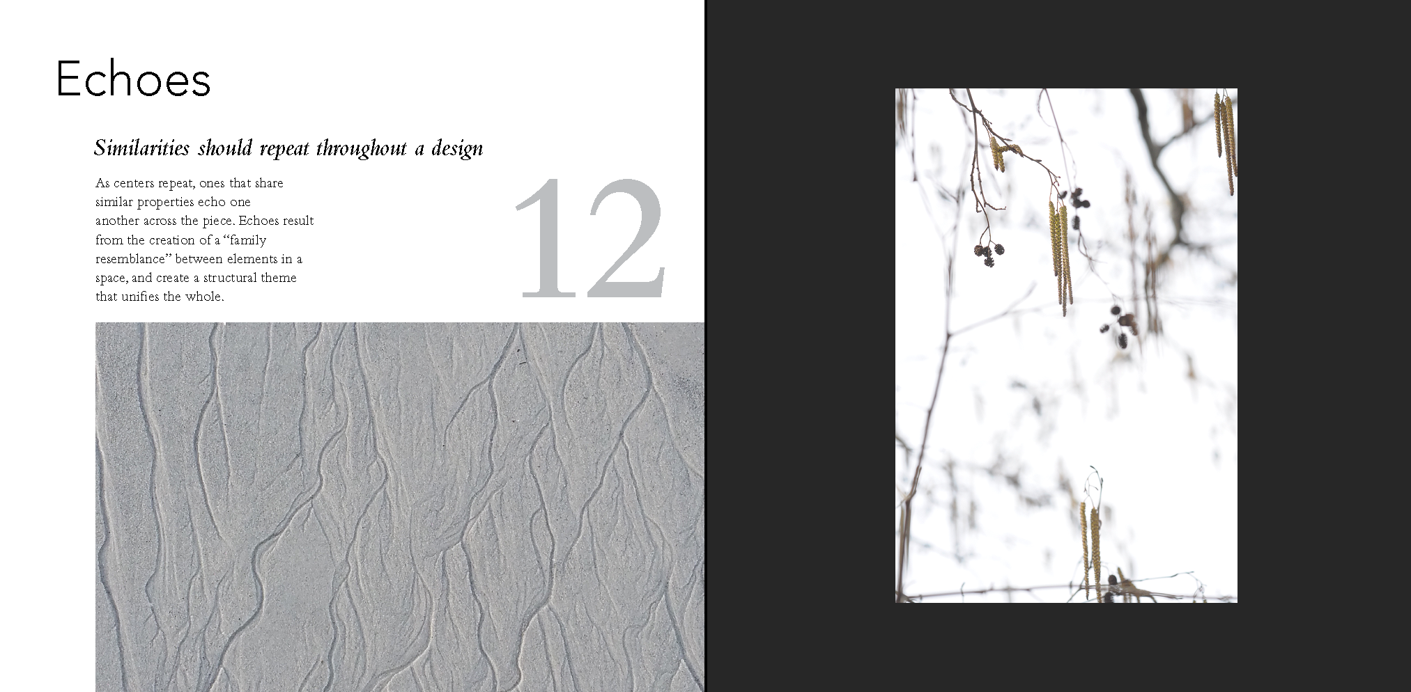
The openness of the Echoes page improved dramatically when we removed the dark page background and enlarged the right hand image. Previous versions had used the gray and white images as geometric counterpoints, but introduced very strong contrast between the white image and the page. Eliminating the heavy frame of the dark page gave the composition a little air to breathe.
In contrast, the misty image seemed to benefit from that narrow sliver of dark border. The image tends to melt into the page a bit too much without the background, which gives it a bit of tension to play against. It was important that the image be placed asymmetrically on the page, and the balance shifted dramatically on going from the gray background to the black one.
With each stage of this project, I was happy with the revisions that I brought to class. And with each revision, we found things that would make them even better. Looking back at the first draft, I’m not sure why I was so enamored with it at the time, but I’m glad that we kept pushing for something a little (or a lot) better.
Wow, this is fascinating. I’m going to enjoy watching you design graphics as much as I enjoy watching you design knitting.