My VisComm class was assigned the task of making a poster on an environmental topic this semester. We chose a general sub-topic (water, land use, etc.) from a list of options, and then researched and created an informational poster to summarize that particular aspect of the environment.
I chose to work on biodiversity, and then decided to narrow the scope further to discuss how agricultural practices are reducing the US milkweed population and threatening the monarch butterfly. My first sketch was a hand-drawn collage of a few different ideas.
That turned into several different electronic versions, as I played with how those elements might work together.
The first version was based pretty directly on my first sketch. 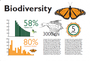
We agreed that the butterfly was probably an unnecessary decorative element in this iteration, and talked about options for incorporating it into the title as a logo element.
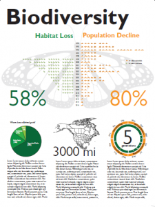
I had considered using a butterfly as the background in my hand-drawn sketch, but thought that the strong wing patterning would distract too much from the poster content. After two different people independently suggested that I try it, I decided to try reintroducing the idea.
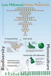
I wasn’t thrilled with it, but I did really like the centered version of the bar chart, which compares milkweed and monarch populations side by side. Without the butterfly, I thought that the shape of the graph became a lot stronger and more interesting. I tried adding some side labels based on one of Ernesto’s suggestions from the previous revision, in an attempt to frame the rest of the poster.
It did work as a frame, but it also distracted from the content of the rest of the poster. The graph in this version made it my favorite, but everyone else liked the second version better. I thought that the plain white background made the design cleaner, but the butterfly’s popularity made me decide to try another version to see if we could find a way to get along with the shadow butterfly.
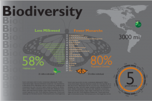
Based on my success with inverting background colors in the Studio Maps project, I decided to try making the background color dark and the butterfly even darker. That helped a lot; the butterfly pattern was still pronounced, but the darker color receded into the background more. Since the graph was in bright colors, it stood out pretty well against the dark background.
I also toyed with introducing a gradient and text repeat element on the side to represent fading biodiversity. This failed soundly in the critique. Live and learn, I suppose…and don’t introduce unnecessary elements to be clever.
Ernesto was out for a week, and the next crit session was held by Nathan Felde, who has an entirely different view of what a poster is and what it should do. He felt that my poster draft had no story and no interesting visual elements that could be understood at a glance. He also told me to make a poster, and not write a novel. Point taken.
It was very useful to have such a different perspective on the “big picture” goals at this point in the project. I had gotten to a point where the design was kind of working, but I wasn’t satisfied with it and wasn’t sure what else to try. Based on Nathan’s lecture and the crit session, I made a hasty (sloppy) new sketch.
Which I turned into an electronic version using headlines to bring out the individual parts of the story. I also started to really focus on the organization of the pieces rather than the dominant aesthetic elements.
After several more iterations, that turned into this:
Ernesto came back last week, and was slightly horrified at the magnitude of changes I’d made. He thought that I’d lost a lot of the strongest visual elements in this version, and that the color scheme was weaker.
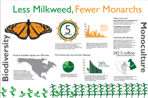
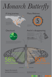
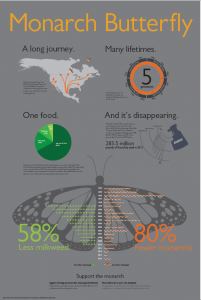
So, I went back to the drawing board, scrapped a bunch of stuff, and kept the best pieces from each version. I put the colors back, and reintroduced the shadow butterfly. By now, that butterfly has become a persistent source of disagreement: two professors and one other student have told me that I don’t need it, but pretty much everyone else (including the professor for my class, who I consider the “client” in this case) likes it. I could go either way on the butterfly, but I wasn’t willing to scrap the story line. So, I kept it.
And, to my surprise, it seems to have worked. When you try to please everyone you risk pleasing no one, but in this case most people thought that the newest version was strongest (I have not had a chance to ask Nathan to see what he thinks).
I also changed the title typeface in this version. I wanted something clean and delicate, like a butterfly. My first instinct for this poster has been to use a delicate serif typeface, but I had scrapped that in some of the early pre-versions. I decided to revisit that idea here, and used a Baskerville italic to see if it would work. I was rather smitten with it (especially that ligature at the end), but the crit consensus was that it didn’t make sense to have a serif title if the typeface didn’t show up elsewhere in the poster. I wanted the subheads and numbers to stay sans serif (Gill Sans), so I killed it.
We also made a few color tweaks and some minor changes to the spacing, but with this version we might finally be getting close.
![20151121_200350[1]](http://ericagunn.com/wp-content/uploads/2015/11/20151121_2003501-e1448154464415-225x300.jpg)

![20151121_200441[1]](http://ericagunn.com/wp-content/uploads/2015/11/20151121_2004411-e1448154496473-300x252.jpg)
This is fantastic! The visual representation of the milkweed and monarch population losses is the best I have seen-and I’ve seen a lot due to the research I am doing on monarchs! Is there a way to contact you to see if I can have permission to share this within the grad school work I am doing? Thanks for posting this!