I have been playing around with visual encodings lately, as a way to explore different kinds of visual expression. (The previous posts outline the origin story and rules for this project in great detail, so I’m not going to go into it here.)
Visual encodings are essentially rules for how to create visual marks from information. Usually in data vis, our focus is on the accurate display of data, and so we tend to be very conservative about how these encodings are applied. When we remove that constraint, we end up with a set of rules that feeds beautifully into generative or algorithmic art (just replace the real data with an intelligently-bounded set of random numbers, and hit “go”). I really enjoyed playing around with this kind of art in my classes at Northeastern, and thought that it would be fun to continue those explorations in parallel with the more academic/theoretical ideas I’m exploring in the Form to Data post series.
This project is just me, a piece of watercolor paper, and a micron pen, playing around with ways that one could use numbers to create visual designs.
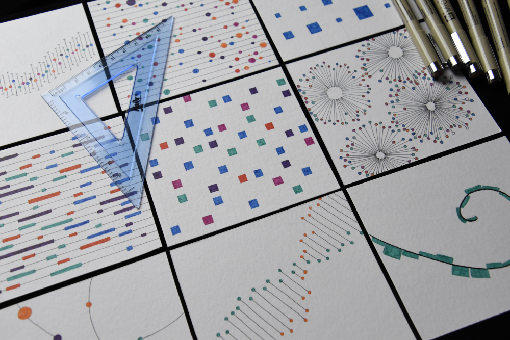
Each of these little sketches is a riff on using a set of rules to make marks on paper. I’ve chosen different combinations to make them visually interesting, and I’m using my design eye to guide composition and placement in ways that a random number generation wouldn’t right off the bat.
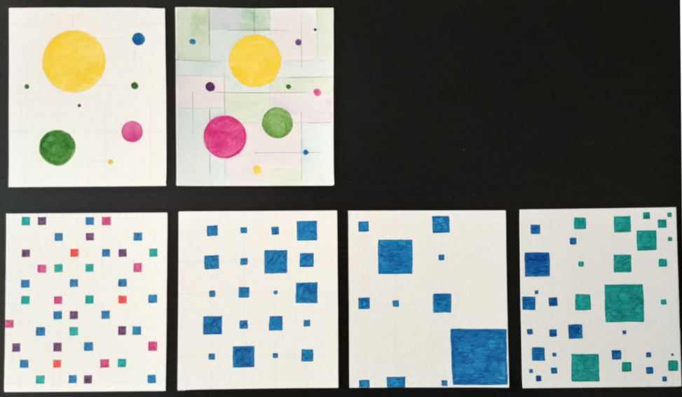
I started out with a composition of circles, with lines in the background that give the impression of a grid. These I did in watercolor as an homage to historical data vis that was carefully drafted and colored by hand. I soon found that my technique was not precise enough to give me straight lines yet, so I switched to pen instead.
I also played with squares on a more formal grid, with different levels of occupancy. I let some vary in color, others in size, and then I played with Fibonacci rather than linear grids. I also played around with dual layers of encodings, with two colors placed on a mirrored grid. (The two grids were complicated to keep straight, and I made a couple of mistakes on this one….wonder if anyone can see them?)
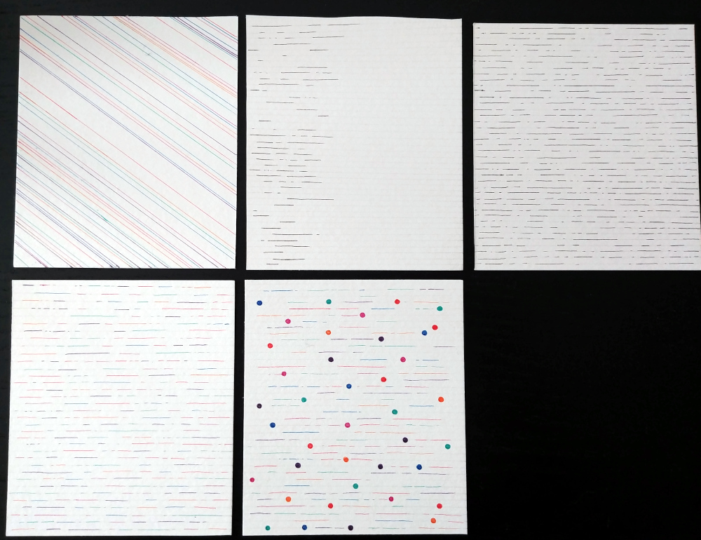
I also played with lines; first just varying color, then allowing there to be multiple line segments with a positional scaling starting at the left of the page. Then I used multiple colors and multiple segment lengths to create an overall pattern that fills the entire page. Mixing in circles of different colors creates a second layer here as well.
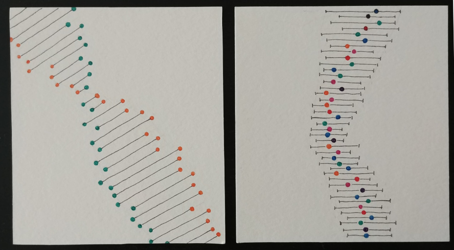
I messed around a bit more with mixing circles and line segments. These hearken back to more traditional graphic forms, but the context and application makes them feel more like music to me than like charts.
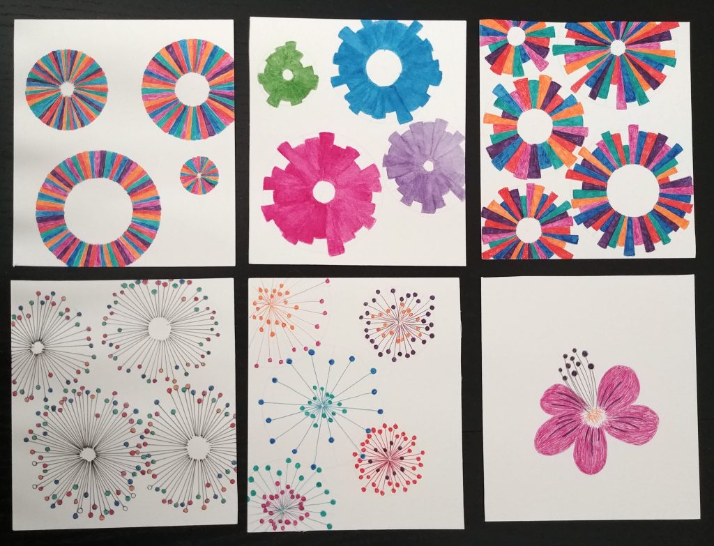
I also played with circles inside of circles, and creating connections with wedges and lines. Some of these are again reminiscent of basic chart forms, but used to create a visual composition rather than a legible data display. Many of these felt vaguely floral to me as well, so I also experimented with a more representational encoding (a la Georgia Lupi), where the number of petals, the number of veins, and the number and size of the dots on the stamen could all have some hidden meaning.

The image on the left here also plays a bit with representational meaning; the form is a mirrored bar (or violin) chart, but with the right “data” it takes on a strong visual form.
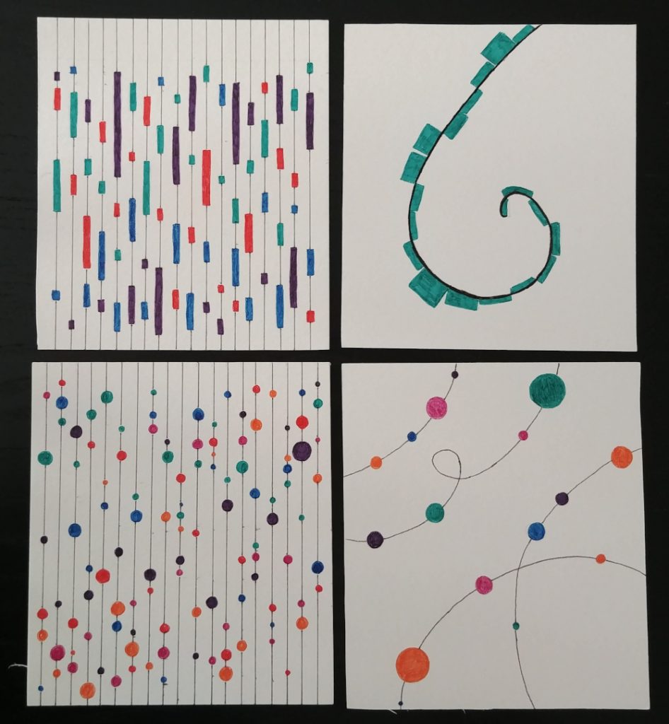
This set returns to a mix of lines and shape encodings. The pair on the left use the lines as a basic grid with a positional encoding, and then the bubbles or rectangles encode size and color in different ways. The two charts have equivalent data capacities, but changing the encoding from a circle to a rectangle gives an entirely different feel. Placing these encodings along an arbitrary path rather than a straight grid also creates an interesting visual display.

This series is perhaps the most systematic, and the most subtle. In the version all the way on the left, each mark is a little comma of the same size, but rotated and positioned in different ways. The next keeps all of the commas the same size, but some of them are mirror images of the others; there are two “hands” in the tail. Next, I let them vary in size, and then in length.
One of the things that interested me most about this exploration is the sense of creating a secret visual language. Here, it is not connected to meaning in any way, but there’s no reason that it couldn’t be if you wanted to. In a sense, what I’m creating is a set of visual cryptograms, similar to the coded word puzzles that I used to love as a kid. None of these sketches have meaning, but it would be fun to play with the idea of creating a visual code. If data vis is meant to clearly present data, perhaps part of the appeal of data art is the very human search for secret messages and hidden code.
2 thoughts on “Play with encodings”