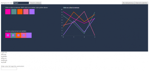
In the last post, I wrote about a color picker application that I’ve been playing with as an evening project lately. I’m going to be building some fairly demanding color palettes over the next few months at work, and wanted a tool that would support iteration and cut some of the time out of the more manual parts of the process.
I spent some time playing around with making palettes to test out the application, and showed it to a couple of colleagues at work who may also end up using it as part of this project. Based on our experiences using the system, I came up with a few new features that I wanted to add.
The first was a minor adjustment to the simultaneous contrast tiles. They worked really well when two colors were touching (which depends entirely on the selection sequence), but didn’t allow me to look for problems across all of the colors in the palette simultaneously. So, I added a set of smaller central squares to each tile, and allowed the user to click on any one of the tiles to apply its color to the central tile. This gave me a fast and easy way of looking for particularly jarring color combinations, and gave me opportunities to replace colors that might not work well together.
Next, I added a re-center feature, to re-locate the color of any square in the palette. I found that I often wanted to tweak an individual color just a little bit, but it was difficult to find it again once I’d iterated away from the original location. This new feature allowed me to shift-click on any one of the squares, and re-create the full color sample set, centered around the selected value.
So far, the application only allowed users to add or subtract colors from the palette; any changes to the controls at the top of the page affected the sample tiles that the user could choose from, but they didn’t change any of the colors that had already been added to the palette list. Generally speaking, this was a good thing; I wanted users to be able to explore the full color space to find colors to add, without having to worry about losing or changing the ones that they’d already selected. But sometimes, it seemed like it would be helpful to be able to load a palette and just add a hint more blue, or red, or take it down a bit in value. In this case, I’d want to apply changes uniformly across the whole palette at once, rather than having to manually update one color at a time.
I added a palette editor to the page as a way to start exploring this function. It takes a single color as input, and adds it as a transparency (with a user-controlled weighting) uniformly across all swatches in the palette. This allows for subtle and not-so-subtle tweaking of the color set, and was a lot of fun to play with and explore.
It can’t do anything but add colors yet, so it’s hard to get saturated colors out of an unsaturated palette, but I’m thinking I might want to add a multiply or other color blend function to extend its usefulness in that direction as well. UX/UI updates and responsiveness are also major things on the list of upgrades, but I wanted to let the features settle down a bit before diving into final layout and design.
The current version of the palette tool is here.

