This post is part of a larger series focused on exploring the fundamental principles of data visualization. Eventually, the collection may grow into something larger and more coherent. For now, each post simply picks up and plays with one idea related to how we represent data visually. Other posts in this series can be found using the Form to Data tag.
The simplest ingredient of any visual system is a mark. Really, a mark can be anything: a smudge of pencil, a scratch on a surface, the period at the end of this sentence. To be useful as an element of communication, the mark should be intentional. A random scratch or scrape might make for good forensic evidence (representing an index of some other presence or activity), but visual communication requires that a mark serves the very specific purpose of representing some thing or some idea.
A dot is perhaps the most basic mark.
On its own, it has no real meaning. It may serve simply as a visual element in a composition, with no greater meaning than its shape and position relative to other objects on the page. Its use in an art piece might give it particular cultural or emotional significance, transforming it into a symbol that encodes greater meaning for those who know what it represents. This transcendence from visual element to symbol is what most artists strive to create in their work.
Data visualization (in most cases) has a slightly different purpose, and encodes a different type of meaning. In the most basic case, the mark is purely representational: like a stick drawing, the mark is a simplified version of an object or entity in the real world. Thus, the mark becomes a sign for that object, to those who know what it is intended to represent.
There are some fundamental tasks that can be accomplished with just a simple mark. These tasks are so important that they likely drove the invention of visual communication by our ancestors some 120,000 years ago. Archaeologists consider the use of signs as the first evidence of our transition to modern humans, and they may form the basis for language, written communication, and abstract thought as well. Data visualization is truly an old practice.
The first purpose that a visual representation can serve is that of a record, a representation that some thing exists, or has existed, at some point in time. If multiple symbols are present together, they can be used to count.
Depending on how the marks are arranged, they might also be used to create groups, or distinctions between different kinds of entities. Notice that adding groups does not stop the marks from being used for counting. Actually, it increases their value: the image above represents 5 simple objects, but the one below encodes several additional layers of meaning. There are still 5 objects in the image, but now they are divided into two different groups (and possibly two different kinds, though we’re not sure of that yet from this representation). One group has three objects in it, and the other has two. So, instead of 5 undifferentiated objects on a page, we now have 5 objects in two groups, and membership in these groups is not evenly divided. Notice also that the mark itself has not changed; each object is still represented by an individual dot, and the dots are all the same. It is only their arrangement that creates this illusion of grouping.
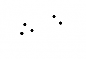
But maybe you are not interested in creating groups. Fortunately, there are still other tasks that can be done with simple marks on the page. Maybe you want to show that some things are bigger than other things, using the mark to represent size. 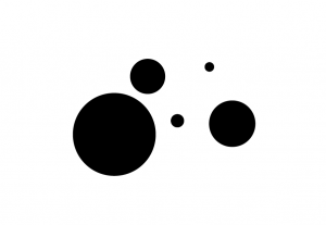
If we are ready for a little abstract thought here, you could use the size of the mark to represent something other than the physical size of the object: possibly its weight, or its cost. Now, size has stopped being representational (big dot = big object) and has become symbolic of some other property that you may not even be able to see (big dot = expensive). Instead of representing size, these dots now encode value.
An encoding is essentially the rule that helps you make (encode) or understand (decode) a symbol. If I want to make a representation of a very expensive item, I know that I need a very big circle because in this system size encodes the items’s value. If I want to compare the value of two items next to each other, I can look at their size to figure out which one costs more. Because this visual encoding is so effective, I barely need to glance at the image to understand that some items are “more” and some items are “less” than others, and it is immediately obvious which one is the “most.” Once I know how the image is encoded, I also understand “more” or “less” of what (size, weight, cost).
Once there is a differentiation between objects, I can also use my marks on the page to sort items. This is similar to the task of placing them in groups, but the sorting that I have drawn below adds a new concept: that of sequence. The dots below progress uniformly across the page, with the smallest on the left and the largest on the right. This indicates that they have one particular order that makes more sense than the alternatives.
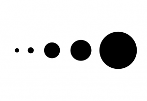 This sorting feature is most obvious when the marks have an encoding like size, where the value increases continuously from left to right. In this case, the size encoding reinforces the sort order, and so doesn’t require a lot of knowledge or explanation to understand. But there is no reason that the marks have to be drawn this way: the dots below still retain an order.
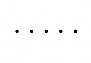
In a society that reads from left to right, most people would probably assume that the sequence begins on the left and ends on the right, but there is no reason that it has to. This sorting is more ambiguous than the last, because there is no additional information to give direction to the sequence. The dots are too carefully arranged for their placement to be accidental, and so people will naturally perceive them as having an intended order, but without further information it is difficult to know what the sequence means.
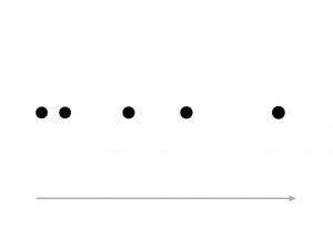
Adding a new mark helps to clarify the sequence direction, and gives the arrangement of dots more meaning. Because this new mark establishes a sense of sequence on its own, it is less important that the original marks are perfectly arranged. The drawing below uses a mark’s position to encode its value (weight, size, cost), rather than the size encoding used in the original marks. Now, the mark itself does not tell you its value; the dots are all the same. Instead, the object’s value is represented by its position along the arrow at the bottom of the drawing. Marks that are closer together are closer in value.
 Once the concept of an external sequence is established, it is even possible to contradict that sequence with a second encoding, and the meaning is preserved. In this image, the dot position represents the sequence and their size represents some other variable or property of interest. Once we have two encodings that can work together (position and size), our individual marks can now represent two separate things, at the same time.
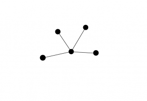
We can use combinations of marks to support other tasks with visual elements, as well. The dots below are connected using lines, which represent a relationship between the dots that would not have been clear from the original image above. These secondary marks can now be used as a method of grouping items together, giving them a sequence, and various other tasks that we might want to accomplish.


1 thought on “Marks and encodings”