Back in May, I submitted a proposal to the VERTIGO STARTS initiative for an artist residency with the GROW project in Scotland. The GROW project disburses soil moisture sensors to citizen scientists in Europe, who then place the sensors in the ground where they live. The sensors automatically report information on soil moisture, nutrient levels and a variety of other factors, and these measurements are then used by the GROW team to calibrate satellite measurements of soil quality.
As I discovered while working on the participatory part of the thesis exhibition, soil sometimes seems like an abstract concept to people who live in cities or don’t think of themselves as gardeners or farmers. Finding a way to relate soil moisture to people’s lived experience would be a critical first step in creating an effective art piece for the project.
To help with this, I wanted to use sonification (the representation of data through sound) to connect data about soil moisture to the sound of rain. Everyone has experienced rain, and most people likely have at least some emotional connection to the ideas of drought and rainstorm, so I hoped that this would help people to hear their own experience reflected in the data, and help them to make emotional and value connections to the project.
Sonification can also help people to detect patterns in large datasets, literally allowing them to hear changes in the data for themselves. It has been used to good effect by Ryan McGee et al. in the Sounds of Seismic project to represent seismic events. Lauren Oakes and Nik Sawe used sonification in their project The Sound of Climate Change to highlight shifts in forest populations over time, and David Dunn has also explored sonification in his Acoustic Ecology of Pinyon Pines. Sound is a highly emotional channel, and elicits different responses than visual stimuli alone. Tying sound and visualization together could create an immersive experience of the data that is stronger than either mode of communication alone. In discussing long-term trends like climate change, sound can also be more effective than visuals, because it is easier to maintain a sense of consistent increase in musical register than to detect gradual changes in color or intensity over time.
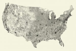
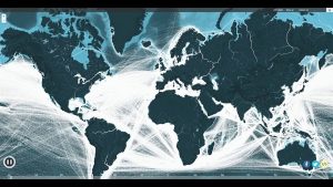
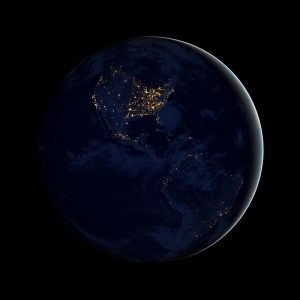
For the visual component of the piece, I wanted to use a “data only” view if possible. There is something really compelling about the interplay of positive and negative space in a data-dense visualization, and I am always drawn to them. Some of my favorite examples include the Wind Map by Fernanda Viegas and Martin Wattenberg, the All Streets map by Fathom Information Design, and the Global Shipping Map by Kiln. NASA’s Black Marble photos from 2012 show the global light distribution from space, with a similar effect.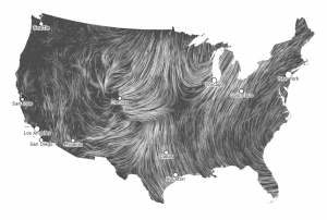
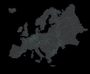
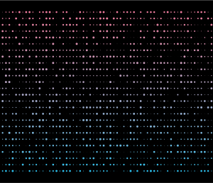
Based on these examples, I considered making a map of Europe showing soil moisture data. Moisture measured by each sensor would be mapped onto point intensity, and the net effect would be to show sudden addition and gradual waning of soil moisture between rainstorms. High quality or mulched soils should have longer on times than sandy or low quality soils, and irrigated lands should be consistently higher than other sensors in their area. These different behaviors would make an interesting visual composition, and might allow users to see weather patterns reflected directly in the data, in the form of a spike in soil moisture moving across Europe.
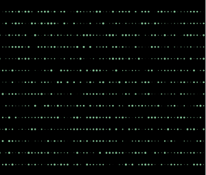
I didn’t have access to real data from the project, but I mocked up a simple particle system in After Effects to get a sense of what the soil moisture data might look like over time, as different weather patterns move across the landscape.
Geographic representations are very familiar to most people, and are often very popular. They provide an immediate sense of place and context for the data, making it easier for people to relate to the information. They work well for dense datasets with many sensors, but may not work as well if the geographic representation is less complete. They can also have some of the same artifacts as chloropleth maps: high activity areas are naturally seen as more important and often focus attention on a very small area, with extended patches of apparent nothingness in between. For a project emphasizing population or city activity, these are distinct advantages, because the intuitive reading reinforces the intended message. Depending on the emphasis chosen by the GROW project team, this feature may or may not be desirable for this visualization.
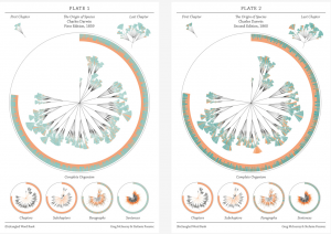
Non-geographic visualizations have the advantage of freeing up the spatial coordinates to represent other variables within the dataset, and can sometimes allow the user to detect more abstract (and often more useful) patterns within the data. They have been used to good effect in Mapping the Epigenome by Martin Krzywinski and Jonathan Corum, A Year in Diabetes Data by Doug Kanter, Off the Staff by Nicholas Rougeux, and The Evolution of The Origin of Species by Stefanie Posavec and Greg McInerny.
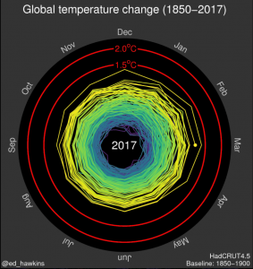
Circular representations are often used for displaying large datasets because they are compact, aesthetically pleasing, and are well suited to showing rhythmic data or long-term trends. This latter feature is shown very clearly in the Climate Spirals visualization by Robert Gieseke and Malte Meirshausen, which places strong emphasis on the prevailing change in global temperatures over the past century and a half.
With these examples in mind, I thought about how I might visualize the moisture sensor data. Plotted on a linear axis with time progressing from left to right, variations in soil moisture could be shown for many parallel sensors.
Using the vertical axis for a second variable such as temperature could highlight the variable dynamics of soil moisture based on temperature within a sample dataset.
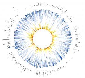
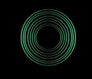
Circular plots could highlight periodic variations, showing cyclic absorption and release of moisture throughout the day, across a period of weeks or months, or possibly over the course of years. Circular time plots could show diurnal rhythms for multiple sensors simultaneously.
Radar plots could be animated to show variation across multiple cycles for several sensors.
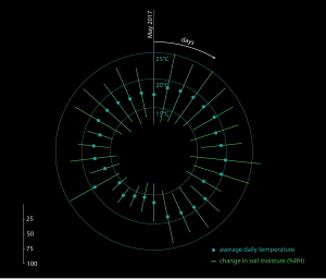
Combination plots could use different encoding methods to represent multiple variables in
a layered display. This sketch correlates the soil moisture window for a sensor with the
average daily temperature over a period of time.
I found out last week that I didn’t get the artist residency, but it was fun to think through different ways of approaching this dataset, and I am reassured by the similarity between my proposal ideas and the winning entry that I was heading in a good direction. Making the sketches gave me an opportunity to experiment with new tools in Illustrator and After Effects, and gave me some practice in writing proposals for artistic work. The winning artist, Kasia Molga, has some very interesting work, and it will be fun to see what she produces with the data.
