Before I could really start unifying the design of the thesis site, I needed to get all of my different code experiments in one place so that I could actually see them. That started as a bunch of screen shots in a powerpoint file, but I’ve also been coding a front page design to support users in exploring the site as well.
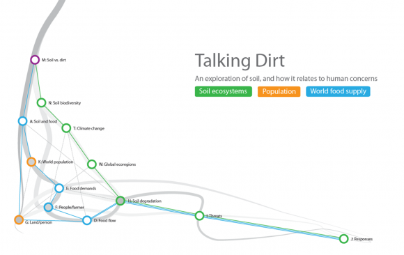
The front page is really important to this project. It’s the first thing the user will see when they come to the site, and it needs to help them understand how all of the modular visualizations in the site are connected. I think it’s important to allow people to choose what they want to see and when they want to see it, but you need to be oriented to the options before you can choose. I wrote about the process of choosing which stories to show and how to connect them here. The last post ended with an Illustrator sketch of what the index page could look like, with nodes representing each of the topics, and line color reflecting the different narrative paths through the visualization.
A user could choose to explore any individual node by clicking on it directly, or if they’re looking for more guidance they could choose a particular story of interest by clicking on one of the buttons under the title.
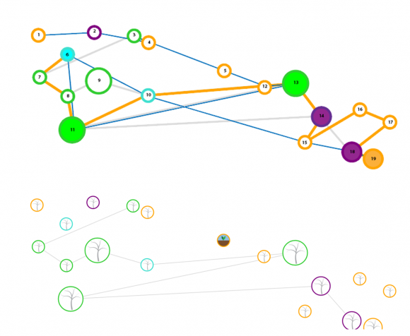
I started out by drawing all of the nodes and links in a rudimentary force layout, just to help myself explore the connections between topics while I was developing the narrative threads. To help me relate the different representations, I used Illustrator coordinates to determine the basic node placement.
I also used this as an opportunity to set up my node and link file formats, and to figure out how to do things like add image and svg drawings inside the nodes from an arbitrary file. It was clear that this wasn’t going to work well as an interface; besides being ugly, it would just be difficult to navigate. It needed more direction and structure than an undirected network. In my proposal presentation at the end of last semester, I found it helpful to compare the different ways of structuring information:
At the beginning of January, this project was best described as a collection; a loose grouping of related topics based on a set of classification guidelines. The drawing above showed the project as a network; connected, but with no particular directionality. An alternative structure would be a traditional narrative, which imposes hierarchy and a direction on the story. Developing my storylines was really a process of shaping this collection to line up with narrative lines. Ideally, I’d like the interface to reflect a narrated network, which I think of as a hybrid between a traditional narrative and a looser node/network form. In this model, a user should be able to access each piece of the visualization as a modular whole, or to experience it as part of a continuous narrative.
I wanted my visualization interface to support both modes; the user can select a node directly to see what it contains, or they can choose a narrative if they want more guidance. These thoughts were in the back of my mind as I massaged the storylines into individual narratives, and as I rearranged the nodes in Illustrator to come up with the clearest, minimal representation of the interconnections. This process resulted in the sketch that I showed at the top of the post; it uses roots rather than tree branches to indicate direction, but stays with the familiar information structure analogy, while also reflecting the content of the website.
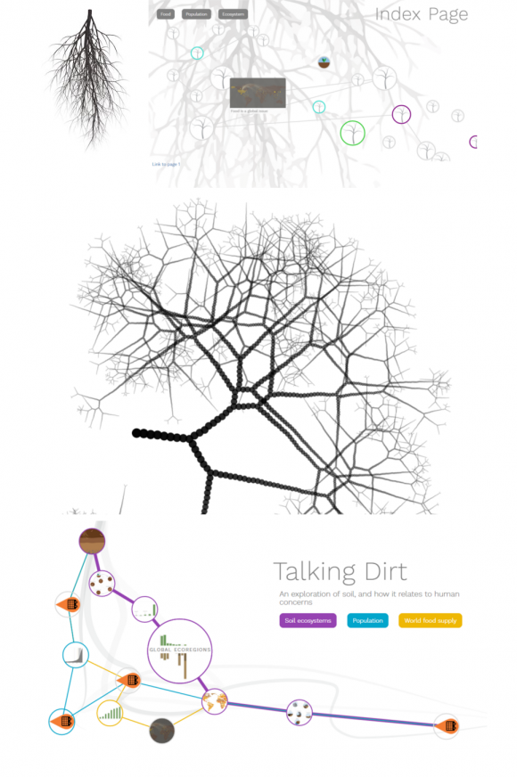
I made a pinterest board to get a feel for what I was looking for in a root image, and then made a couple of ill-fated attempts to execute something like that in code. My first attempt used an image traced in Illustrator, which was far too complicated for my purposes. I also played around a bit with some generative algorithms in Processing, but it was clear that it was going to take a lot of refinement to get the right results, and I was too short on time to make that happen. Eventually, I settled on using a pre-drawn Illustrator file for the roots, because it could be imported simply, scaled to match different screen sizes, and could be directly related to my node positions.
The node coordinates still need to be tweaked to better match the root graphic, but I think that this combination does a good job of both structuring the node network, and creating a sense of flow within the document. I am slowly replacing my (very ugly, bright orange, impossible to ignore) default icons with screenshots of the different graphics as I fill in the content of the site, and this week I replaced the blocky tooltip shown in the first root version with a title bar that pops up when a user hovers over a node. I’m not sure that I’ll keep the node icons in the final version, but I think they’re helpful for giving a quick preview of what the user will see when they make a particular choice. I’m currently thinking that the nodes will have a white fill in their non-expanded state, and will only show the screenshot when the user hovers, but I’m still working that out.
I’m also working on creating a compact representation of this navigation interface that can be included at the bottom of each page in the visualization. I think it’s important that a user be able to make choices at every step of the visualization. Rather than having to choose a narrative and then being stuck with it, I’d like to allow them to see the recommended paths, and all of the options on each page. I also think that an overview “map” is essential for helping people maintain context in a visualization that contains many smaller stories. I’ve been experimenting a bit with d3’s tree layout to see if I can make this work (I use a gray background for debugging early page layouts – it makes it easier to see where my page elements end up if CSS misbehaves):
This has a long way to go, but with a few manually-added links I can make a structure with the same node structure as the front page. It feels a little too much like a subway map at the moment, but that may be largely a matter of styling. I would consider importing link paths from an Illustrator SVG to make a more hand-drawn feel, but I lose the d3 data bind that way, and I need to be able to re-color the links depending on the narrative content and user selections, so I need a connection to the data. Still trying to think my way around that particular road block. I’m also starting to play around with animations and interactivity, and am gradually switching from the debugging colors and layout into something a little closer to the final version.
The interface is definitely still under development, but it’s slowly getting closer to something that could work. Getting all of these pieces functioning and responding to user input will be a big part of the next phase of development and design, in addition to cleaning up the individual components and filling in the holes.


