As discussed in my last post, I chose to change my dataset for my Studio3 class, since the land use data had completeness issues and Mauro preferred that I not work on a dashboard as part of his class. Instead, he wanted me to work on something more expressive, with more interesting data.
I chose to focus on food imports and export data, because food is the most direct soil product sold internationally, and because it is of natural interest to anyone who eats. The soil degradation and land use information is very interesting and provides a good snapshot of how the soil health issue is related to our current social structures. But, in focusing on arbitrary national borders, it misses an important component of global systems: as with most ecological issues, the impacts of soil loss are not local, and cannot be contained within national borders.
I wanted to make a visualization to emphasize connections between countries, and the motion of food products around the globe. When placed in relationship to the soil degradation map, I hope that this graphic will help to emphasize that soil degradation isn’t just something that happens locally to people “over there,” but that soil fertility loss anywhere affects all of us. Also, I hope to reflect the fact that the purchasing power of developed nations shapes the policy of emerging economies, for better or for worse. Relating this map to fair trade and the local food movement is probably outside the scope of this project, but I hope that this graphic helps viewers to realize the extent of their reach in a global economy and to consider the impacts of their choices.
The data is tabulated by the FAO-UNESCO as a detailed Trade Matrix that shows the origins and destinations of imports and exports for each country, by year. The Trade Matrix data is presented as individual categories for each kind of product traded, so that it is possible to look up how many tonnes of coffee beans were traded between Colombia and the United States in 2013, for example. The database also contains a Food Balance Sheet that gives the difference in total imports and exports for a given country, but does not identify trade balance values for individual trading partners.
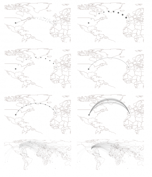
Because I wanted to represent motion of products, I chose to experiment with particle systems, showing tiny dots moving around the map to represent food trade between countries. In the first iteration, I gave the particles a fixed starting point, and then allowed them to spray out like water from a garden hose. This made it difficult to identify the destination country, and would make a very cluttered visualization if data were shown for multiple countries at one time. Emitting a single stream of particles helped to simplify the visualization. I considered animating the particles with differences in size or fill color or size, but this complicated the graphic without adding new information.
I also began experimenting with Bezier curves to trace the particle path and guide the eye. These curves could be used alone, in combination with particles moving along them, or in multiples to show the intensity of imports/exports. With these options in hand, I then began applying these different techniques to real data (in the last two panes), to see what a fully connected system might look like.
Next, I began experimenting with showing the import/export quantities and highlighting destination countries in different ways. First, I tried changing the fill color of all import/export partners for the selected country. For countries that are heavily connected, like the US, this highlights the extent of their trade partnerships, but leaves the occasional odd hole in the map, which draws more attention than the colored countries because it looks like a mistake.
As an alternative, I tried drawing dots at the centroid for each destination country. This was much more effective, as it draws attention to the partner countries rather than the map.
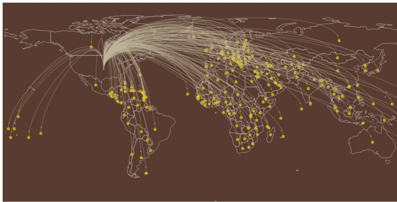
I also tried taking advantage of the presence of these spots to reinforce the trade volume between countries. Initially, I programmed the spots to blink on and off as each particle reached the end of the Bezier curve, which resulted in a map that pulsed in time with the import/export values. Most people found the pulsing distracting, and it made it harder to see the sizes of the country spots, so I reverted to a static view.
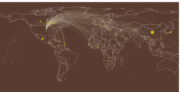
I also tried highlighting major trade partners using chloropleth shading on the background map, but I felt that that was redundant and that the spots alone did a better job.
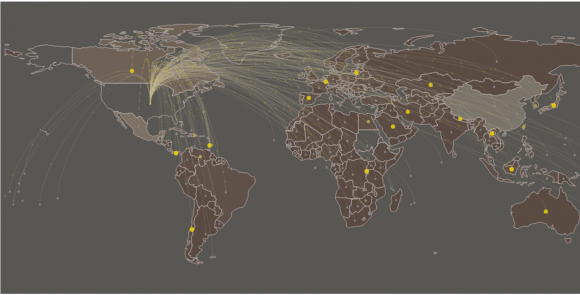
At this point, I also decided to step back a bit and check whether the Beziers were actually necessary. Although I reduced the opacity to make them less prominent, they do still partially occlude the background map, especially when a country exports to many of its closest neighbors. Without the curves to highlight particle paths, it was difficult to follow the particle motion at all, and the map became much less visually interesting. The Beziers also help to highlight the connectivity within the graphic, which is one of the primary features I hoped to convey.
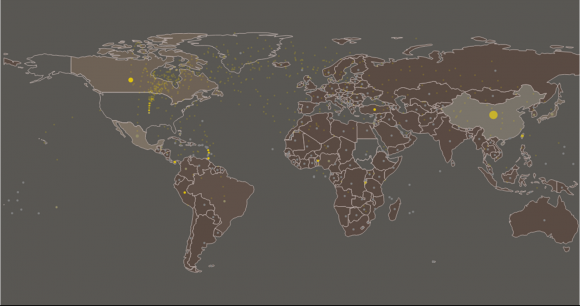
I also tried using straight lines to connect the different cities, to see if that might help with issues of occlusion while retaining connectivity. I did not feel that this approach was nearly as appealing or as successful as the Bezier version.
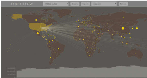
The current version of the visualization uses the Bezier curves and particles to animate the motion of food from one country to its partners. Users can select the country that they want to view using the dropdown menu, or by clicking on the map. The user can also toggle back and forth between import and export data, and the particle motion changes direction as a result. Each origin/destination partner is marked with a yellow spot whose size reflects the quantity of food traded between the selected and partner nation. This makes it easy to see at a glance that China, Mexico, and Canada are primary food trade partners for the US. The timeline across the bottom of the screen shows the historical values for all years available in the dataset. Hovering over a section in the timeline allows the user to load data for a specific year, to allow them to explore changes in trade relations over time. I also collected the data to allow filtering by category and to show the net trade balance for each country in the world, but have not yet implemented these parts of the visualization.
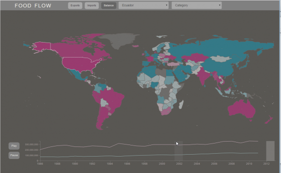
Finally, I included a second page in the visualization to show the net balance for different countries over time. Each country is color coded on a diverging scale to indicate net positive (magenta) or negative (teal) balance for a given year. The timeline shows the curves for both imports and exports for the selected country, to show trends over time. As the user highlights different sections of the timeline, the map colors update to show the world food balance for that year.
A screen capture of the working version is linked below, or you can view the live version here, using Chrome.
Overall, I am pretty happy with how this visualization stands at the moment. I need to add labels and context indicators in the final version, and need to implement category selection as well. Since this visualization is intended for inclusion in my thesis project website, the colors will need to be updated to match the style of the rest of the site, once it is developed. Still plenty of things to work on, but so far it’s looking pretty good.
