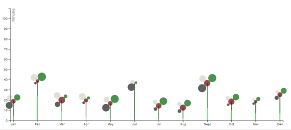
After completing the soil poster in static form for my Research Methods class, I decided that I wanted to explore the possibilities of digital interactive media for representing multi-dimensional data of this kind. The poster format required that I present only a single snapshot of the data, and made it hard to provide additional detail and context on request. On-demand filtering would also help to address the suggestion to include only the top 5 or 10 countries from the list, and would give the user more control while exploring the data.
With that goal in mind, I chose this project as the topic for my Design Studio 3 class in the fall of 2016, taught by Mauro Martino. In addition to presenting the data that I had already collected, I also wanted to expand the information included to create a deeper view of the topic at hand. The first step was to include land use and population data from multiple years, so that users could observe changes over time. I also wanted to do a better job of connecting data between graphs, and to include more detailed storylines that discuss the evidence for the ecological importance of the soil.
Before diving into full-on construction, I decided to step back and reconsider the design problem from the beginning, as a way to broaden my perspectives on the project and explore alternate directions.
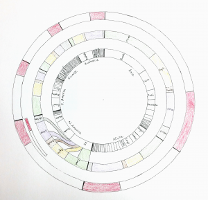
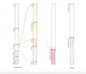
For this exploration, Mauro challenged me to start from the beginning and use other metaphors and ways of organizing the data. I drew several sketches, and then finalized a couple for closer consideration.
Both of the final versions were derived from Sankey diagrams, and were intended to show how land was distributed within the different countries. The circular version required replication of data categories, so I rejected it and created an “unwrapped” version of the same information in linear form. I didn’t feel that the Sankey metaphor fit this particular dataset very well, since I’m more interested in static relationships than in flows. The other disadvantge of this method is that all but the largest countries would be nearly impossible to select, since their scaled widths would be so small.
In addition to looking at alternate representations, I also considered how I might modify my original glyphs to represent the data in a less literal way. Inspired partly by Moritz Stefaner’s OECD data, I considered using floral glyphs to emphasize the connection between land and soil data and the plants that we eat.
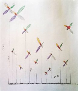
I thought that these sketches were somewhat promising, so I tried representing the petals as other simple shapes as well. These sketches worked less well; I felt that they favored the metaphor over the quantitative values too much to be the main visualization for a project of this kind.
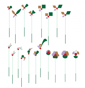
I did write a very simple version of the flowers in code, to see how they would work in an animated version. Since country populations generally grow over time, animating the flowers with data caused them to grow. I still felt that this was too metaphorical an approach, and the fact that I had only four data points of very different sizes made the flowers look rather lopsided.
