This post is part of a series focused on exploring DVS 2020 survey data to understand more about tool usage in data vis. See other posts in the series using the ToolsVis tag.
The last post talked about some general insights into the structure of my data that came out of my recent foray into weaving as a way to understand my visualization problem better. Working my way through the realities of a complex physical project forced me to organize and categorize my thoughts around the abstract project, and helped me to see the problem more clearly.
The next step was to take those insights back into the original project (the tools vis), to see how they hold up in this context and what else there is to learn. Essentially, I’m working with an extended metaphor here, and it remains to be seen how far it will stretch before it breaks down. I think there is an exciting seed of insight at the bottom of all this, but it’s going to take some careful thinking to extract its core value from the rest.
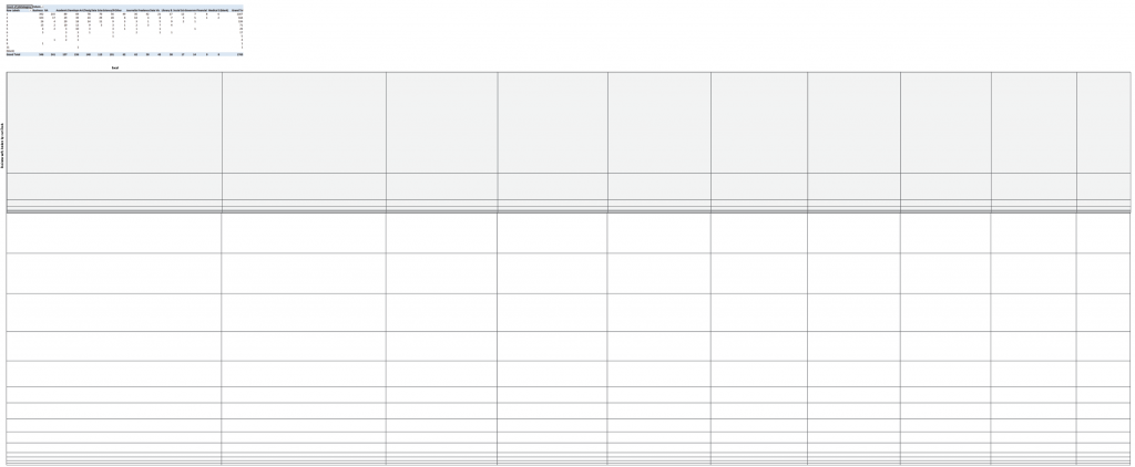
The first step at this stage is to get more specific. It’s easy to get excited because the structures of two problems are similar, but it’s much harder to figure out how precisely one maps onto the other (and, more importantly, where it doesn’t!). I started by returning to my pivot tables in Excel, and calculating some bin widths based on the count of different tools. In weaving, you can create stripes by using warp threads of different colors, and I wanted to get a sense of how those stripes would be distributed if I defined them based on the different tools. I want to keep things not-aggregated for now, so that I can work directly with the patterns in the data, so I chose to define each “thread” as a single response count for the different tools, and set the scale at 1 px per thread. Using those basic counts, the distribution across the dataset looks something like this:

The first (gray) box shows the most popular tool – Excel – subdivided by the number of tools that people use. People who use only one tool and use Excel show up in the first gray stripe, then people who use two tools one of which is Excel, etc. The remaining white boxes show the total counts for the other tools in the dataset. Next, I did the same thing for the weft.

Instead of using the count of tools for the weft stripes, I used count of people per career group instead. A “thread” here represents an individual row in the dataset, rather than a count for a particular tool. Because the data is multiselect, this means that the warp will be wider than the weft is tall. Again, I subdivided the weft threads by the number of tools that people use.
When you weave a fabric, the warp threads and the weft threads cross to make a pattern. I haven’t worked out what the pattern itself will be yet, but the intersection between stripes should be a combination of the warp and weft colors. Focusing just on the gray subdivided bar and putting the first two sketches together, I get a view of the basic color pattern that the intersecting stripes should make for the first weft stripe, across all warp columns. You can see the expected stripe overlaps in the box all the way on the left.

I could easily repeat this exercise to create the outline for the entire pattern this way, but I’m really just looking for a basic idea of the distribution of different groups, and thinking through how these groupings will or won’t work. It will be a lot faster to build this out in an automated way later, so that single-square approximation is enough for now.
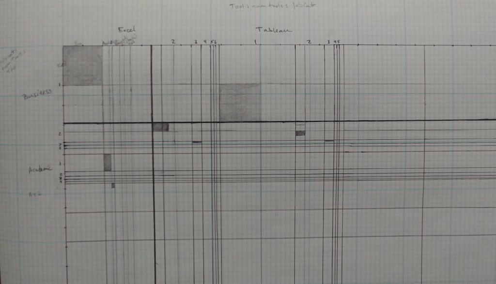
Next, I went back to pen and paper to think through the weave pattern in more detail. Here, I wanted to focus on the intersection between stripes, and to think more carefully through the implications of the question multiselect options. I think this is actually going to be the most interesting part of the pattern, so I wanted a better idea of what that might look like, and how it would work.

Since the first sub-square is defined as people who have only one tool, it will not have any filled boxes for other tools in the list. The second box will have one other column highlighted, the third will have two, and so on. Already, though, I was starting to run into sorting problems. Should I group it so that the first stripe contained Excel with one tool, then Tableau with one tool, then R with one tool, or so that it showed all of the tool counts for Excel, and then all of the tool counts for Tableau as a separate stripe? These details of how you cut and sort the data make a huge difference in what pattern you’ll see. Trying to actually fill in pixels forced me to make more granular choices, and helped me to see that my initial definitions had left something out.
After a few iterations, I realized the missing piece. Instead of cutting tools by count of tools and careers by count of tools and looking at the intersection, I’m pretty sure that I need a third cut to align the sort orders in the final array. In fact, each set of stripes should have the same set of cuts, just applied in a different order.
- Warp: Tools > count of tools per person > career group
- Weft: Career group > count of tools per person > tools
That gives me a structure that looks more like this:

I think this was the piece that I was grasping for, back when I kept reinventing the wheel with pivot tables. I could see that there was another transformation in there, and I was playing with the right variables, but I couldn’t see that there were actually two independent pieces of the problem (the warp and the weft), and that the information I cared about was the intersection of the two. Every time I got close to the solution I needed for either warp or weft threads, I’d get thrown off by the intersection piece and end up confused.
I’m pretty sure that all I’m doing here is re-inventing a cluster analysis, which is what I suspected I’d need way back at the beginning of the project. Still, I think there’s value in the stepwise approach, though, and I feel a lot more comfortable about what’s going on in the data now that I’ve really thought this through. I try never to use an analysis until I’ve fully understood it, especially when it’s a black box function in an unfamiliar tool. Unlike a physical medium, data is a space where you can apply just about any transform, and there’s very little to stop you or force a reality check. If I make a mistake with weaving, my materials will contradict me, and I’ll end up with a very visible tangle. With code, I could be doing something completely illogical, and R will probably still return a number. Understanding what that number means and whether you can trust it is an entirely different matter. In an abstract context, experience is all about knowing how to error check, and how to catch problems early when things start going off the rails. Without a deep understanding of how a function works or a way to evaluate its output, it’s easy to make mistakes. Re-inventing or re-deriving the analysis from basic principles might be an inefficient way to go about things, but it’s always important to develop a sense of the data before wading in, and I almost always find that it’s worth the time.
At this point, I have a very clear idea of what I need for the first step of this analysis, and counting all of those intersections is going to be extremely tedious in Excel. This tells me that it’s time to head back into R to see if I can figure out how to structure an analysis there to give me the data that I want.
In the meantime, I can also start mocking up the visual form in a more automated way. Transitioning into Javascript, D3 and HTML canvas, I can write functions that use pixel blend modes to assign color values to columns and rows based on a data value. This will need quite a bit of development to get to an aesthetically-pleasing output, including writing color adjustment sub-routines that will take a fair bit of time. For now, it’s just helping me to think through the data output structure and to rough out the general set of visualization functions that I might need.

I’m not investing too much time on the visualization code right now, because I’m pretty sure that this is just a temporary state on the way to somewhere else: I fully expect that I will get this dataset where I want it and immediately decide to visualize it in a different way. I will almost certainly need a different visualization for communicating insights from this data, though I suspect that the tapestry I’m developing here might remain the eye-catching overview that’s needed to draw people in. It’s very uncommon for the visual you use to explore the data to be the same as the one you use to present the information. You need to work your way through and build up to the analysis (and that’s usually the most interesting part), but when you want to communicate an idea to someone else, you really can’t expect them to spend months figuring out what it means. Most of the time, these fascinating in-process visualizations turn out to be no more than blips in the learning journey. Falling too deeply in love with either the concept or the visual form at this stage would be a mistake.
The idea of a treemap has been a fairly insistent presence in the back of my mind from the beginning of this project. That’s unexpected, because I don’t usually have a lot of use for that type of chart, but a treemap is really just an aggregated version of my stripe buckets, above. It may be that this project is precisely the time when I need that particular tool; only time will tell.
Regardless of the final visual output, we’re still firmly in sketch mode here. I don’t want to get too deep into something that’s only going to change. Still, it’s worth working on the display code in parallel with the data analysis in R, because that may inform how I structure the analysis and the output, and will help me to think through (and possibly error check) some of the details as I go. Having an automated way to quickly visualize the output will also save a lot of time as I start to get into this more detailed refinement of the dataset.