This post is part of a series focused on exploring DVS 2020 survey data to understand more about tool usage in data vis. See other posts in the series using the ToolsVis tag.
Playing around with the branching vis from the last article got me thinking about which aspects of the tool grouping really matter. What I ultimately want is a way to summarize all of the different relationships between tools, in a way that helps me to see groupings and connections between them. I want to understand which tools people use, which tools they tend to use together, and how that varies across different career groups.
Looking at unique tool groups is one way to get at the question of which tools are used together, but that’s a fairly complicated analysis, and I was struggling to take that step all in one go, with the information and skills that I had to hand. Tackling the whole tree at once felt rather cumbersome, and a few days of poking at it weren’t really getting me to the results that I wanted. I was pretty sure this wasn’t really a dead end, but I’d run into a boulder in the path, and I wasn’t sure how to get around it yet. Stepping back and trying a different angle is often the best way to figure out a problem like that, so I decided to try again with some simpler descriptive analyses, and work my way back into the more complex structures that I need.
We can define the relationships between tools in many ways. The branching analysis looks for unique groups of users who share an entire set of tools [Excel & PowerBI & Tableau, etc.], but you could also look for information about the number of different tools that people use, or the tools that are used most often paired together instead. Because it is only focused on two tools at once, pairwise analysis is often much simpler than looking across the whole group at once.
Another take on basic counts is to look at the number of tools that people use overall. Rather than looking at the count of people who use a specific tool, I can just sum across all tools for a particular person, and use that as a metric on its own. I don’t care yet about the specific tools themselves or the details of the data, and my analysis is too messy to pull out any real conclusions at this stage. Instead, I’m looking to understand general distributions and variability between groups.
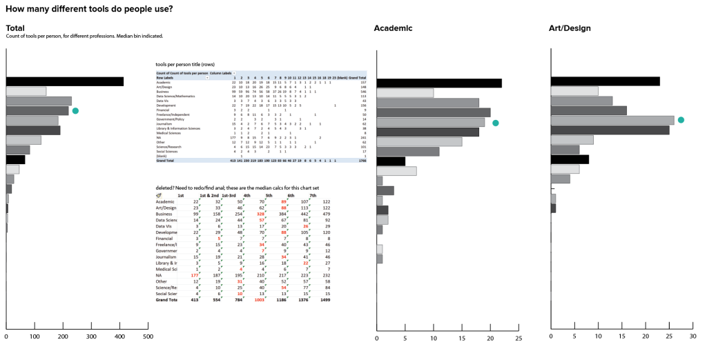
There are a fair number of people who reported using just one tool, but in most groups the median value (here represented by a teal dot) was 4-5 tools. There’s no way to tell whether that’s because people really only use a few tools, or whether that’s just the point where they decided to stop reading the list: I suspect the latter was the case for many people who chose just one tool. We could possibly do more analysis of where the responses fell in the list of options to try to suss some of that out, and if I were doing a formal research project that depended on this data I would want to dig into that a bit more before coming to any sweeping conclusions. I’m not sure we need that level of certainty for this particular item in this context, though (and certainly not at this stage!). For now, it’s enough to talk about how many tools people chose to identify and just leave it at that.

Looking across groups, I can see that the distribution varies across professions, as well. Some professions have a much wider distribution, while others are clustered mostly toward the top. It’s also good to keep in mind that a few of these profession groupings have very little data, which probably leads to some of the sparser charts. In some professions there is a secondary peak in the 7-10 tools range, where others fall off pretty uniformly from 1 tool on down the chart. Again, there are tons of details and many stories that could probably be teased out here, but right now I just want to know if this analysis is interesting enough to come back later. I think it probably is.
Breaking out of simple counts, a basic pairwise analysis is pretty easy to do manually with a pivot table in Excel. Once you choose a reference tool, you can compare the number of people who use the reference tool with the number who don’t for every other tool in the list. Putting this into a stacked bar chart, the bar for the reference tool is all black, and the rest of the bars in the chart show the proportion of people who use that tool along with others in the list. Gray bars show the number of users for the second tool who do not also use the reference. In the first chart, the black bars show how many people use ArcGIS, and the gray ones indicate how many use Excel but not ArcGIS, for instance. I didn’t bother creating the full chart set here, but I can already see some interesting variability in the values.
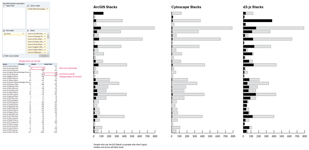

If you’re willing to do a little tedious copy and paste work, you can take the results of that table and turn them into a correlation matrix, too.
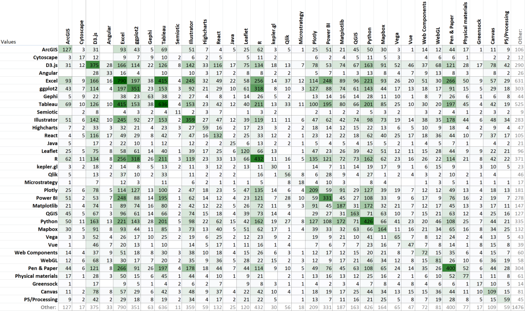
Some conditional formatting helps to make the higher values pop out, and also highlights the symmetry of the chart. By definition, the values should all be reflected across the diagonal line, because there is no ordering relationship in the data: pairing tool A with tool B should give the same result as pairing tool B with tool A. This helps me to see that R tends to be used with Excel and with ggplot individually, but it doesn’t tell me anything about how many people use all three.
I also spent a fair bit of time in this section of the exploration poking around what I think (for the moment at least) has turned out to be a dead end. This was another take on the branch analysis, but worked from the bottom up in Excel rather than using the R groupby command. I wanted to create groups based on the number of tools that people used, and then to trace the divergence within those individual threads. I started by making a really awful pivot to generate all of the combinations of tools represented in the dataset, and then collapsing out all of the blanks to create strings of tools. This had the advantage of allowing me to tell instantly whether a particular combination had 1, 3, or 7 tools in it, just based on the columns that it occupied, and I could easily filter and sort to get the full branching path for any individual tool, in a very Sankey-esque sort of way.

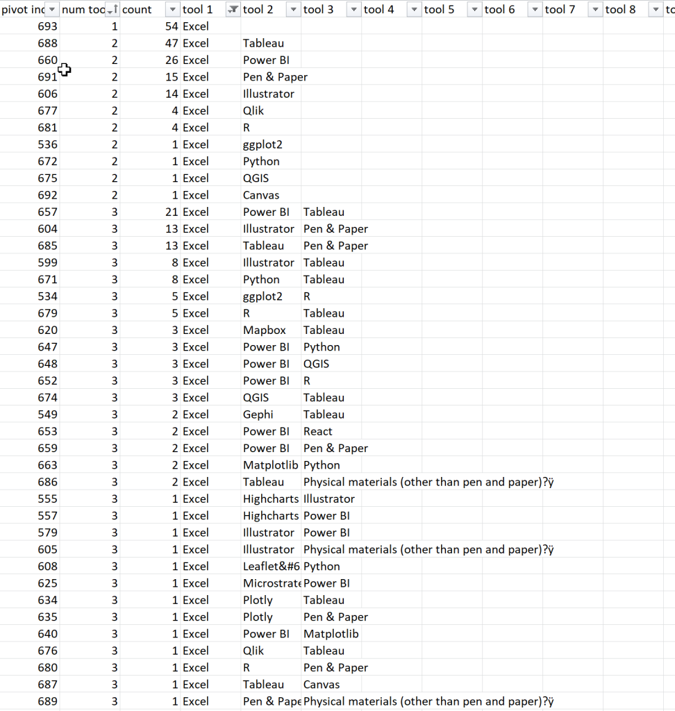
Unfortunately, this ran into the same kind of sequence problem as the previous analysis, but with a slightly different twist. I could easily map out the individual branches and the first, second, and third tool for each sub-branch, and their length on the chart reflected the size of the tool group, as intended. I hoped that that would give me a sense of how the different tool groups tailed off, and where the centers of density (most common tool groups) lay within the population. Unfortunately, the branches still had artifacts based on the order of the tools in the original list: Excel & PowerBI & Tableau & Mapbox should belong in the same group as Excel & PowerBI & R & Tableau (red lines in the screenshot), but this analysis misses the similarity because it still sorts the branches from left to right.
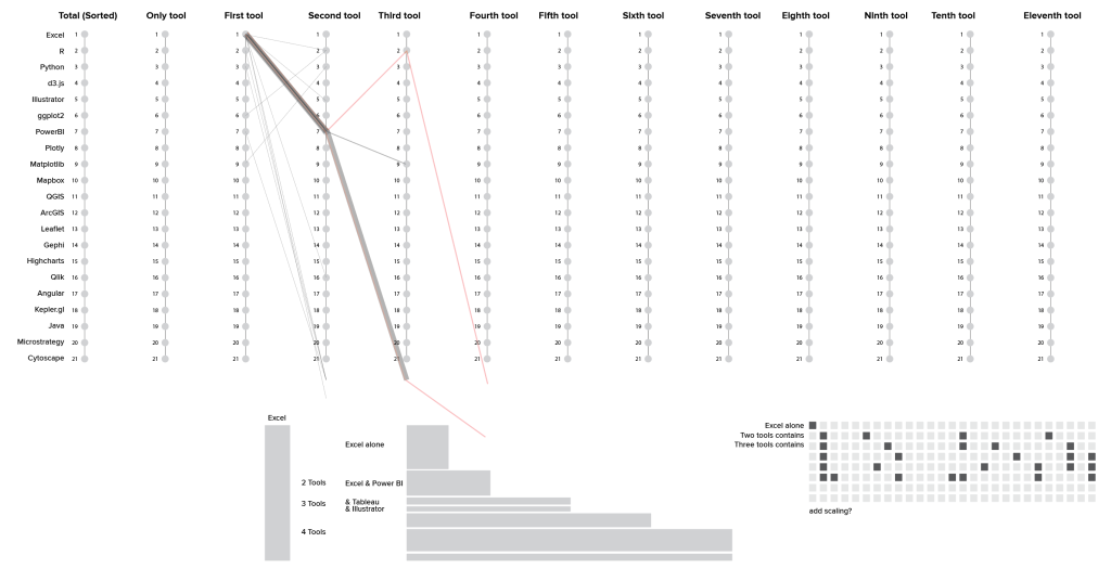
Ultimately, I think I probably want some kind of a clustering / correlation distance analysis to draw the connections between the different tool groups, rather than trying to tease them out of the individual row elements in Excel. This is the kind of analysis where other tools (and even different data formats) may just be better at getting me where I want to go. Right now, I’m not going to worry too much about running into another dead end here, but I do think that I’ll probably need to do a little bit of research before I can find the right perspective from which to crack this particular nut.
I actually suspected that a clustering analysis would be the answer before I even started working on the data, and I spent a few days reading up on that approach before beginning this exploration. I didn’t want to jump straight into a less familiar analysis before getting acquainted with what’s really in the dataset, though. Experience has taught me that this kind of pre-analysis is often useful, even if you end up coming full circle. I think I probably will end up back where I started by the time I’m finished with this little wander through the data, but it’s still worth it to me to get a sense for the distribution, size, and shape of the data before I dive into something more complex. I almost always find more connections and interesting paths to follow when poking around in the dark, and it’s also a good way to identify some of the gotchas and the caveats in advance. As someone who learned to work with data by creating it, it’s always a little odd to come into someone else’s dataset where I don’t know all of the ins and outs and limitations for responsible use. This early exploration phase helps to set context for me, so that I have a better baseline from which to judge results when I start doing more complicated things with a larger risk of error.
1 thought on “Better Together: Pairwise analysis of tools”