Charts and graphs have a job to do: the secret is knowing when they are (and aren’t) on the job
This post was originally published on Medium for the Data Visualization Society.
As a data vis designer living in both the art and data worlds, I sometimes hear that I should “just go wild” or “let my hair down” to produce more exciting, visually engaging graphics that feel more fun. On the other hand, I also hear that data visualization is a serious discipline with a purpose, where clarity and accurate interpretation trump all other concerns.
So, which is it? (Spoiler: maybe both!)

The difference between data vis and data art
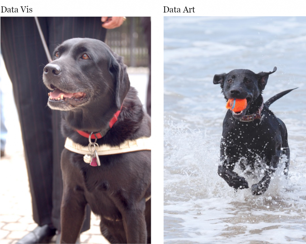
To me, data vis is like a guide dog: staid, disciplined, and faithfully focused on the task at hand. Data vis has a job to do. Data art is more like a puppy: energetic, enthusiastic and playful, fearlessly exploring the possibilities of the medium and the moment — an expression of pure, kinetic joy. The guide dog and the puppy can even be the same animal, at different times. The key piece is deciding when the guide dog is on duty, and when he is off-leash and free to play.

When the guide dog is on duty, her focus is on doing her job. For a data visualization, this means helping people to see trends or patterns that they might not otherwise see. A good visualization steers a reader carefully through a complicated narrative, highlights the right information, helps us to understand the things that we should see. It is the guide dog’s responsibility to ensure the safety of her human — likewise, it is the responsibility of data visualization not to create false impressions that could lead a reader astray.
On the other hand, no-one does well without play, either. Time spent “off-leash” can increase the vibrancy of our message and help visualization designers to uncover new and useful visual forms. Engaging in the spirit of play is a core part of the creative endeavor. Done well, it can inform our approach to more sober visualization work. (Note that the content of a data art piece can also be devastatingly serious; it simply conveys that topic in a more visually-playful way.)
But what about making charts seem more fun? Just as there is plenty of room for fun in the guide dog’s life, there is room for aesthetics and flashy UI choices in charts. The “fun” just shouldn’t interfere with the dog doing his job. He can wear a sparkly collar, a funny halter, or reindeer antlers at Christmas if that makes his owner happy. (Note that it is the owner we’re usually pleasing here, not the dog. The dog is usually perfectly happy either way, and doesn’t care one way or another about the frills.) He can get treats, play with a toy, and people can pet him if it’s not too distracting, but what other people think of as “fun” will actually be stressful and distracting if it interferes with the guide dog doing his job. It’s hard to focus on a task when everyone just wants to play with you and have fun. If it’s the dog’s experience we care about here rather than the owner’s, leaving him alone and letting him focus is often the best thing we can do. Similarly, an undecorated chart is often best when there is a task to be done.
Distinguishing and defining the edges between these two forms of data expression is an active, ongoing discussion in the data vis community. In the Data Visualization Society Slack group, there are whole channels devoted to the topic of data art and data/graphical literacy, and these discussions pop up in almost every other channel as well.
On the job vs off-leash
A central question seems to be: how do people know when data vis is working and when it’s at play? We need the equivalent of the guide dog’s working harness to let our viewers know how they should approach our work. Fortunately, we already have a wide range of indicators that can signal our intention for any given visualization.
Context: The more (analytically) formal the platform, the more accurate the visualization should be. Informal platforms allow for a bit more freedom to play. You probably expect something different from your bank than you do from a pamphlet about your town’s symphony orchestra or an ad for the local farm stand. (These contextual boundaries are often hotly contested: consider the epic feud between Edward Tufte and Nigel Holmes)
Tone: A serious, academic, or authoritative tone should always be matched by data visualization that lives up to the gravitas (and responsibility) of that authority. A “fun” and casual tone might create a bit more room to breathe. If you claim expertise and authority, you must live up to it.
Visual language: Abstract representations tend to be more formal. Traditional charts and graphs are designed to convey accurate and reliable data in a meaningful way. Their visual form is accordingly sober, and can sometimes feel a bit dry.* Adding pictograms, icons or other representational elements, distorting the basic chart form, and other overtly stylistic choices (gradients, glow effects, and the like) can signal that data is not the primary focus of the graph, and indicate that we are moving more into the domain of play. Note that this signal can also undermine a reader’s trust in the reliability of a working data visualization, and should be used with care.
Perspective: Born from the fields of science and population statistics, data is by definition impersonal and objective. As our society moves toward mining personal data at an individual level, there is good reason to question whether this definition still holds. A growing number of voices argue that data is always (and always has been) situated within a particular framework or ethos and that its idiosyncrasies and situated nature should be exposed. Art has the tools to present multiple perspectives, and humanism offers us a new way to think about the people behind the data, as well as the numbers themselves. A more personal, situated view leaves room to explore the human meaning of data on a deeper level.
Use of emotion: Traditional data visualization is designed to help you reason. Data art is designed to help you feel. Emotion helps us to engage with a piece: it can make data more exciting, or help the viewer experience the gravity of a particular data set. In my opinion, there’s nothing wrong with using emotion, but it needs to be done carefully and in context. Too much reliance on the wrong kind of emotion can make your data feel unreliable or suspect.
Using these and other signifiers to give context to your work can help your audience know how to interpret the content that you present, and it can clarify the boundaries that define the appropriate use of data for a given piece. Including a discussion of the data and a statement of purpose can help to frame your work in a thoughtful and data-responsible way, and can improve the data literacy of your audience as well. As both a technical expert and a designer, I think there is abundant room for both practices in the data visualization world. We simply need to be clear about when data visualization is (and is not) on the job, and about what kind of job we are trying to do.
* Note that accuracy can also be beautiful — “working” graphics are no excuse for bad design. Good visual design is deeply functional: it makes traditional graphics clearer, more focused, and easier to read, as well as enhancing its aesthetic appeal. Five Thirty Eight and the New York Times use very traditional graphics to good aesthetic effect, which is achieved through purposeful visual design. Aesthetics that truly support a chart’s function will always improve its focus and its legibility.