We have been working on a product re-design at work lately, and I’ve been thinking a lot about what goes into making a good color system for analytical applications. The purpose of color in our application UI can be broken down into a few distinct (and often competing) themes:
- Color to direct attention. Color can be used to tell the user where to focus, both in support of the traditional design hierarchy (headings more prominent than subheadings), and to supercede that hierarchy when necessary. We often need to violate the standard UI hierarchy to draw extra attention to alerts and other notifications that the user might otherwise miss, and color is a powerful way to do that.
- Color to represent identity. We use color to represent identity in several different ways. First, color reflects our product brand and company identity, and should be compatible with company marketing and other materials. Second, (and most important to data visualization) it is used in charts to indicate the identity of specific variables on display; product A is the red one, product B is the blue one, etc. The question of how to assign these colors to reflect consistent data identities across the entire product is a very interesting one that I hope to delve into in the near future. For now, we’re focusing on just the creation of a base color palette, rather than data-aware systems for deploying color within the application. Color can also be used to indicate relevance or importance of chart items. This is a variation on the previous usage, and is often in conflict with the use of color as a straightforward representation of identity. In this situation, a particular highlight color is used to indicate whichever data element a user should focus on for a particular chart. It might be My Product in one chart, My Sales Numbers in another, and My Quarterly Earnings in a third. All of these items would be represented with a consistent color to tell the user that those items are the most important/relevant to them, but the specific identity that the color represents changes from chart to chart.
How we deploy color in the application depends on which of these purposes we need it to achieve for a particular situation, but knowing these different use cases also helps us to set the criteria that form the basis of our color system. In order to achieve all of these different aims, we want colors that satisfy the following requirements (as much as possible; as before, these categories are often in direct competition with one another, and competing demands need to be balanced against other design criteria for our specific product).
In general, we want:
- Balanced value. Colors with similar values have an equal weight on the page. This avoids the impression that one series is more important than another. In the example below, the dark line feels heavier, bolder, and more important on the page.

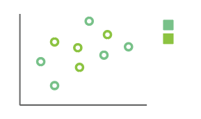
- Distinguishable hue. Our eyes are most sensitive to distinctions in hue, or chroma; this is usually the feature that is used to give colors a name. We need colors that are separate enough that users can easily tell them apart, even when they take up only a small space in a chart. There are two distinct colors in the chart below, but it’s really hard to tell them apart when looking at thin lines or small spots of color in a chart that doesn’t have a strong association between points in a series. Increasing the hue difference between the two colors (or reinforcing the colors using differently-shaped symbols) would help make them easier to tell apart.

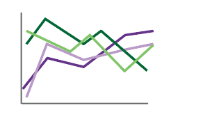
- to Reduce color groupings. When more than one color is present in a chart, people usually expect like colors to be related, creating associations that may not be accurate. Using distinct colors avoids creating unintentional groupings within the data. The chart below uses two color “families” – a green and a purple. All of the colors can be distinguished from one another, but people will tend to think that the two green and two purple lines go together, even if there is no actual relationship between the data contained in the chart.

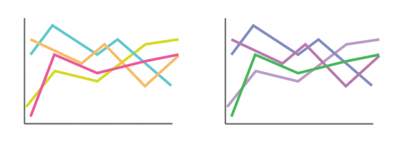
- to Keep colors related. Colors should feel like they belong to members of the same family; otherwise, colors that are less related than the others will tend to “pop out” as more important or different than the rest. In the chart on the left, the magenta is slightly more saturated than the rest, and is at the opposite end of the spectrum, so it feels different than the other lines on the page, giving it an importance that it maybe shouldn’t have. Sometimes this is what you want, and sometimes it isn’t, but you need to know when you’re doing it. The chart on the right is an example of how you might use #3 and #4 intentionally to indicate a series that stands out from the rest of the data in the chart, if you specifically want to highlight the difference.

- Accessible colors. Roughly 8% of men have some form of colorblindness, where the rods and cones in their eyes cannot distinguish some colors. Red-green colorblindness is the most common. Because color is so central to the meaning of data in a chart, it is especially important that the palette colors should be distinguishable by colorblind users. This helps to avoid confusion, and increasing accessibility is simply the right thing to do. The chart on the left shows two colors that look quite different to people who are not colorblind. Viewed through a colorblindness simulator, the distinction between the two colors is completely lost; both the orange and the lime green blend into a mustard-yellow, which makes the bars look like they’re part of the same series. Depending on where and how this happens, it could have huge consequences for how a user interprets and understands a graph.

- to Minimize simultaneous contrast. The human eye often perceives an unpleasant “vibration” at the interface between colors with a large amount of contrast between them. Minimizing this vibration improves legibility, makes a less painful viewing experience, and reduces eye fatigue. Colors need to have high contrast in order to be distinguishable, but not so much that they start vibrating in a chart. Reducing vibration can usually be accomplished by adding a common color to unify the two colors, or by moving one closer to the other.

- to Reflect our brand. Colors should be consistent with our company brand, aesthetically appealing, and present a bright, clean, modern feel. Colors should create a sense of energy and excitement in our product.
- to be Aesthetically pleasing. I think of the criteria above as the “first, do no harm” rules. This one goes beyond that. Colors should present positive emotional
connotations, be pleasing to look at, and make it easy and interesting for the user to read and understand the data.
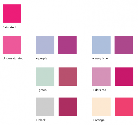
Within this set of rules, we can then begin making subtle adjustments that fine tune our color palettes to meet these different objectives. The color squares below show how subtle differences adjust the mood, tone, and value of a color, and allow us to adjust a palette to support our needs.


