Having the ability to make your own tools is one of the best things about programming. Recently, I’ve been working on color palettes for a data visualization application at work, and needed a better (and less manual) way than mocking up a bunch of alternatives in Illustrator.
I wanted a few very specific things from this tool:
- to explore all of the color space parameters and see their effects in real time
- a simple way of selecting colors based on these explorations
- a way of testing the success of these colors relative to our current application background color, both as large blocks of color and in a data visualization.
- an application that supports an iterative process of inclusion, exclusion, adjustment and search based on results.
I poked around for quite a while online, but none of the palette generator tools did all of the things that I wanted, so I decided to build my own. I used a combination of d3 and a lovely little color picker plugin that I used for an earlier project to do the color selection and mockups.
First, I had to choose a color space. I did some reading around online, and the LAB color space is supposed to be really good at two of the things that are critical for success in this particular color palette: it should be as color blind friendly as possible, and it should use colors with similar value to avoid unintentional emphasis on some data over others (mixing light and dark colors in a single visualization tends to make the light ones pop out and the dark ones recede, or vice versa, depending on your background color).
I wanted a palette-picker option, which would systematically vary the different components of the color space, and allow me to choose colors that I find visually appealing from a set of equally-valid options. I also wanted to be able to mix colors within the range selected, either adding a single color component uniformly across all selection samples, or as an interpolated gradient from one color to another. I hoped that this would allow for more subtlety and control in mixing palette options, rather than taking the dominant colors in the color space and calling it good enough.
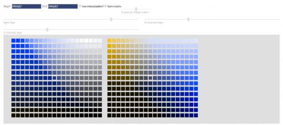
With these basic requirements in mind, I built the first part of my palette generation tool. The LAB color space has three primary channels: lightness (L), A (red-green) and B (blue-yellow). I wanted to make it as easy as possible to select colorblind friendly colors, so I chose to separate out the red-green and blue-yellow channels, hoping that I’d be able to use the blue-yellow range and half of the red-green range to build my palettes. I built a grid of squares, using a user-selected color as the center tile, and then increasing the lightness channel from bottom to top, and the A and B channels from left to right.
When I looked at these tiles using Spectrum (a colorblind simulation plugin for Chrome), I was surprised at how much overlap there was between the two channel palettes; it turns out that most people with red-green colorblindness have a lack of sensitivity light in that color range period, rather than just an inability to discriminate between the two colors. Seems like it might not be as simple as only using colors from half of the A channel (red-green) range.
I also added controls to allow the user to adjust the size of the step from one square to the next, and to choose whether to add a gradient from left to right across the palette, or to add a semi-transparent layer of a second color the tiles. These different options help to access colors that are otherwise difficult to find in this color space, and give a little bit more control when selecting colors.
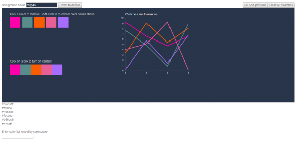
I also wanted to test how the color palette would function. I wanted to see the selected colors as a group, and to look at them side-by-side to see if there were any problems with simultaneous contrast. Finally, I wanted to know how they might look in a graph or a chart; sometimes colors that are really easy to distinguish as solid blocks are really difficult to tell apart when drawn as a thin line in a chart. So, I created a simple line chart with randomly-generated points, to see how the colors would look against the selected background color.
The color tiles are click-active, and remove a color from the palette when its square is clicked. This makes it very easy to add a bunch of colors, and then remove the ones that don’t work. I also added a rudimentary undo after a few minutes of deleting colors and immediately wishing I hadn’t. Finally, I printed a list of color values to the page, so that the user could copy and paste into another program when they found a palette that worked well. It didn’t take long using the program to realize that it would be much more helpful if I could also enter a list of values from a previous session, so I added that feature on as well.
With this basic set of functionalities, I started playing around with the program a bit to see how well it worked, and also shared it with a couple of colleagues at work who may use it for a project we’ll be working on later this spring. (More on that in the next post; this one is getting long enough as it is.)
Overall, I was really happy with the color selection process that this basic application supports. It could use a lot of work in terms of UX and UI, but the basic functions were starting to emerge, and the workflow was one I really liked. It’s certainly a lot faster than manual color creation in Illustrator, and allowed me to iteratively explore a much wider range of the color space.


