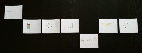
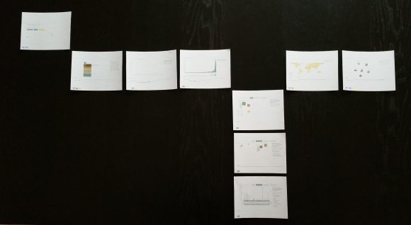
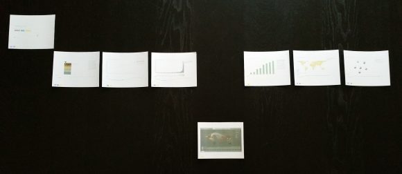
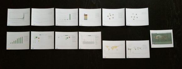
I thought it would be helpful to take a step back and look at the birds-eye view of the website content as I close in on feature lock over the next couple of weeks. I wanted to make sure that the narratives are balanced, that the level of detail is where I want it, that the structural pieces fit together to make the kind of experience that I want to create. I cut out screenshots from each of the website pages, and sorted them in different ways to get a better sense of how the project as a whole is distributed.
One reference that has come up over and over again as I discuss this project with other people is Charles and Ray Eames’ video Powers of Ten. This project spans many different levels of scale, and it’s important to help the user transition between them smoothly, and understand what the different levels mean.
Story
Soil is important at a molecular level, because it contains the nutrients plants need. On a microscopic level, it is populated with a huge variety of microorganisms that make up 25% of all species on the planet, are central to helping soil function, and that may hold the key to new antibiotics, information on disease, and a host of other things. At the macroscopic level, soil depends on local geology, is affected by its history of past use, and supports the plants that make the food we eat. Products from the soil are shipped globally, and it also has direct impacts on the quality of our air (through oxygen from plants, but also from methane and nitrous oxide release, among other things), and its role as a carbon storage mechanism makes it important for mitigating climate change as well. Topically, soil spans a wide range of scales, even before we get to the data visualization part of it. Each of the narratives that I chose to visualize walks through some subset of this story.
Detail
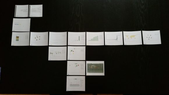
Sorting in terms of content depth, the project itself spans a pretty wide range. Starting out at the very top, I have general quotes and factoids for the Facebook group that are interesting but don’t contain a lot of information about the system as a whole. Then, there’s the index page, which gives an overview and identifies the different narratives that the user can explore, and the topics within each one. The next level contains the bulk of the visualizations for the site. Because this project is aimed at a general audience who might not want to fully immerse themselves in the data, it’s important that most of the visualizations are fairly simple, and easy to read and understand.
A few of the visualizations go one step deeper, allowing the user to see a simple data story, but also to ask questions about where it applies (to which ecoregions or countries), and the Land Use and Food Flow visualizations allow them to break that information down even further, to compare categories and look for patterns in the data. The Land Use visualization goes the deepest in terms of making quantitative comparisons of multiple variables at the state, region, or global level.
The Food Flow visualization takes the import and export data for a single country, and breaks it down into partnership relations. These can be further filtered according to category, to see differences in grain exports, for example, vs. meat. I aggregated the 1000-plus categories available in the original data into 20 to simplify browsing, but there’s still a lot of detail to be played with there.
Both the Land Use and Food Flow visualizations start out at a high level overview, but also provide the user with further filters and controls to allow deeper exploration. I expect that the majority of users will not spend the time to delve into these more advanced modes, but they are there for the people who are interested in more specific questions and more quantitative comparisons.
Comparing narratives
I was also curious about how the different narratives stacked up in terms of detail in the current version of the site. The soil narrative stays pretty high-level, partly because there isn’t a lot of detailed data available, and partly because introducing any detail requires introducing so much. It’s easy to understand that the soil community is made up of different kinds of microbes; it’s quite another thing to start talking about which ones are found in which layers of the soil, how they vary with moisture content, how microbial populations change along the length of a particular kind of plant root. In terms of information available, there isn’t much middle ground between very general and super-specific, and the information content reflects that. I chose to stay on the high-level view because of my audience, though my own personal fascination leans deep into the detail of this section.
The one exception that goes a tiny bit deeper into the soil data is the Ecoregions visualization, which shows data from a scientific poster that talks about global carbon reserves, and links it to the World Wildlife Fund’s designated ecoregions, to give users some sense of where those different carbon distributions might show up in the world. This additional level of detail and interactivity moves that visualization a little deeper into the information space.
The population narrative also stays mostly at a high level, and shares many of the visualizations from the soil narrative, as well. It delves really deep into population, land use, and food supply in the Land Use panel, but a user could easily choose to stay on the overview page and ignore those deeper layers of detail.
The food narrative follows along with the population narrative quite closely, but jumps down to the Food Flow data instead of focusing on land use. Food Flow really could populate either the third or the fourth level, depending on whether the user chooses to get into individual data categories. Since the option to go deeper was available, I chose to rank it on the lower of the two levels.
The data also has issues of scale associated with it. Most of the data I have is statistical information from the World Bank or FAO-UNESCO, which means that it’s available at the global and sometimes regional and state levels, and only a very small amount is available at a finer degree of resolution. The scientific study data, on the other hand, tends to focus only on a few examples rather than broad analyses of the whole globe.
Global vs local
Grouping the visualizations by their aggregation level makes this clear pretty quickly: the top row is data aggregated to a global level or general information that is not site-specific. The lower row contains the visualizations whose data is grouped by country. The Ecoregions and Soil Degradation maps go to a slightly less aggregated level, at least for the bigger countries, because they ignore country boundaries and focus on natural features instead.
Personal/Impersonal
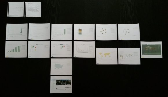
This one places the data in terms of its personal/impersonal nature. The quotes and factoids are at the top, with some interest but probably fairly small personal impact. Next comes the global statistics, and then the country-level statistics, where people begin to see distinctions between their situation and that of others around the world. Next, I put in the map with all the soil sampling locations that I’m collecting for the exhibition; this piece of the project begins to look at the heterogeneity of soil within a single country, and even within a single state. It also begins to incorporate the personal and the local, which is the part that has the most relevance and emotional resonance for most people. At the very bottom, core to the dialogue part of my thesis, is the Facebook group itself, where people can interact with one another, tell stories, and learn about this resource that we all should treasure.
