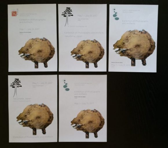
While my design synthesis class was working on finalizing the letterhead design, we also started working on a series of New Yorker ads for an art exhibit featuring photos and artifacts from our site. I was still trying to decide between a few competing logotypes, so I started out making a few sketches that used the different designs.
I decided to focus on artwork made from Yakusugi cedar as the primary artifact for the exhibit, because there were higher quality photos available, and because it felt more like an exhibit advertisement than photos of trees.
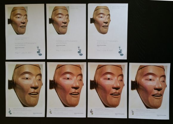
I also played around with different text arrangements and editing out the photo backgrounds.
And I experimented a bit with the weight of the photo vs. text on the page.
And I tried out a few of the different revisions I was working on to improve the river marks. (Click on the image to make it larger.)
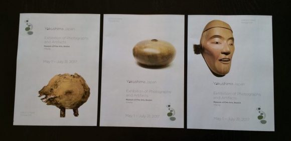
For the latest draft, I decided to use a very pale green fill to cover up the yellow gray page color of the magazine, and settled on the 5-stone version of the river mark, with the green stones. I also experimented with including the logotype on the page, but I think I’ll probably switch back to the plain text for the final version. I also arranged the series in the wrong order for the photo – the face should come first, followed by the other two, to make a more dynamic balance of photo placements in the series.


