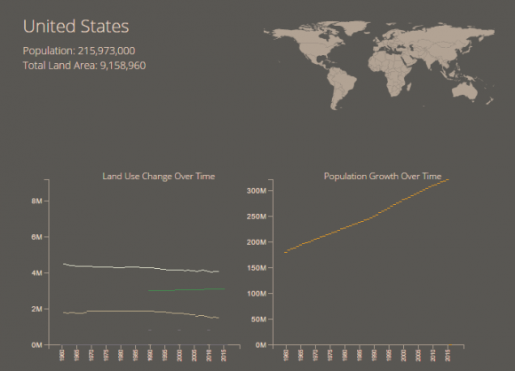
Working on the flower animation for the land use data in my last post brought an important issue to the forefront: data completeness. While working on my initial sketches and reconsidering the structure of the visualization that I wanted to create, I was also working on collecting data for all of the different metrics across multiple years. I assembled land use and population data from the World Bank Development Indicators database, for all years available in the time period measured, between 1960 and 2015.
When I began examining this data more closely, it became clear that the datasets had
very different levels of completeness. Forest data was not collected at all before 1990, and for some countries was not collected until much later. Urban data is only collected every 10 years.
There is fairly good continuity for agricultural and arable land, and for population statistics,
but it was clear that I would not have access to all variables for all years. I mocked up a simple dashboard in d3 to begin exploring the data and looking for trends.
It immediately became clear that there would be problems with any visualization that attempted to show all five land use categories (forest, agricultural, arable, urban, and other) for each year. Urban data is only collected every 10 years, and the coverage is often spotty. Forest data has only been collected since about 1990, which would limit the longitudinal span of the data. Since many of these trends take place over fairly long periods of time, it’s important to have as many years as possible represented in the data, but the issues with data coverage undermined the idea of using my original square glyphs (or some adapted version of them) for the entire time period. In the end, I removed the glyphs altogether from my later versions of the dashboard.
It was possible to begin seeing some differences between countries (look at change in forest area, for example) using this primitive dashboard, but Mauro really didn’t want me to work on a dashboard in his class, and suggested that we look for a new dataset that would be more amenable to visualization. I was still committed to finding a way to include the land use data in my soil website, but decided to shelve this piece of the project until a more opportune time, and to focus on a dataset that both Mauro and I could be excited about.


