This project was completed as part of a homework assignment for my Special Topics in Data Science – Data Visualization (CS7280) class taught by Michelle Borkin in the fall of 2016. The assignment was to create a visualization using a dataset of interest to us, and to create three linked views, at least one of which included brushing.
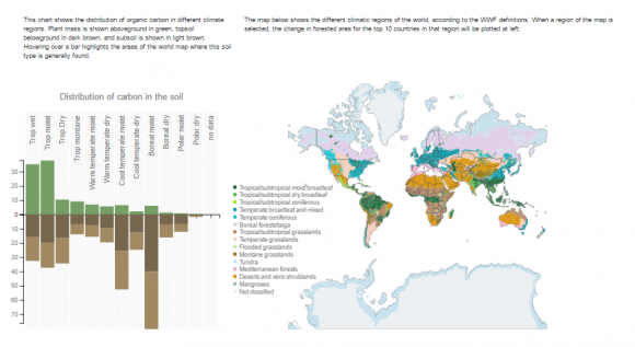
Since it was pretty certain that my soil project was turning into a thesis at that point, I chose to use this assignment as an opportunity to update one of the visualizations from my Research Methods soil poster. In the original poster, I presented a bar chart comparing the amount of carbon in living plants with the amount in the soil for different kinds of ecoregion around the globe. This data is particularly interesting to me, because the distribution is not what one might expect.
Tropical rainforests do have the most aboveground carbon, consistent with lush plant growth in a warm climate, but it is the northern boreal forests that have the largest amount of stored soil carbon. Since the purpose of this graphic is to emphasize the importance of soil as a carbon storage mechanism that can help combat climate change, it is interesting to realize that it is actually the cooler regions of the globe that lead in this regard. I thought that it would be interesting to link the bar chart with map data, to help users understand which regions of the globe each bar relates to, to create a better understanding of the geographic distribution of soil carbon.
Unfortunately, this is not trivial. Like soil, ecoregions are defined in different ways by different groups, and the definitions do not match one to one. The scientific paper that presented the soil carbon data states that they use the IPCC climate regions definitions, but gave no specific conversion between those definitions and the labels in the chart. The names for the labels seemed to match several other nomenclatures better than the IPCC standards, so it’s possible that there is an error in the original paper. The paper references data in the Harmonized World Soil Database, which was named similarly to the FAO ecofloristic zones, so I used these values to map onto the ecoregions listed by the World Wildlife Federation (WWF). I downloaded map data from the WWF website, and created an array that linked the WWF data to the bar chart data as follows.
The map data was exported as .shp files, and converted to geoJSON using mapShaper, a free online map conversion tool. All paths were simplified to 2.5% to reduce the number of points that needed to be projected by the browser in order to draw the map. The map outlines come from the Natural Earth database, and are drawn as SVG shapes on top of the Canvas element, to allow d3 mouse selection
and brushing behaviors.
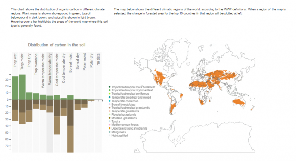
 All 15 WWF ecoregions are shown on the map. When a user hovers over a bar in the bar chart, the map updates to show only the ecoregions associated with that bar, allowing the user to see where on the globe those ecoregions are located.

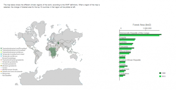
If the user selects a region on the map, then the application displays a list of the top 10 countries in that region, and shows their forest land area for both 1990 and 2013. This allows the user to search for trends in the amount of forest area change within a particular region during that time.

In future, I plan to split these visualizations into two separate graphs. They were included in a single, linked view in part because of the specifics of the homework assignment, and partly because I hoped to create a direct bridge between the soil carbon storage and deforestation. In practice, though, I think the dual action of the central map—showing ecoregion coverage in one mode, and selecting country deforestation data in the other—is confusing. The ecoregions do not fit neatly within countries, and each country usually contains more than one ecosystem, so it is difficult to make any quantitative comparison from one end of the graphic to another. I think that each half of the graphic serves a useful purpose, and that they’d be better off split in two for future versions.
A screen capture of the visualization is included below, or you can view the live version in Chrome.