I’ve been taking a Sketching with Code course with Noah Paessel this semester. Most of the course content is pretty basic, since most people in the class haven’t done any coding at all before. But I’ve also found the open-ended assignments to be a great opportunity to stretch in different directions with my code.
This is the first week of the semester where we’re allowed to use libraries; up until this point, everything has been done in HTML, CSS, and canvas. At first, I was running into things that I use libraries for all the time, and it was a little frustrating to hand code everything that I usually take for granted. As the semester has gone on, though, I’ve found it really helpful to code in Javascript straight up. Not only does it help me to appreciate the libraries that I do use, it’s also helping me to lean into areas I hadn’t explored before.
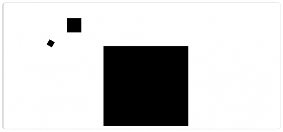
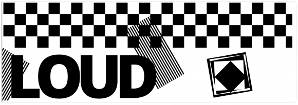
We started out the semester playing with CSS and HTML styling, and I learned about CSS animations and using flexbox for alignment. I also played around with random numbers We played a bit with typography, and did some simple graphic design exercises in composition.

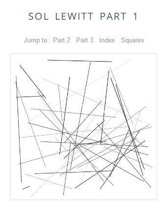
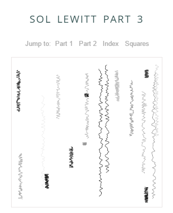
Then, we did some computational art, inspired by Sol Lewitt, and I used this as my chance to experiment with animation frames. (See the live versions here.)
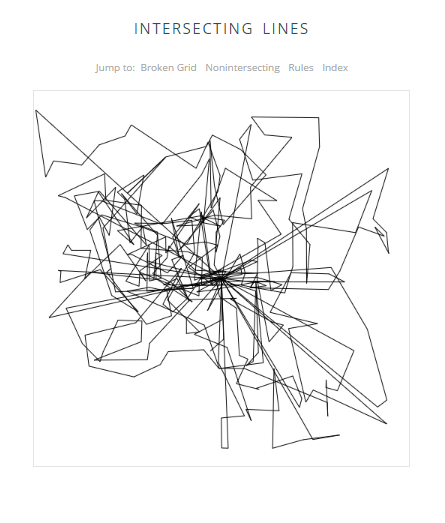
In the next assignment, I built a basic random walker, and used it to make a series of connected lines inside the bounds of the canvas.
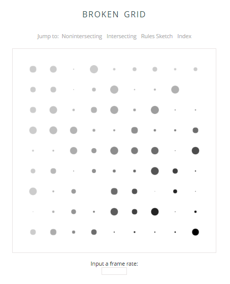
Then I started playing around with accepting user input, and updating my code sketches to match. The first was an animated broken grid with more random numbers, where the user can change the frame rate.
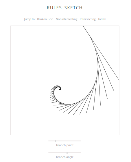
And then came what I think might be my favorite piece so far this semester. We needed to make a rules sketch that would draw something based on a simple set of rules that we defined. I chose to make mine fully parametrized, so that the user could set values for each of the values that determine the drawing.
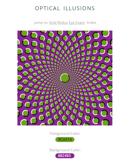
I continued with the input theme the next week for our optical illusions piece, kind of the visual opposite of the rules sketch, as loud as the previous one is quiet. For this illusion, use of two competing colors cause the image to spin. It was also a fun exercise in deciphering circle packing geometry; the construction is really quite simple, if you can stop it from spinning long enough to count! I did use a library called jscolor to allow the user to change the color values and see how that affects the speed of the rotation.
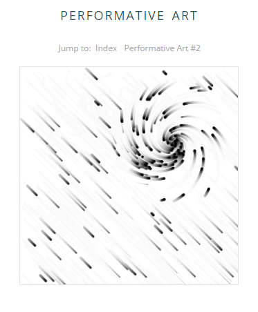
Last week was a performative art assignment, where we needed to use mouse input to allow the user to interact with the drawing. My first sketch was a stream of particles, falling like rain. When the user mouses over the canvas, the particles swirl around the mouse, creating a vortex.
I tried a bunch of different things with this animation, but didn’t quite get it to where I wanted to be. I was pretty happy with the rain in the background, but still don’t quite love how the mouse interaction works. I think maybe a more gradual application of gravity would work better here.
One of the reasons that I tried the particle system was that I was thinking about using particles for a different project in another class. Even if this assignment wasn’t particularly successful, the exercise gave me a chance to develop a particle system and give it some behaviors, which fed into my ideas for the other designs.
The second performative art piece turned out a lot better. This one is another take on falling rain, except this time it uses the mouse motion to generate ripples. I had planned to add music to accompany the bigger drops, but didn’t find midi libraries simple to use. Still, I think it’s really relaxing to play with this piece, and am very happy with how it turned out. There are lots of invisible details in there that make it feel realistic, and I just enjoy watching it go.
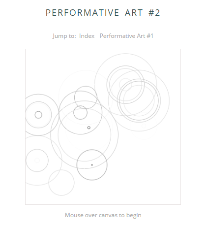
In an updated version, I think I would add an auto-play using a random number generator to make the piece more interesting before the user interacts.
This week, our task was to create a simulation, of anything, using code. Inspired partly by the botanical feel of my earlier rules sketch and partly by my walk home from the train the other day, I thought I’d try simulating the growth of trees. I found a great book on the Algorithmic Beauty of Plants that I can’t wait to dig into when the semester is over; that kind of programming is really appealing to me.
In preparation for the project, I did some reading on L-systems (recursive systems that “rewrite” part of an array each time the code is written) and turtle geometry (who knew turtles were mathematicians?), and translated a Koch snowflake example from p5.js to plain Javascript and canvas, just to get my feet wet. That gave me a reasonable handle on what the more theoretical discussion was really talking about, and then I went ahead and started building my own model to play with.
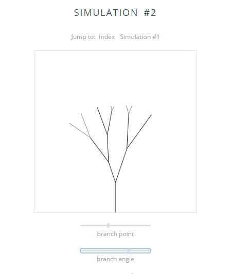
I based the final version on a simple 2-way branching system, and again exposed all the relevant parameters for the user to control. It’s really fun to adjust the branching point and branching angle, and see what happens to the tree. I also added a randomness factor, which the user can scale to include as much or as little randomness as they like. With a lot of randomness added in, the branching becomes nicely asymmetric, and even begins to resemble a real tree.
Overall, it’s been really fun to work on these small sketches every week, and it’s definitely had impacts elsewhere in my work as well. I hadn’t really explored the canvas at all before this semester (besides using it in my summer internship project, which I’ll talk about later, I hope), and it’s been fun to play around and see what it can do. It’s also been useful to get a better understanding of plain javascript, without all the layers of libraries thrown in. Working through these simple examples has also given me a better understanding of alternate approaches to code for other projects I’m working on. I love the weekly practice of taking small risks and learning just one or two new things, and designing within constraints; it has really helped me develop my code, and I’m beginning to sense a bit of a design aesthetic in there, too.
