This post is part of a series of posts about work that I did at the RISD Summer Institute for Graphic design in June/July of 2016. The class was Introduction to Typography, taught by Ernesto Aparicio.
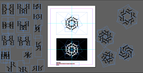
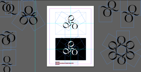
This assignment was a classic typography exercise, and a lot of fun. We needed to choose a single letter, and play with symmetry and composition to create an interesting form. The strongest of these could theoretically be used as a logo, or as a simple design element made from text.
A love of symmetry was one of the things that drew me to crystallography (the symmetric arrangement of atoms and molecules is what gives crystals their properties, and the loss of this symmetry was the topic of my PhD thesis), so it’s no surprise that I had a lot of fun with this assignment.
I didn’t want to get caught up in over-analyzing such a simple assignment, so I chose to do a lot of rapid prototyping instead. I think it’s really important to iterate between carefully controlled, precise work that focuses on perfection in form, and a looser, faster, more gestural style that gets out of the analytical realm and into play/instinct. To help myself switch modes, I played a little improv game with myself and just said “yes” to whatever suggestions my mind came up with. I’d start out with one sketch, and then wonder what would happen if I tried this other thing. So, I’d make a copy, and immediately try it out. Sometimes it worked, sometimes it didn’t, but as soon as the idea was sketched out, I dropped it and moved on. It felt kind of like a warmup exercise for playing the piano, or at the start of a run. Nothing was supposed to be perfect, didn’t matter if things made sense or not, I just tried things out and kept going. When I started running out of “what ifs” for a particular letter, I chose another one almost at random and started again.
For each letter, I generated a bunch of different forms very quickly, and then went through and chose the ones that I thought were the best. I took those and went through the different options with Ernesto to choose the ones that he felt were strongest and the most aesthetically interesting of the lot. And then, I went back to those sketches and obsessed over every pixel and tiny detail. It was really interesting to see all of the tiny little details of a letter, to watch how one part plays off of another, and then to try to recognize what makes a strong final design.
The final versions are here, if you want to see the finalists.


