It seems I never posted about my ID Studio 2 semester project. The guidelines were very broad: we were given the option of several social media sites, and asked to choose a visualization project using data from that site.
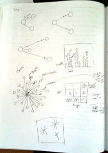
I chose to work with data from Twitter, because I thought it would be interesting to watch conversations evolve over time in a person’s social network. I also suspected that “conversation” on social media might have several different interpretations, depending on the particular users involved, and the context of the conversation. I was hoping to detect patterns in the Twitter conversation tree based on these different conversation styles.
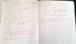
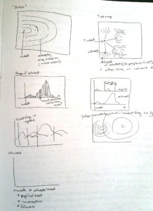
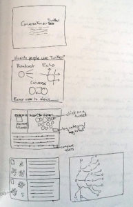
My early sketches focused on watching a set of messages extending out from a single user, with some supplementary graphics to help analyze the patterns.
Unfortunately, I ran into problems almost immediately. To say that Twitter doesn’t make it easy to view conversation trees is a bit of an understatement. In order to watch a conversation unfold, I would have to write an API query that ran for the period I wanted to examine, and then update the search terms every time someone new “spoke” to my primary user of interest, so that I could include this new person (and related tweets) in my tree. I would only be able to use pre-collected, and pre-processed data, and that wasn’t really consistent with finding and exploring interesting patterns in the data.
Instead, I decided to focus on the number of times a particular tweet was retweeted, since that’s a statistic that is readily available from the API.
I started out with a static dataset collected from the Rest API, and then switched to a live query through the Streaming API once the development was mostly finished. The streaming version required me to modify a PHP script that I found online, which I then stored on my personal web server and accessed from the visualization when needed.
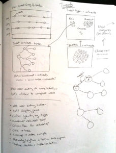
Instead of showing users as the nodes in a conversation tree, I ended up visualizing a single user, and looking at the different types of tweets that they sent instead. I also wanted to be able to explore their conversation history as a timeline as well as a collection of tweets. Working within these constraints, the visualization structure began to take shape.
My early code sketches were really simple. I started out drawing a circle for each tweet, and a satellite circle for each retweet. Because I wanted to leave the conversation tree option open as long as possible, I used a treemap to add the satellite circles as child nodes.
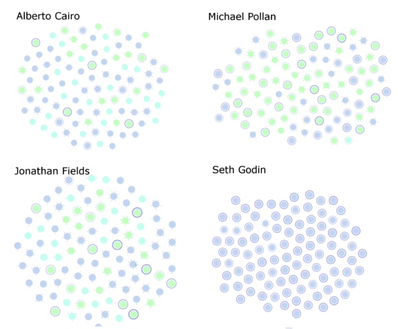
Even with this simple visualization, I started to see encouraging differences between users. Alberto Cairo is a designer, Michael Pollan an author, Jonathan Fields an author, podcaster and internet entrepreneur, and Seth Godin an author and internet guru of sorts. In this version, light green circles represented retweets, purple represents new tweets, and aqua @replies. The satellite circles (which often look like rings for tweets with a lot of retweets) show how many times a user’s tweet has been retweeted.
Cairo and Fields both have a fairly large proportion of @replies (aqua), indicating that they participate in conversations by directly replying to other users. Pollan’s @replies are lower; he mostly tweets his own thoughts (purple) or retweets others’ posts (green). Seth Godin uses his twitter account only to broadcast his blog posts, and never interacts with other users on this account.
One of the most immediate things that popped out (to me) is that the best way to get your tweets retweeted is to forward along something that’s already going “viral.” People with small user bases almost never get retweeted for what they themselves day, but instead for echoing something that someone else has said.
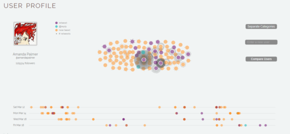
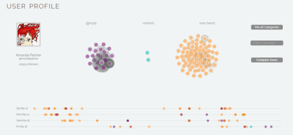
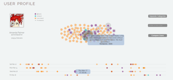
In the final version, I changed the representation colors to something easier to distinguish and spread out the satellite nodes to take up more visual space rather than forming a solid circle.
I allowed the user to toggle between viewing the tweets separated by category and as a more holistic overview.
I also added in a timeline, and mouseover behavior that links the timeline and main visualizations, with tooltips that show when the user clicks on a tweet.
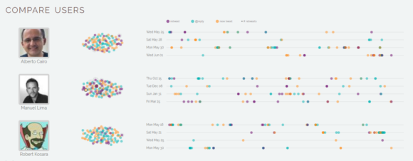
The “compare users” page allows the user to look for patterns between different Twitter user profiles.
The live version is here. (It’s a bit slow when there are lots of retweets, and the animation occasionally freezes while rearranging the circles. If that happens, click on any circle and drag it to unstick the animation – I need to get in there and add a callback function to keep the force layout minimization from being interrupted. Edit: I believe the callback issue is fixed now; if it happens again, I’d appreciate hearing about it, since it’s an intermittent and hard-to-reproduce issue.)
The project didn’t end up quite where I expected when I started out, but it did give me a chance to learn about API queries, HTML forms, and to practice implementing linked visualizations in d3. And, it’s interesting to look at the differences across users.
