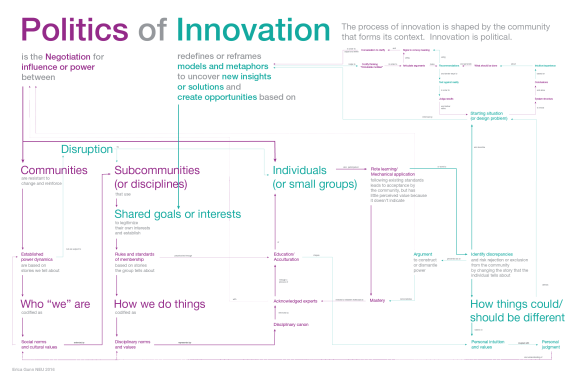
We’ve been working on drafts of our final poster for my design theory class with Hugh Dubberly over the past few weeks. The assignment is to create a concept map of our own synthesis of some aspect of design, and to present it as poster form in lieu of a term paper.
It’s an interesting challenge from an information visualization standpoint, because it requires that we present a complex argument in a simple visual form. In order to have the substance of a term paper, it’s necessary to keep the detail of the argument, but a poster requires a somewhat simplified design.
My first draft focused on finding the structure of my argument: that innovation happens within the context of a broader community, and is therefore political.
In our class discussion, it seemed that the ideas themselves were pretty clear, but the presentation was hard to follow without reading all of the individual pieces (not a surprise…I knew I hadn’t added a lot of hierarchy yet). I also wanted to emphasize the different levels of social organization: the chart is divided up into three sections, showing dynamics at the community, subcommunity/disciplinary, and individual levels. In the second draft, I added color fields to separate the different social hierarchies, to help draw connections across the different regions of the chart.
People did see the connection between color and the title, but were confused about words that crossed boundaries. They also didn’t connect the large text terms with a title for each color field, and so had difficulty interpreting what the different fields meant. In thinking about my model more carefully, I decided that it actually doesn’t make sense to separate politics and innovation into different color domains, if the argument is that the two are intertwined.
In latest version, I went back to plain text, condensed some of the steps in the diagram to reduce crowding and visual noise, and used the extra space to increase the size of key words. I also went through and removed words that seemed like they wouldn’t have meaning to people outside of the class (replacing boundary objects with shared goals or interests, etc.). It’s not clear who the audience for this poster is, but I’d prefer for it to make sense to someone who hasn’t spent a whole semester studying design theory.
I think this version is starting to feel cleaner, and I hope that the bigger picture meaning is starting to emerge. I’m not happy with the heavy teal arrow cutting through the text, and I feel like disruption is a little crowded in its corner, but those elements are pretty heavily constrained by alignment with the title, and I haven’t found a better solution yet. I’d love to blow the whole thing up by 50% to open up more space, but the final size is given in the assignment, so I have to work within these constraints. I could do that by making the text smaller, but it’s supposed to be readable from across the room. The lower left corner does still feel a little crowded to me, but otherwise the visual balance seems to be evening out.
I think it was helpful to condense the multi-step sequences, and to bring up the weight of the main arrows and subhead text. I’m not sure that it’s finished yet (and I know there are lots of micro-adjustments to be made), but it’s progress, I think. We’ll see what Hugh thinks when I turn it in!


