My Design History class with Paul Kahn got me very interested in the early 1800’s as a period of design innovation. People has access to public data and statistics tools for the first time, and developed a host of new tools to visualize this new kind of information. William Playfair invented bar and pie charts, Andre Michel Guerry began mapping crime rates and other statistical data, among others. This period of rapid innovation occurred as a response to a new technology (statistics), and a different kind of information (publicly collected census data).
I’m interested in deconstructing the process of innovation itself, but I am also interested in this period because I think it parallels the current state of information design. Data has never been more open or more readily available, and as we accumulate new mountains of data we need new tools to help us pull the information out of the noise. I was really interested in Paul’s class as an opportunity to look backward for clues about how to move ahead.
My Design Theory class with Hugh Dubberly picked right up where Paul’s class left off – we watched a TED talk by Manuel Lima on visualizing complexity, and looked at several examples of how to conceptualize networks. The main point that I took away from our first weekend seminar was that the internet has not yet reached its full potential – early pioneers envisioned it as a web of knowledge, and we currently use only a piece of that. Machine learning and computing power have now advanced enough that we can begin assembling discrete webpages into collections based on the user’s needs, and we’re approaching the point where we could actually begin to take advantage of the full power of a networked system.
But no one knows how. Hugh’s challenge to the class was to think about how we can develop the tools needed to graphically represent networks.
Hugh and I have been communicating by email, and he asked me how I would visualize a network. Of course, I don’t have an answer to that, but I have started picking at the question, trying to figure out the shape and texture of it, and what kind of answer it might need.
First, I thought about the characteristics of networked systems, with their complex, interdependent relationships that are almost impossible to decode at a glance. This obstacle is my primary objection to most of the “network visualization” work out there – the resulting graphics are so chaotic that it’s impossible to get more out of them than a general sense of “whoa, that’s complicated.” And sometimes beautiful. But understandable? Not so much.
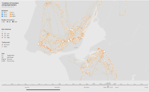
So how do we make networks understandable? My mind keeps going back to a beautiful animation that Pedro Cruz showed on the first day of my Processing class last week. It’s a map of all the shopping centers in Portugal, and it’s animated so that you can see people moving through their shopping routes. Not surprisingly, the summer holiday and Christmas shopping season maps show very different kinds of patterns.
The visualization itself is very simple, but the behavior it shows is quite complex. You can see multiple paths and loops establish themselves, and you get a very clear sense of how dynamic the motion is. A snapshot wouldn’t have been nearly as effective, because you wouldn’t be able to visualize the flow. So, item #1 on my list of properties is that network graphics should include information not just about connections between nodes, but also about the flow between nodes, because that’s where the real story lies.
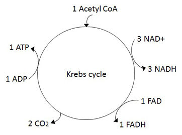
My mind also keeps coming back around to biological cycle diagrams used in textbooks to teach the Krebs cycle, respiratory cycle, etc. (Image below from study.com)
Each of these cycles represents a single component in the network of processes happening inside an organism, and it focuses on that one component only. Other parts of the network are reduced to inputs and outputs, indicated with little arrows joining and leaving the cycle of interest.
The ability to change focus from the network to a single component also seems critical. A network representation should allow users to see just one part of the network, or to step back and see the whole. Users should be able to change both the breadth and depth of the graphic (or in a static situation, you should include multiple views that represent the scope of the network, as well as particulars of the subsystem of interest).
Biological cycles focus only on one piece of the network; to see the full scope, you’d need to include interactions between cycles. Here I’m thinking of a series of coupled cycles, all interacting. Rather than have mysterious arrows appearing and disappearing from nowhere, the diagram could show other processes that are related to the first as their own separate but interconnected cycles. Now we’re beginning to get into the territory of coupled equilibria, which could be viewed from the perspective of chemical reactions. This expansion beyond a single cycle causes two problems: first, it requires a more sophisticated treatment of time. Second, it also requires that we figure out how to cleanly visualize connections between cycles.
If you were to try to describe all of the chemical reactions taking place in a biological system, you would immediately run into the question of time. On what timescale should you show the data? What detail do you include in the cycle? Some chemical reactions take femto- or nano-seconds, others are much slower. Biological events tend to take place on the order of seconds, hours, or even days. To actually represent a biological system, you have to account for this fact.
Since we’re talking about dynamic equilibria, the progress of each reaction will depend on the output of other reactions. If you think about it as a complex system of gears, each cycle is represented by one gear. Big gears turn slowly, and small gears turn quickly. A small gear has to turn many, many times before the big gear ticks forward a step.
If you look at the system on a timescale of the little gear, the big gear doesn’t seem to move at all. If you use the timescale of the big gear, the little ones become a blur of frenetic activity. Even a very high level view of biological cycles runs into this problem immediately. You breathe something like 10 times per minute, and your heart beats about 80 times in that same period. If you think about measuring the diurnal variation in your heart rate, you’re suddenly talking about a 24 hour period with 115,200 heart beats in it. Timescale matters.
I want to come back to this point in relation to a discipline that is constantly grappling with the treatment of time: geology. But before I do that, I want to take a brief detour into the world of linguistics.
We are reading an excerpt from Ferdinand Saussure’s Course in General Linguistics for Design Theory this week. In addition to laying out his theory of signs as a tripartite relationship between a concept and a sound-image (the combination of an idea of an object and the sound that represents it), Saussure goes into great detail about the fundamental nature of language and how to study it.
He divides the study of language into two pieces: study of the language as it is spoken at a particular point in time, and study of how the language evolves over time. He argues that these two perspectives must be kept strictly separate in order to do valid linguistic research. Saussure also grapples with the problem of defining scope: because the language is constantly evolving, it isn’t possible to take a perfect snapshot that truly represents all of the language at any one time. Once you’ve chosen your time interval, you have to accept that some of the details in your snapshot will be blurry.
Still, it is profoundly useful to separate evolution with time and interactions at a particular time into two different axes, so to speak. Studying the first becomes the task of following change through time, and the second maps out all of the moment-to-moment dynamics. Each process informs the other, but they are also functionally separate (no one relies on the original etymology of a word to determine how to use it today – in a sense, the history of a word is divorced from its current usage. “Cool,” “hot,” and “gay” seem like appropriate modern examples of how usage changes meaning, even in relatively short periods of time).
It seems to me that this principle applies to network visualization as well. You can choose to visualize the state of the network, or you can track its progress over time. Animation allows you to do a little of both, but in order to extract meaning the user will probably want to slow down the frame rate and compare evolution of snapshots across time.
Hugh presented a graphic representing terrorist networks that did exactly this (image from http://skyeome.net/wordpress/?p=30).
This diagram focused on the evolution of active terrorist networks, and used snapshots that depict the network at specific times as a way to add contrast and context.
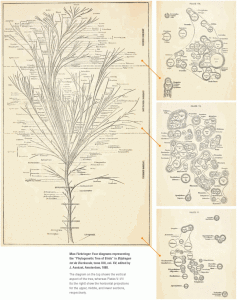
Skye also showed a graphic in class that seems relevant – a “tree of life” showing species evolution through time, accompanied by a cross section of the branches to show snapshots of species prevalence at a particular point. Here, the snapshots were used to document the tree at a particular “height,” but didn’t necessarily show interaction between the nodes at any point in time (at least I don’t think they do…the reproduced image is not high enough resolution for me to read the details). (Image from http://phylonetworks.blogspot.com/2014/03/trees-treemaps-and-networks.html?m=1)
A similar question arises in the book Time’s Arrow, Time’s Cycle by Stephen J. Gould. Paul recommended this book to me last semester, and I’ve been slowly working my way through it. Gould examines seminal works in the field of geology and argues that the early theories differ more profoundly than is usually believed. Rather than focusing on the specific details and mechanisms of the theories, he steps back and differentiates them according to their varying conceptions of time.
Some theories argue for a single, unidirectional “arrow” of progress (or decay) through time. Creationist theories (sometimes) envision a perfect work of creation that is consistently degraded and worn down by time. Evolutionary theories – often implicitly, sometimes explicitly – point to an advance from “lower life forms” to “higher” ones, often positioning humans at the apex of this climb.
Others take a more cyclic view. These theorists recognize that mountains can both erode and be made through a process of continuous geologic cycles. This view would suggest that, on average, the earth is a system in stasis, and events that we consider cataclysmic are really just phases in one long, continuous cycle. Strictly held, this viewpoint says that there can be no progress; only endless repetition of the cycle.
Pushed to the point of absurdity, the cyclic view says that anything that currently exists on earth has existed before, in some previous cycle. This extreme view was lampooned in a cartoon drawn by Henry de la Beche, poking fun at Charles Lyell, who sometimes took the idea of geologic cycles a bit too literally. (https://www.tumblr.com/search/henry%20de%20la%20beche)
In their more moderate forms, both views find support in religion, and in science. Working out the fundamental relationships between time’s arrow and time’s cycle was seminal to understanding change on a geologic timescale, and shaping our models of progress and change. Overlaid with a more moralistic tone, this debate seems to underlie much of out social and political rhetoric as well.
Gould’s point was that each author, in developing his theory, had to choose between these two structures as the frame of reference for his model. That choice drew deep and sometimes impassable distinctions between the different models. Similar to Saussure’s choice of evolution-through-time vs. snapshot-in-time, Gould’s observation gives us a useful distinction for thinking about how to visualize complex relations.
Time’s arrow is more of a narrative approach, which sometimes oversteps itself in its need for a conclusion. An origin story might put humans as the proud product of evolution, but nature will likely keep right on going, in its blind, directionless path through time. The cyclic narrative focuses more on description and interdependence, pointing out the connections between events. It can also become deterministic or mechanical it the theory fails to account for random change.
This brings me back to Saussure, who says that the fundamental feature of language is that it is arbitrary. It is a set of conventions agreed upon by a community, and so is naturally resistant to change. No one person can completely change the language and hope to be understood. And yet, people change language all the time. The very process of speaking forces the language to evolve, as the process of living does for a species (that last is my addition, not his).
In order to be stable, a language must be immutable, and resist change. But in the very act of using it, people invent new ways of speaking, and so the language changes constantly. These conditions occur only when the system itself is completely arbitrary. There is no fundamental reason for French to be better than English, or English better than the proto-Germanic tongues that it came from. The only thing required to make a language “valid” is for people to agree to speak it. That social agreement is based on culture, history, and what people’s parents spoke – at root, a completely arbitrary set of circumstances. We can map out cause and effect to understand how linguistic change happens, but there is not a deterministic criterion that can tell us which words will change next.
What does all this have to do with network graphics? I think there are fundamentally different ways to visualize networks, as well. One approach is to follow the story of a particular actor, or node, and map everything else as inputs/outputs for that central narrative. Viewed unidirectionally, this gives us the standard tree diagram of interactions branching from a single, central trunk. These interactions become more and more bifurcated with time, as the map extends into deeper and deeper layers. Like a view of evolution focused on the descent of man, this approach favors one particular narrative and runs the risk of excluding everything else.
Another option is to look only at connections – to try to make explicit all of the components at play in a complex system. This view is certainly more complete, but it is not always helpful – it can often be difficult to know what to take away from such a complex graphic.
As designers, I think we need to figure out how to walk the line between narrative and complexity – how do we create ways for people to interact with the full interconnectedness of the system, but still emerge with a narrative insight that can be stored for future use? To me, this balance is at the heart of designing a useful network graphic.
We already have several variables at our disposal:
- Structure – nodes and links that show connections between ideas
- Flow – transfer of information between nodes as a function of time
- Scope of the graphic
- breadth and depth of the network structure to reveal
- time
- scale on which to measure
- axis to consider – evolution over time, or snapshot in time?
I would propose that we need to add at least one more item to the list: a concept of space.
When I first started thinking about mapping complex systems, weather maps seemed like a good place to start. These graphics take complicated interactions between abstract ideas (temperature, topography, wind, etc.) and turn them into visualizations of trends. Rather than presenting every piece of information for every weather station on a spot map, meteorologists add another layer of abstraction to the data and present trends across larger areas. This reduces the complexity of the graphic and makes patterns more readily apparent.
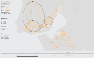
The same could be done for traffic flows in Pedro’s traffic graphic. Rather than animating the motion of shoppers, he could produce a still image with arrows to represent flow. (The arrows are mine – hopefully the authors will excuse my defacing their graphic to make a point.)
Both of these examples rely on a concept of space to be meaningful. Viewers don’t really care about the motions of high and low pressure systems in the abstract – they care about whether or not it will snow in their neighborhood tomorrow. Similarly, Pedro’s map loses a lot of its interest if you remove those summary arrows from the landscape that they derive from. Now, instead of a story about where in Portugal people do their shopping, you have a graphic that says people go first to one store and then another, in a set of quasi-circular routes. That may be helpful, depending on your research question, but it may not. In both of these cases, adding a spatial dimension provides context and enhances the relevance of the graphic to the reader.
But what about systems that have no inherent spatial component? Biological cycles and chemical reactions have no set positions in space. Skye’s evolutionary tree imposes spatial relations on a dataset that otherwise has none, and uses that distinction to indicate the relative abundance of species as a function of trunk size. So, space can be useful for encoding another layer of abstraction.
It can also cause problems. Once you represent a set of nodes in space, you have to figure out how to show the connections between them. Clarity requires that you minimize crossings to whatever extent is possible. Failing to untangle connections or graphing them without establishing hierarchy between them is what makes a lot of network graphics look like hairballs. (I have no idea who coined that term, but the folks at Fathom use it on their blog, and I love it.) Too many connections, and you end up with a messy, unappealing blob that doesn’t convey a lot of meaning.
This seems like the biggest challenge in network visualization. How do you display enough data to fully represent the complexity of the system, without turning it into a hairball?
Here, I think the concept of space can help us. There was a family of rabbits in my back yard when I lived in Madison. In the winter, you could look out the window and see a complicated network of trails across the back yard. Sometimes the trails connected one rabbit hole with another, and sometimes they didn’t. But even if the trails didn’t connect, it was still perfectly intuitive to imagine that the same rabbit made both sets of tracks. You just had to realize that there are times when the connection happens in the yard, and times where it happens underground. The kinds of connections that you map out depend on the spatial layer that you observe.
We noted a similar shift of perspective in Paul’s class last semester when we studied maps of London around the time that the Underground was built. Early maps emphasized street-level landmarks and access points for the Underground were minimal, incidental additions to the map. As the Underground grew in importance, the maps came to emphasize the stops and train connections of the rail system, and both the geography and city landmarks became less important. Codifying information into discrete layers that can be visualized as separate strata offers an attractive option for keeping complex systems navigable. Rather than showing connections on both layers simultaneously, graphics can focus on one layer at a time and use smaller indicators to show connections that allow access to other layers.
This approach does involve some narrative bias, since the designer has to choose which layers to show, which connections to emphasize, and how to show relationships between the layers. Still, simplifying the diagram makes it more useful, since the user now understands how to approach the information and can choose in which direction to explore.
I’m sure that there are more variables to consider in this complicated question, but that’s my first take: structure, flow, scope, and use of space to create layers of information. It will be interesting to see these ideas develop new branches (or is that nodes?) as I apply new ideas and theories to this very basic model.


