The third project of the semester for my ID Studio class was to make an atlas page (of any size) to visually show economic information for a country. We were given a page from the Economist magazine, and asked to create a graphic containing the following information:
- The country in the continent
- 5 major cities
- 5 nearby countries
- Size in relation to US states
- Population in square km, compared to Bangladesh
- Population relative to 5 nearby countries
- Population change every 20 years since 1900
- Population under 15, between 15 and 60, and over 60 (in relation to the total)
- Percent urban population
- Top 4 exports relative to the total
- 4 main export destinations and percentages
- 4 main origins of imports
- Energy consumption relative to the US (total and per capita)
- Historical timeline, with a minimum of 20 dates and 4 images
- Top 10 agricultural products, and quantities of each
- Television, radio, newspaper, and internet users per 1000 people
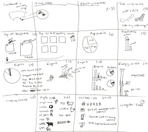
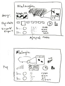
I was assigned to Malaysia, and began as I always do: gathering all of the data together, and trying to get a sense of what it looks like. I started out with a rough sketch of ways to display each kind of data, and a couple of ideas for the overall layout.
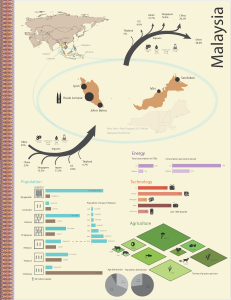
From there, I started building a digital version.
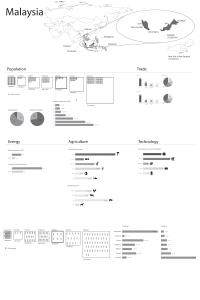 This version was fairly clean and pretty clear, but it used a lot of bar graphs. There’s nothing wrong with bar graphs, per se, but I wanted something more visually interesting, so I spent the rest of the semester trying to convert them into a more dynamic composition, without losing clarity.
(The pie charts in this version are just reminders to include age and population distributions; they’re not intended to be part of the final graphic.)
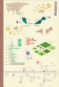
Doug thought that my combined area and population density graphic wasn’t clear in the first version of the poster, so I reworked it to show the number of people in a single square km, and kept the area constant rather than scaling the boxes relative to the size of the country. The population and area information for each country are shown separately as an attached bar graph, which is also connected to the population change since 1900. That population history moved around several times in my many revisions, trying to find a way to fit it in.
In an attempt to put a little more of Malaysia in my poster, I incorporated a hand-painted batik fabric as a decorative element on the left hand side of the poster, and drew my palette from that. I expected that Doug would tell me that it was unnecessary and to take it out, but to my surprise he let it stay.
The agricultural products graphic took its cue from the diamond shapes in the batik as well, converting the bar graphs into proportionally-sized parallelograms that look like fields.
I also converted the import/export information into arrows whose width was proportional to the importance of the import/exports. One of my classmates took one look at the arrows and said I had been influenced by Minard’s map of Napoleon’s Russian campaign. I hadn’t thought about that connection at all, but it’s not unlikely that the idea was floating around in my subconscious after a discussion of Minard’s graphic in history class a few weeks earlier. Doug thought that the “hairy arrows” were hard to read and could be done better, so my unintentional homage ended up disappearing in the next round of edits, to be replaced by quieter arrows with bubbles to represent each trade partner.
The final version included a timeline, as well as updates to several of the other graphics. The energy use comparisons were judged to be too similar for the per capita and total energy data, so in this version I exaggerated the differences between them. I tweaked several of the colors, added size comparisons for the different import and export products, spent a good deal of time smoothing my map to be less “jittery,” and generally tucked and tweaked until things fit and flowed well together.
The end result does still have a bit of the bar graph around it, but I think it also has some visual interest as well. It’s a fairly busy piece, but it doesn’t feel cluttered to me. Hopefully that means that I learned a thing or two about organization along the way!
