Every once in a while you catch yourself using the same approach to solve different problems. Sometimes that’s a good thing, and the insight gives you another tool in your repertoire. And sometimes, you realize that you’re applying the wrong solution, and a different approach might work better. Over the past couple of weeks, I’ve come across a couple of habits in my own designs, and I suspect that being aware of them will turn out to be very useful.
We’ve been working on composing type for VisComm this semester, and the last assignment required us to use (and stick to) a grid. I usually think of myself as a pretty rectilinear, grid type of person, but this assignment was downright painful to work on. I would start designing, get to a point where I liked the layout, fit it to the grid, and have an overwhelming urge to tweak it off of the grid just a little bit.
(I take it as a good sign that I can feel strongly enough about text positioning that it is actually painful to leave it untouched. There might be some hope for turning this scientist into a designer, after all.)
Mostly, I was having trouble with examples where there was more than one line of text, or where the grid didn’t allow me to center something that I really, really felt needed to be centered.
I settled on a subset of layouts that fit relatively comfortably with the grid, but there were still nagging things that I wanted to fix and couldn’t without breaking the grid. For example, it was making me crazy that I couldn’t center “Paul Kasmin Gallery” between the title and the date in this piece:

When I brought it to class, Ernesto took one look at it and told me that my whitespace was too regular. I had divided the page too evenly, and it would be more interesting with bigger contrast.
And so, I came upon insight #1: If I really, really want to break the grid, I should look for other things that aren’t working in the piece. I could see that there was a problem, but I was trying to apply the wrong solution. Instead of centering the text perfectly, I needed to emphasize the difference in whitespace (changes in font were made for other reasons).

Insight #2 came from a couple of different assignments. First, there was the Genealogy project for my ID History class. My first draft of the poster used boxes to organize the data into a flowchart.
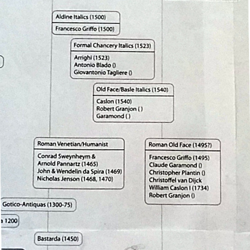
This is a very science-y way to do things, but I was pretty happy with how the design was coming along. When I showed it to Ernesto, his immediate response was that the design was too closed, and I needed to open it up. When I did, it got a lot better.

The second assignment was the book review layout for my ID Studio class. My first draft had a big box around the text, in an attempt to give it visual weight equal to that of the images. When I brought it to class, Doug said that I had too many organizational principles going on at once, and suggested that I simplify the design.
Increasing the font size and establishing a single left margin (no indents) helped a lot. Hanging the text and figures from two dedicated grid lines helped to split them into different fields and improved the contrast between types of information.

In the second version, I found the whitespace between images distracting. Because the figure separation is as big as the text gutters, it was competing for attention and making the grid feel less coherent. The competition was particularly strong between the first column gutter and the first two images, where the whitespace almost lines up, but not quite. Reducing the image spacing just a tiny bit helped to make the figures feel like a single block that is separate from the gutters above.

Insight #2: If I want to put a box around it, it’s probably not organized enough. Good design doesn’t need to be contained – look for changes to the structure that will create hierarchy naturally.