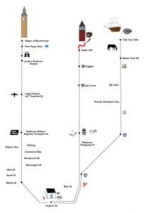
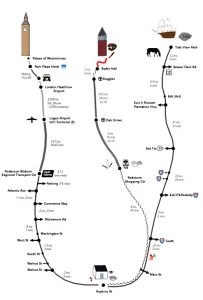
I am behind on my posting – a lot has happened with the map since last time! I had some ideas of where to head when I checked in last time, and have spent the past couple of weeks developing the map with a whole new structure using a revised concept. From this:
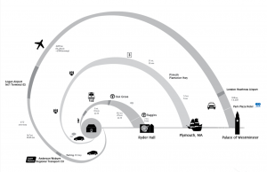
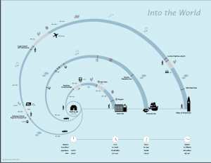
and now this:
Besides the underlying organization of spirals rather than line paths, the major changes have been:
- Taking another step in the direction of abstraction (eliminating turn-by-turn directions and specific landmarks)
- Adding more details about the experience of taking the trip (icons for noise level, crowding, etc.)
- Working on tweaking the icon details to help them feel more cohesive
- Using color to support the narrative of the map
That last point was particularly important, as it turned out. When I first started drawing the spiral structure, the path was a dark color on a white background, and everyone who looked at it immediately saw a seashell. Since there was nothing seashell-themed about this project, I wanted to make that feature of the design less prominent. Making the lines a little thinner and the icons a little bigger helped with that, as did reducing the contrast between path and background. I originally went to a light path on a dark background, but that was a little too much, so I ended up in the medium range for both sets of colors. This design is pretty quiet at the moment, and I’m not sure how to make it “pop.” Most people seem to find it interesting, but the muted color palette is not to everyone’s taste.
We have our final design review today, so hopefully that will give me more ideas of things to tweak and change.


