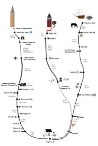
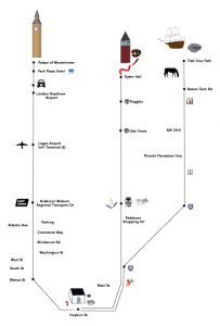
After deciding to stick with straight lines and stripped down symbols for my map project in the last post, I started playing around with ideas for how to humanize the design to keep it from feeling barren. I had stripped out all of the non-essentials to focus strictly on content and utility in the first sketches, but I wanted to play a bit with how to add some of those “extras” back in, without compromising the simplicity of the design.
Inspired by my favorite examples from the Pictorial Maps book, I decided to sketch out some of the more important landmarks along the route. I don’t normally think of myself as someone who is able to draw, so this was a bit of a personal challenge for me, but I thought it would be fun to push myself a little and see what happened. Working from a photo rather than real life was very helpful; it flattens out the third dimension and makes it easier to see the geometry. In the end, I was really surprised at how well the sketches came out.
I wasn’t sure if they fit the original design concept, though. I really liked the artistic feel and the human touch, but I wasn’t sure how well they would work with the very linear approach I’d outlined. I put that on the list of things to ask in my first crit session last Monday, and left it at that.
In the crit session, Doug took one look at the sketches and said that he was going to push me to do something more symbolic. He wants me to practice moving away from realism, and the sketches are very photographic (fair enough). I had also slightly misunderstood the core assignment: I thought that this map was intended solely to guide someone else’s journey, but realized during the class discussion that it should include some of my own personal journey and associations as well. So, I had more to do in the visual representation department.
I had used different kinds of lines (dotted, dashed, etc.) to represent the different kinds of transportation, but other people found this less intuitive than I’d expected. In general, the core layout seemed to be mostly understandable, which is all that I was hoping for at this stage. The class discussion was very helpful, and it was fun to see all of the designs that other people had come up with. I thought that the criticism was reasonable and fair, and it helped to refine my understanding of my design, general good practices, and the assignment. Overall, I’d call that a success.
For tomorrow, we needed to put all three maps together in one layout, and draw them at full size. I had never used Illustrator before, so I wanted to get into that part of the process sooner rather than later. I sat down on Wednesday to learn the software and start mocking up a digital version of the map.
First, I drew very simplified icons for the major landmarks. These are good enough to show my intention, but I will still need to do quite a bit of polishing before the final version if I decide to pursue this design direction. In each case, I tried to step back from each landmark and capture only its essentials. My complex drawing of Ryder Hall became just the tower (with an evening light display), and our house became focused on its most recognizable attribute: the green front door.
 That door lies at the root of one of the biggest design decisions in this phase of the project: use of color. In my original sketch, I had planned to use color to relate time and distance annotations to specific map locations (10 mins from home to the bus, etc).
When I started out in Illustrator, I decided to keep things simple and worked only in black and white. I ended up really liking the black and white icons, but there were a few stubborn places where I still needed to use color (including my front door). I’m still torn about this aspect of the design, but decided to convert all of my drawings to color in the later revisions.
Joining the three maps together created another problem that I’m still trying to work my way around. The original sketches used straight lines for each route, and the routes were oriented around the user at all times. This works great on each individual path, but becomes something of a problem when you want to put all three paths together. If you start at the icon of my house, one route should go right and the other two should go left. Simple, right?
Well, yes. Until you consider how each of those routes is drawn, and how it must be read. I feel pretty strongly that the user should not have to rotate this particular map in order to read it; that was a really fundamental decision in this design. Unfortunately, both options for keeping the lines straight out from the house required the user to rotate the map in order to read it when the routes were combined.
To get around that problem, I decided to change the location of the house to the bottom of the map. This created the problem of how to draw the house, though. After several iterations, I ended up with a view of the house from above, showing the street heading off to the left and the right in either direction.
I really didn’t like this solution, especially because the house was viewed from a totally different perspective than the other buildings shown in the map. I let it sit for a day, to see if I might like it better with fresh eyes. I didn’t, so I drew the house as seen from across the street, and changed the route orientations to match.
(You can also get a peek at my “symbolic language” icons in that last view. They’re still rather literal, but I am working on it.)
I really like the patterns that I used to indicate modes of travel in this revision of the map. Everyone found the use of footprints to indicate walking intuitive in the last version, so I ran with that and drew tire and railroad tracks instead of dotted and dashed lines in this version. I suppose they may also be too literal for the assignment, but I’m hoping that others will like them as much as I do.
The last major design decision in this iteration was to determine what to do about route indicators. The original conception of this project was entirely linear, but placing the house at the bottom of the page requires that the route lines curve in some way.
In the first version, I was careful not to include sharp corners, to reduce the likelihood that they would be interpreted as turns in the map. I like the more organic feel of this map, but I wanted to play around a bit and see what else I could get out of it.
Taking a step back toward the linear diagram version, I ended up with this:

This feels cleaner and neater to me, and is more in line with the original design idea (I also lost the tire tracks in this one; it didn’t feel like they fit in this design). I’m concerned about the clarity of those sharp turns, which I think could be mistaken for turning directions.
I went ahead and completed the draft for the curved version, but I’m bringing both to class tomorrow. It will be interesting to see what other people have to say!


