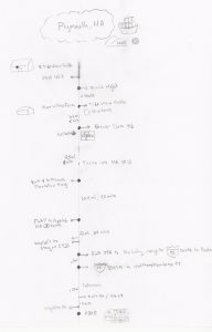
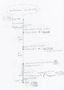
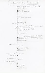
The first project for our ID Studio class is to make a map. Three maps, actually. Each one begins at our home and shows a trip to a) school, b) our childhood home or c) an international destination. Eventually, we will need to put all three maps on the same piece of paper in a sensible way.
This seems like both a fun and a challenging problem. There are issues of scale to be addressed, questions about how to represent complex environments simply, and also opportunities to apply basic design principles (of which I know almost nothing) to a simple project. I think it will be a rich area to play around in.
Fortunately, I was assigned a book on pictorial maps for a book review later in the semester, so I had a great place to start thinking about the assignment. (You’ll have to wait until later for the full review.) The book is called, appropriately enough, Pictorial Maps, and was written by Nigel Holmes.
Essentially, the book is a tour through all of the different kinds of maps available, from the prosaic and functional (think geographical survey maps) to the downright whimsical, and everything in between.
The author has a particular fondness for busy maps with lots of things going on,
but he also showed some examples of very, very simple designs. This one has a ton of detail, but the black and white presentation and use of scale helps to simplify its message considerably.
Immersing myself in all of these styles for an evening was a great way to start thinking about my own map design. The busy maps were fun to look at, but they’re not really my aesthetic, and they left me feeling kind of overwhelmed. It’s a bit like walking through the city with a chatty tour guide going a mile a minute. Looking at lots of them in one sitting left me wishing that there was room to take a breath and just enjoy the scene.
The second map is much more to my taste; calmer, focused, with lots of interesting detail to examine, but less determined to explain everything that you see at each step of the way.
Experiencing my own reaction to these different styles was an important part of setting the tone for my own design; I wanted something simple and helpful that didn’t try too hard to entertain. (I suppose it’s not shocking that the scientist in me goes for the information-heavy option whenever possible…)
I also thought a lot about form. I really like the hand-drawn quality of the pictorial maps, but I was leaning heavily toward a more diagrammatic approach. The example that Doug used in class was that of the MBTA or New York subway maps; something abstracted far enough that the precise details of the path become less important than the stops along the way.
I often struggle to orient myself when trying to read a map quickly, and it is very easy for me to confuse left and right if I don’t happen to be physically oriented in the same direction as the map. It’s easy enough for me to confuse left and right without a map involved…I really don’t need any extra help!
This consideration led me to think about ways of orienting the map to the user, rather than the other way around. I really like the practice, common in GPS systems, of rotating the map so that directions are given relative to the direction that the user is facing at any given time.
Putting these two thoughts together, I decided to come up with a simple linear path with objects and landmarks indicated to the left or right of the line depending on which side the user will find them.
Once this general concept was roughed out, I started building the details of each map. I came up with a list of directions and local landmarks to include, and started to identify which I would label with simple text and which I might want to use icons for. This seems like the perfect place to include the more human component that I liked in the pictorial designs; a collection of hand-drawn icons will probably stretch my sketching skills to the limit, but they will make the overall design more personable and friendly.
I spent a morning checking my directions with Google Maps to collect all of the trip time and distance information, and searched the internet for photos from which to draw my icon designs. (I think I’ll probably wait to start those until after I’ve talked with Doug on Monday, to make sure that this is a reasonable direction to head.) Once I had all of that information laid out, I started outlining a more formal sketch of the design idea.
I’m still very much in the pencil stage, and I think I will probably hold off on color until after the first critique on Monday, but so far I am pretty happy with the design. It will be interesting to hear what other people have to say!
![20150917_204658[1]](http://ericagunn.com/wp-content/uploads/2015/09/20150917_2046581-e1442537984323-272x300.jpg)
![20150917_204805[1]](http://ericagunn.com/wp-content/uploads/2015/09/20150917_2048051-e1442538019353-225x300.jpg)
![20150917_204833[1]](http://ericagunn.com/wp-content/uploads/2015/09/20150917_2048331-e1442538053760-300x166.jpg)


