I really enjoyed my previous foray into hand lettering, and think this might be a really fun way to explore typography in a more deliberate way. Since text is such a fundamental part of visual communication, that seems like a good thing. I bought Sean’s course on hand lettering as a way to focus my practice.
When you start out not knowing what you’re doing, it’s pretty much guaranteed that you’re going to break some of the rules. One of the first videos in the hand lettering course urges against mixing typefaces within a design.
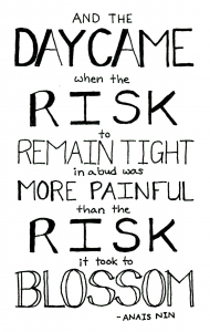
And, of course, that’s exactly what I’d done in my previous favorite version of my hand lettering design.
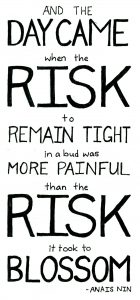
I went back to the drawing board, and set everything in a simple, sans serif font.
I re-justified the text so that “risk” set the width of the final piece. This also meant that the word had to be bigger, so the piece got both narrower and taller in this revision. I do like it better, though. In a more solid font, the word “blossom” pops more, and almost seems to anchor the rest of the words. Forcing all of the major words to justify to the rectangle edges makes for a more static design, but it does feel more stable.
I think I might still want to move the connecting words up a bit, so that their baseline is more evenly centered between the bigger words.
The two Rs in “risk” are not quite the same; the angle where the bowl meets the stem (is there a name for that? There must be.) feels a bit more appropriate in the upper one, but the flattened outside shape of the bowl fits better in the lower R. I also like the shape of the bowl on the lower letter a bit better, and the line width seems more even.
In both pieces, I wanted the words “remain tight” to actually feel tight, like they were squeezed into the line. I think the second piece does a better job of that than the first, but it’s still not quite there. Next time, I’d probably go up a size on the font for those two words and further reduce the spacing between letters to help with that illusion. Elongating the letters vertically might also help them to feel squeezed in place. (I did that a little bit here, but not perhaps as much as I could have.)
I am pretty happy with the uniformity of lettering in this piece. Except for those tricky R’s, most of the repeated letters turned out pretty similar. Since I’m drawing freehand, it took a few revisions in pencil to get it right, but I’m mostly satisfied with how that came out.
I wonder what other weaknesses I’ll find in this piece as I move through the lessons? What do you see as the strengths and weaknesses of each?

