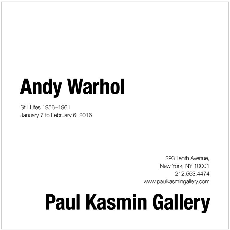
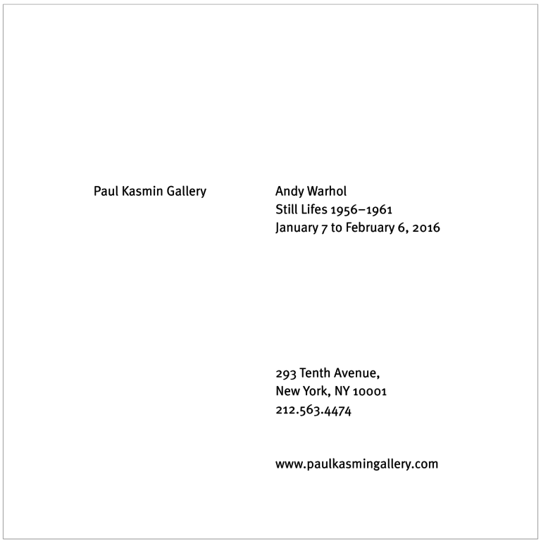
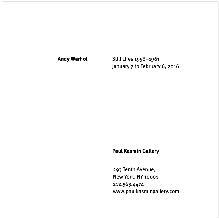
This project was an assignment for my Visual Communications class with Ernesto Aparicio at Northeastern in the 2015 fall semester.
The assignment followed the same structure as the Rights of Man project that preceded it. We were given a selection of text, and asked to create a poster for an art gallery opening based on a specific set of constraints. In the first series, we were allowed to choose a single typeface and size for the text, which was maintained across all 5 compositions in the series. In the second series, we were allowed to use bold to highlight particular pieces of information. In the third series, we were allowed to change the size as well as the weight of the text.
Working closely with a single typeface inside of these rigid constraints allowed us to explore how each element of type design affects a composition. Observing other students’ compositions and their development over multiple weeks also gave me an appreciation of the wide variety that can be obtained within even the simplest of forms.


