
I worked as senior data visualization designer on a SaaS data visualization product for 2 years. As part of that project, I mentored a junior UI designer in developing a charting style system, designed and specified several base charts and interaction patterns, and created detailed selection persistence mechanisms to ensure smooth highlighting and contextual focusing across the application. I also designed the data attachment logic behind an automated system that supported the user in selecting chart types based on custom data configurations, and wrote the requirements and QA testing patterns needed for its development.
My day-to-day work consisted of three major pieces:
- System architecture work was the big-picture thinking that outlined major initiatives and determined the structure and function of our application.
- Creating and maintaining design systems supported the rapid development of new features, and ensured consistency and good design practices across the application, including use of color and typography to support app visual hierarchy and chart interactions.
- Feature design and development described the individual details of each new feature that we build, and generated a full engineering specification for new features for development, including all style definitions and interactions for charts.
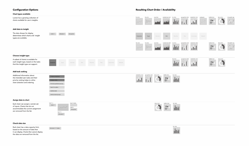
System Architecture

The majority of my system architecture work focused on determining which data is acceptable for different chart types, and automating the chart configuration and selection process, as well as consulting with engineering about how users can input information to configure our charts in the application design mode. We work with several different metadata structures (measures, dimensions, time periods, etc.), each of which can be displayed differently in different charts. I created the chart input assignments to specify which data can be shown where, and how much data (10 series, 100 series?) could be shown in a given chart. I also developed a weighted-sum formula for determining which chart was the best fit for a particular user task, based on a series of user inputs.
My architecture work also involved specification of system-wide features, such as an application-level persistence paradigm that determines when the application remembers a user setting, and when it forgets. This included user selections such as theme, data filter, table sort, chart interactions, etc., and specified whether they are kept, reset, or overwritten by other user actions, such as viewing the page on a different device, in a different web browser session, navigating to a different page, or interacting with a different chart.
Design Systems
Our application relied on a series of UX, UI, and data vis design systems, which all have to function together to create a seamless whole. I collaborated with our UI designer to create a color and typography system for data visualization that works within the broader UI style of the application. I applied and maintained this system for all chart types and other data-visualization-related features of the app, as well as re-aligning with the UI system for different themes and UI color updates.
I also collaborated closely with our UX designer to ensure that chart interactions were consistent with other UX paradigms within the application, and that they supported the user in accomplishing specific analytical tasks. I designed interactions for each chart in our library, and deployed the data visualization style system to create a visual hierarchy to communicate the results of the interaction.
I have written more about designing color systems for data vis here, and have recently been exploring several aspects of creating design systems for charts on the blog, under the Form to Data tag. The video below shows our data vis style system in action, supporting interactions in a stacked bar chart.
Feature Design/Specifications
The system architecture decisions and data vis design system pieces came together in detailed specifications for every feature in the application. The architectural choices helped to define what the features were, and then I worked with the business team to figure out how to stage them and write them into bite-size tickets to feed our agile sprints. Each ticket contained a set of detailed criteria that explained exactly what the feature needed to contain, in sometimes-excruciating detail. (For example, the image below shows a small subset of the specifications for how axis labels are drawn in a chart.) These detailed specifications made it easier for engineers to estimate the effort needed to develop a feature, ensured that they had clear criteria to develop against, and created a list that QA could check against after development was complete.
