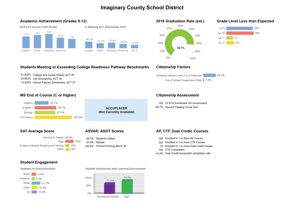
In the last post in this series, we looked at how whitespace can help to clarify a restaurant menu. In this post, we’ll combine whitespace and text hierarchy to improve the design of this dashboard. This example is an actual dashboard that I found online, redrawn and edited to anonymize the information.
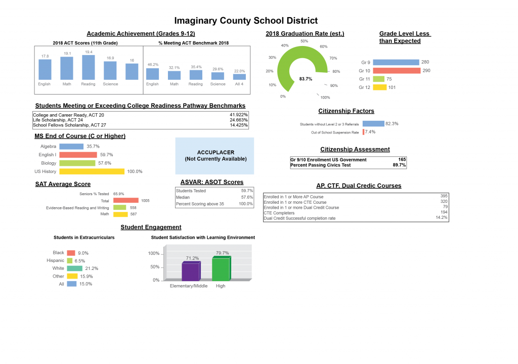
This post focuses only on the page layout and text hierarchy, to see how we can use whitespace and text headings to clarify the content of the page, and does not get into visualization choices and recommendations. The goal here is not to re-design or completely change the dashboard; it is to work with the existing contents to improve the visual display with a few minimally-invasive changes.
- The text and headers need to be more visually separated. Right now, the headers don’t really stand out enough, making it hard to tell the difference between body text and header.
- Too many text sizes and styles. To maintain a strong page hierarchy, text that shows similar information should be the same size and style. Right now, there are at least three sizes of text for the chart axis labels, and two sizes plus two colors for the table text in boxes.
- Clearer page layout. Right now, it’s hard to tell how the page is organized, or what sequence the information should have. A few small tweaks will make this page much clearer.
- More space around the headers. This will help the header text to stand out.
- Choose a single text alignment. Currently, the page uses a mixture of left-aligned and center-aligned text, making it hard to tell how the headers relate to items on the page.
- Stronger grouping and separation between items. The page actually has a decent amount of whitespace on it already, but it’s not structured in a way that makes it useful. Enhancing and clarifying the page structure will make it easier to see which items are grouped together.
- Better alignment. This page contains several boxes to help group information together, but none of them line up in a systematic way. This creates a lot of visual noise, and the lack of padding inside the boxes makes things feel congested and cluttered. Creating a stronger page structure may help us to soften the boxes, or get rid of them altogether.
The first step is to choose a single alignment for the header text. Simply left-aligning all of the text and matching the content alignment to the header makes a big difference already. The page header could be left aligned as well, or left as-is.
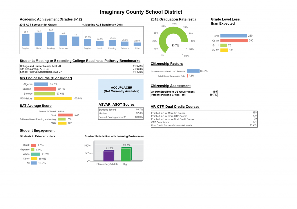
The next step is to give the headers a little bit more breathing room, to make a stronger separation between sections. Making sure that the gap between header and content is consistent also helps a lot, especially for the headers with boxes and horizontal bar charts for content.
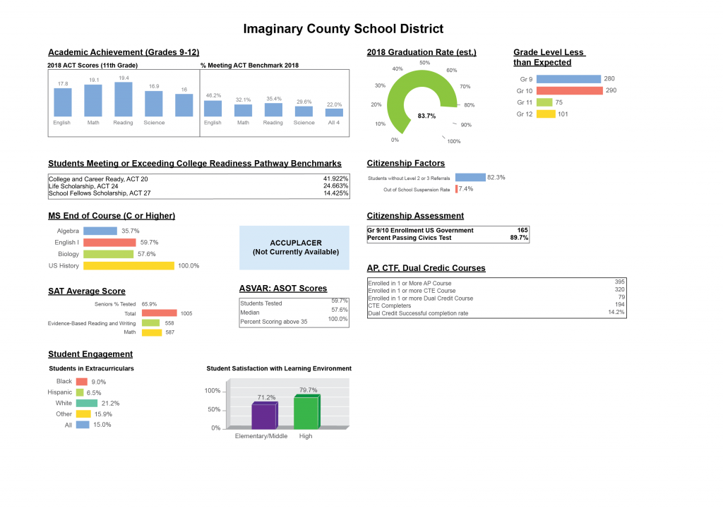
At this point, I’m not enforcing a full-page horizontal grid; this page is currently shown as two main columns, divided into sub-columns where necessary. This implies that you would read the columns on the left first, and then the columns on the right. Drawing some boxes behind the different page items helps to clarify these relationships (and also points out how lax I am being about enforcing regular spacing/padding relationships).
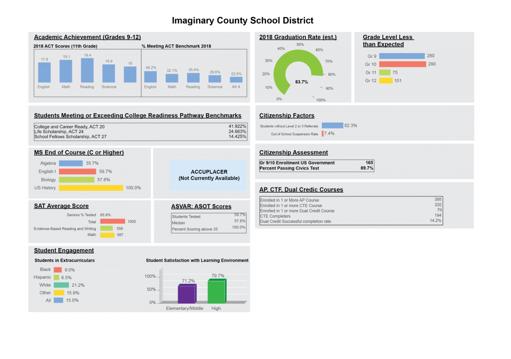
Alternatively, I could enforce a page-wide horizontal grid, so that the boxes in one column line up with the other. This makes all of the items feel more equal, and reduces the sense that there’s a particular reading direction. Now, Citizenship Assessment could be related to Citizenship Factors or to MS End of Course.
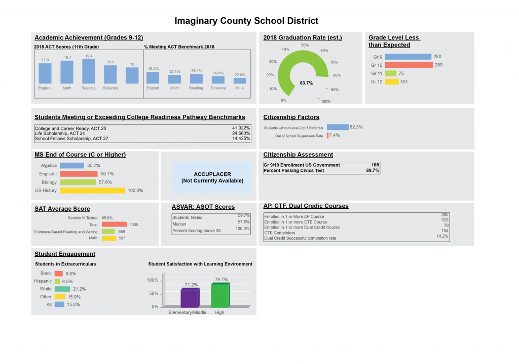
We could also use those boxes to help distinguish between different groupings on the page. This is often (not always) a useful strategy when you have lots of charts on a page, since axis labels and different chart shapes can make them look very irregular and reduce the structural clarity of the page. If your structure is clear enough and you have enough whitespace between items, you shouldn’t need them, but in some cases container grids can help. They are also a lot less disruptive than the outline boxes in the original dashboard. Adding a little extra gap between columns moves us back toward a 2-column view.
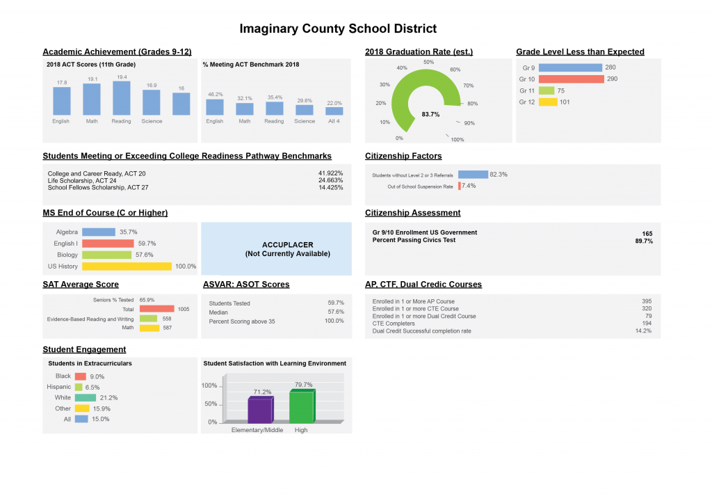
We can increase the header separation by making the main headers 1 pt larger and heavy instead of bold, and making the sub-headers dark gray instead of black. Adding a bit more whitespace between page sections allows us to get rid of the boxes altogether.
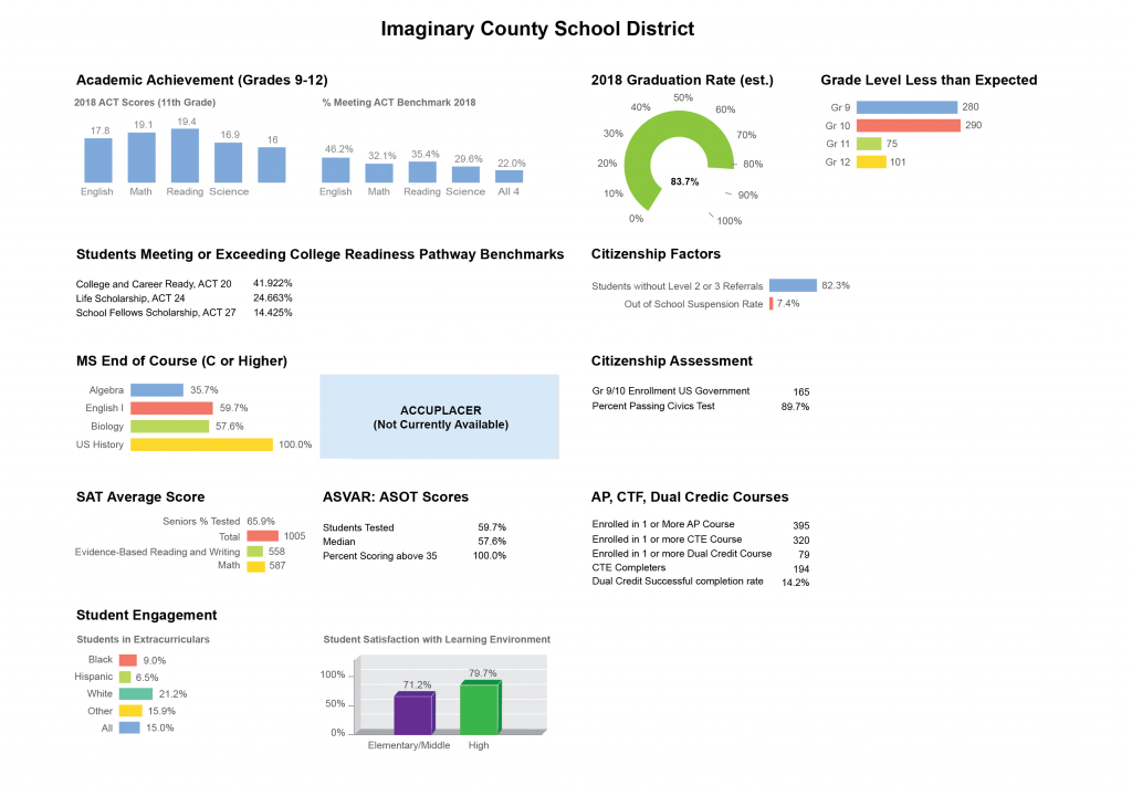
This also illustrates what the boxes are doing for us; notice how much more you feel the irregular shapes of the page contents without the gray background containers to group items together. I needed to add extra space between the Academic Achievement bar charts to make this version work. The stronger headers and page structure are enough to hold things together here, but the background tiles help to reinforce separation between items, especially when there’s a lot of information on the page.
Now that our page headers are working better, we can start to focus on the fine details of the display. There’s no reason that the figure text can’t be the same size everywhere. Making the axis labels adopt a uniform size helps keep the text hierarchy clear, and making them gray reduces their competition with the table text and other text on the page (be careful not to make them too light, though, or you’ll decrease legibility). Increasing the text size does squish the chart in a couple of cases, but that could be fixed by reducing the label length or making the chart area wider on the page.
Without background tiles, the grouping of text and values tends to get lost in the table items. That could be fixed by reducing the gap, adding guides to connect the items, or rearranging the table content to be more clear. There are a few different options for how to improve this.
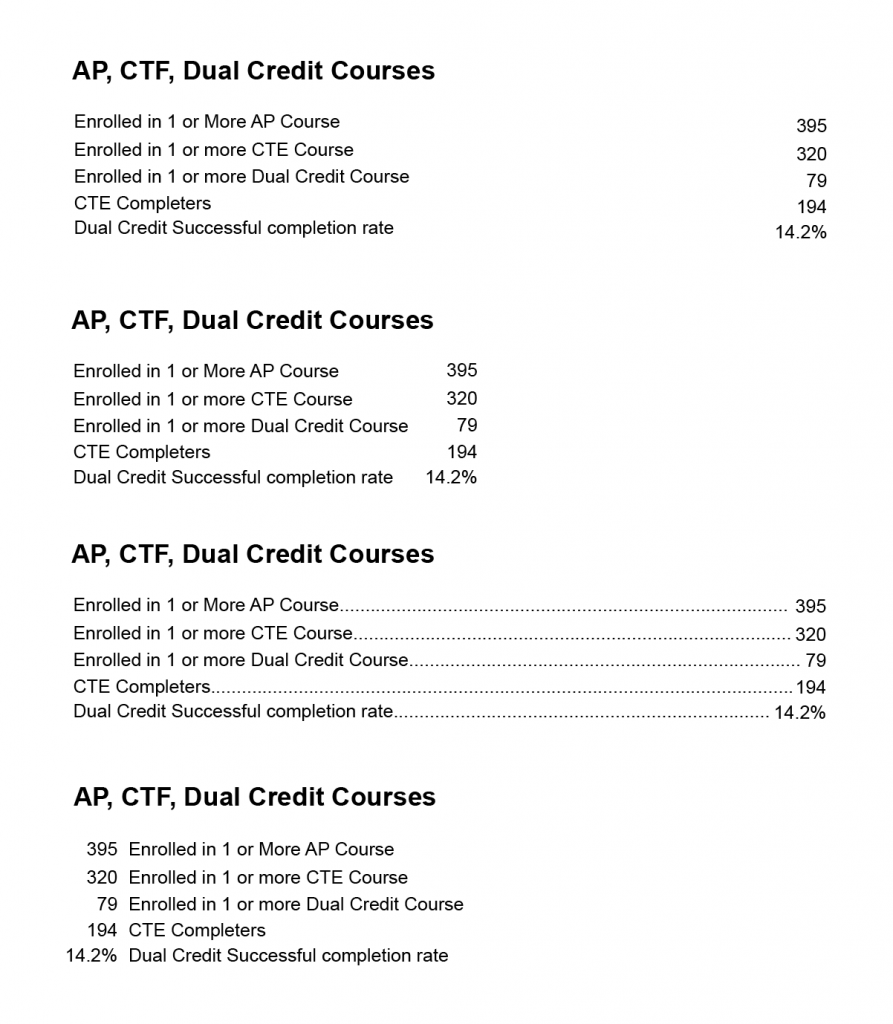
Most of these changes are fairly subtle, but together they add up to a clearer, more cohesive design that supports the information content of the page.
Before:

After:
1 thought on “Whitespace in dashboard design”